A tertiary color
Color theoryIn today’s usual definition, a tertiary color is an even mix of a primary and a neighboring secondary color, or three parts of one primary to one of another. Yellow-orange is the one between yellow and orange.1
An orange that leans toward yellow, named long before the color wheel had rules.
Yellow-orange is the color between yellow and orange: a bright, warm orange that leans toward yellow. Its usual code, #FFAE42, has full red, about two-thirds green and a little blue. No standard defines it.
On the painter’s color wheel of red, yellow and blue, yellow-orange is a tertiary color, the primary yellow mixed with the secondary orange. The idea of naming it is much older than the wheel. Before English took the word orange from the fruit, around 1500, Old English could call a yellowish orange ġeolucrog, “yellow-saffron”. As late as 1905, the color scientist Albert Munsell thought orange was a fruit, not a true color name, and described an orange as “a red orange or a yellow orange”.
Strictly, the order of the words matters. In Robert Ridgway’s color standards of 1912, yellow-orange is an orange tinged with yellow, and orange-yellow is a yellow tinged with orange. Most people don’t keep them apart: in the xkcd color survey, yellow orange and orange yellow came out almost the same, and both are yellower than this code. In fact #FFAE42 has about the same hue as the web color orange, #FFA500. Its touch of blue makes it softer and lighter, not yellower.
#FFAE42 is a light color. White text on it reaches only about 1.8:1, so use dark brown or navy text. It suits food, summer and children’s designs, and pairs well with blue-violet, its opposite on the painter’s wheel, and with navy, teal and chocolate brown.
| HEX | #FFAE42 | |
|---|---|---|
| RGB | rgb(255, 174, 66) | |
| HSL | hsl(34, 100%, 63%) | |
| HSV | 34°, 74%, 100% | |
| CMYK | 0, 32, 74, 0 | |
| OKLCH | oklch(81.1% 0.151 69.9) |
People’s yellow orange, orange yellow and yellowish orange all sit just to the right of the reference: a little yellower and more intense, at the same lightness, inside the outline. CSS orange sits almost on top of the reference, a hair darker. The ISCC-NBS strong orange yellow sits a little lower and to the right. The outline is an approximate range, not a measured one.
Tints with white
Shades with black
Tones with gray
Pairings that work in rooms, outfits and interfaces.
Opposites on the painter’s color wheel. Bold and playful.
Warm against cool. Yellow-orange glows on the dark ground.
From Steinlen’s 1909 lithograph: golden glow, olive leaves and brown wood.
Near opposites with a fresh, sunny feel. Good for food and travel.
One warm hue, light and dark. Cozy, like caramel and cocoa.
A sodium-lamp glow on a blue-gray night. Made for dark themes.
Pick a palette to see where its colors sit on the color wheel. The caret marks yellow-orange. Tap a band to copy its code.
Lined up by hue around yellow-orange. Hover a color to see how similar it is.The bar under each name shows how similar it is. Similarity comes from the distance between the two colors in OKLab, a model of how we see color.
Yellow-orange has no symbols of its own. Studies of color and emotion test words like “orange” and “yellow”, not the mix, so there is no measured mood for it. Its story is in its name: how English speakers, painters and color scientists have named the colors between yellow and red. It is also the usual description of the light from old sodium streetlights.
In today’s usual definition, a tertiary color is an even mix of a primary and a neighboring secondary color, or three parts of one primary to one of another. Yellow-orange is the one between yellow and orange.1
Old English had no word for orange. Writers could call a reddish orange ġeolurēad, “yellow-red”, and a yellowish orange ġeolucrog, “yellow-saffron”. We found this in a summary of the scholarship, not in the Old English texts themselves.2
Albert Munsell dropped orange from his list of hues as “indefinite”, borrowed from a fruit. He called the color yellow-red and said that we describe an orange as “a red orange or a yellow orange”.3
In formal color names, the last word is the main hue. Ridgway’s 1912 standards run from orange through yellow-orange and orange-yellow to yellow, and the 1955 ISCC-NBS system uses orange yellow for yellows with some orange. In the xkcd survey, people’s yellow orange and orange yellow came out almost identical.4, 5, 6
Low-pressure sodium lamps give an almost pure yellow-orange light from two lines in the sodium spectrum, at 589.0 and 589.6 nanometers. Under it, colors are hard to tell apart, which is why such lamps were used mostly for roads.7, 8
Yellow-orange is a name made of two other color names. English used that trick long before it had a word for orange, and color scientists kept arguing about the order of the words.
With no word for orange, English describes a yellowish orange as ġeolucrog, “yellow-saffron”, and a reddish orange as ġeolurēad, “yellow-red”.1
The earliest known use of orange as a color name in English, in an account of clothing bought for Margaret Tudor. Before this, English had no single word for the color.1
Albert Munsell’s A Color Notation calls the mix of red and yellow “yellow-red”, “popularly called orange”, and drops orange as an indefinite name borrowed from a fruit.2
Robert Ridgway’s Color Standards and Color Nomenclature places yellow-orange, hue number 15, between orange and orange-yellow. Because spectrum orange looks much nearer red, he uses yellow-orange to stand for orange on his dullest plates.3
Low-pressure sodium lamps become practical. Their nearly single-wavelength yellow-orange light later fills streets and highways around the world.4
The ISCC-NBS method of naming colors uses orange yellow, not yellow-orange, as a hue name. Its dictionary files yellow orange, a stamp collectors’ color name, under strong orange and moderate orange.5
The xkcd color survey asks thousands of people to name colors. Their average yellow orange, #FCB001, is almost the same as their orange yellow, #FFAD01.6
Philips Lighting, a major maker of low-pressure sodium lamps, announces it will stop making them as cities switch streetlights to LEDs.4
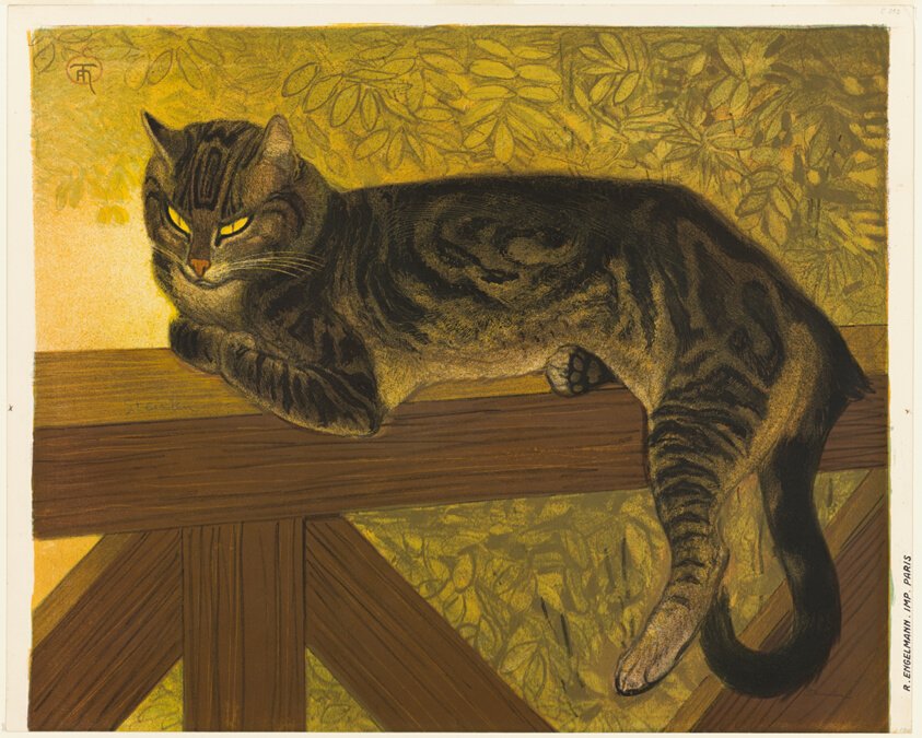
Théophile-Alexandre Steinlen drew this tabby dozing in the sun as a color lithograph. The Art Institute of Chicago lists yellow-orange among its inks, with green, brown and black. In the photo, the glow behind the cat samples as soft golden yellows, paler and yellower than the web code, and deepest in the lower left corner.
Sampled from the background in the Art Institute of Chicago’s photograph (1960.819), released as CC0 (public domain). The list of inks comes from the museum’s record. Colors in a photo shift with the lighting, so read the codes as close, not exact.
Palettes are sampled in-house.
A bright, warm orange that leans toward yellow. Its usual code is #FFAE42 (RGB 255, 174, 66). No color standard defines it.
Yes. On the painter’s red-yellow-blue color wheel it is the tertiary color between the primary yellow and the secondary orange, one of six tertiary colors.
In formal color names the last word is the main hue, so yellow-orange is an orange with some yellow and orange-yellow is a yellow with some orange. In everyday use people treat them as the same color.
No, but they are neighbors. Amber (#FFBF00) is yellower and purer. Yellow-orange (#FFAE42) is more orange, with a little blue that softens it.
Mix yellow and orange paint in about equal parts. Starting from primaries, use about three parts yellow to one part red.
On the painter’s color wheel it is blue-violet. On a screen color wheel, the color directly opposite #FFAE42 is a bright blue, about #4293FF.
Blue-violet, navy and teal give strong contrast. Chocolate brown and cream keep it warm, and a dark blue-gray makes it glow.