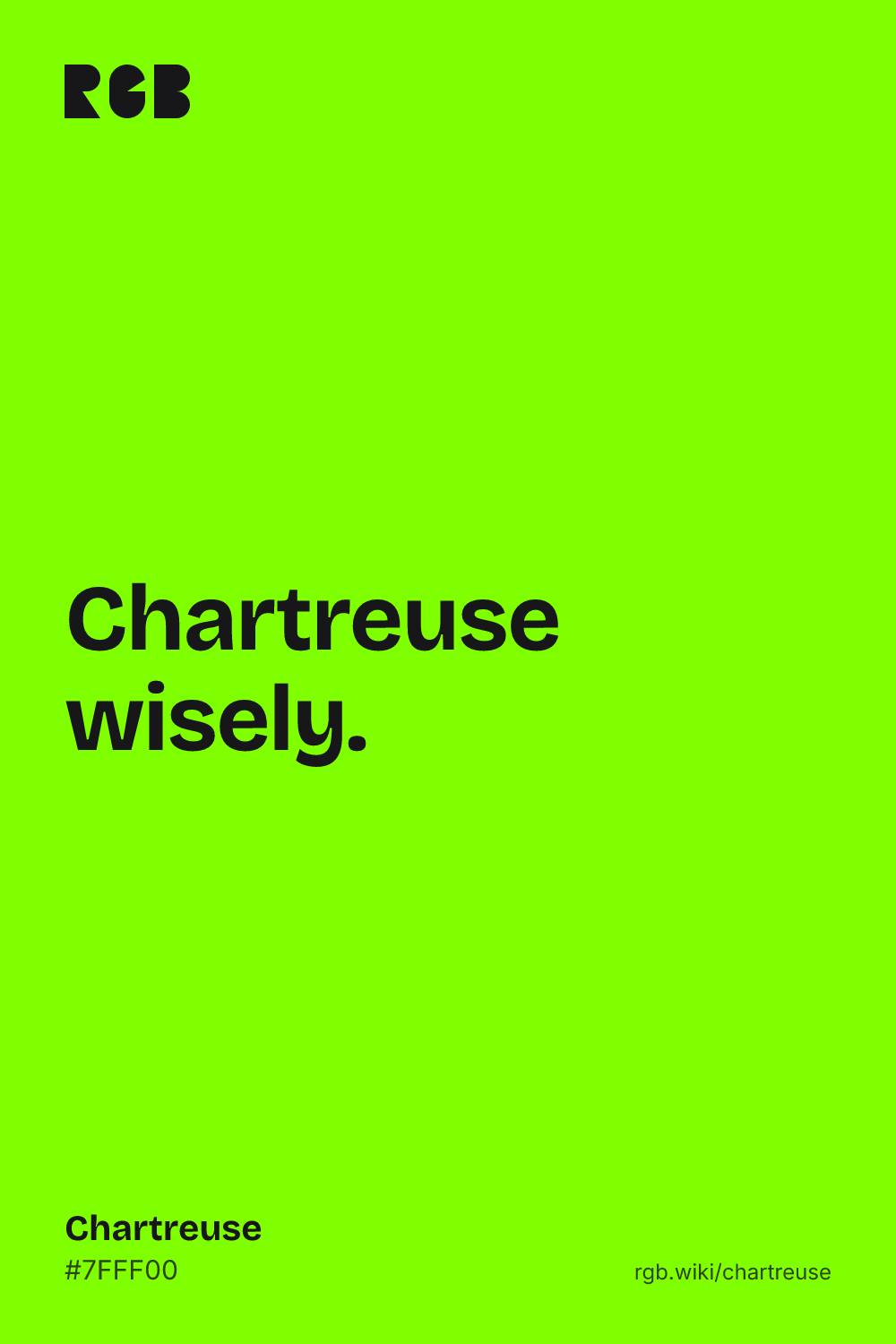
A vivid yellow-green, halfway between yellow and green, named after a French herbal liqueur.
Overview
Chartreuse is a bright yellow-green, the color of new spring shoots and high-visibility vests. Its standard code is #7FFF00: full green, half red and no blue.
The name comes from Chartreuse, a herbal liqueur made by Carthusian monks in the French Alps. The green version gave the color its name, and English speakers have used “chartreuse” for the color since 1884.
On screen, chartreuse is one of the brightest colors there is. It sits right at the wavelength the human eye is most sensitive to in daylight, so it looks lighter than a red or blue of the same strength. When people name colors themselves, their “chartreuse” leans a little more yellow than the web code.
It has also had a career in road safety. Since the 1970s, some fire departments have painted their trucks lime-yellow instead of red, on the argument that drivers see it sooner.
HEX
#7FFF00
RGB
rgb(127, 255, 0)
HSL
hsl(90, 100%, 50%)
HSV
90°, 100%, 100%
CMYK
50, 0, 100, 0
OKLCH
oklch(89.0% 0.265 136.0)
Every code converts from the HEX value #7FFF00. #7FFF00 is chartreuse in the CSS color names defined by the W3C in CSS Color Module Level 4. CMYK is a screen-based estimate; print results vary.
Chartreuse on the color map
LighterDarker
In the xkcd color survey, people’s average “chartreuse” (#C1F80A) came out yellower than the CSS color. The outline is an approximate range, not a measured one.
Shades and tints
Tintswith white
Shadeswith black
Toneswith gray
Chartreuse sits in the middle. Tints add white, shades add black and tones add gray, in 10% steps out from it. Tap any swatch to copy its code.
Light and dark chartreuse
#B2FF66
Light chartreuseMixed 40% with white. A soft spring green that makes a fresh background for dark text.
#7FFF00
ChartreuseThe reference color.
#4C9900
Dark chartreuseMixed 40% with black. A leafy green; white text on it works at large sizes.
Colors that go with chartreuse
Pairings that work in rooms, outfits and interfaces.
Chartreuse and charcoal
Loud but controlled. Good for sport, tech and posters.
Chartreuse and navy
Sharp contrast that still feels clean and sporty.
Chartreuse and violet
Its opposite on the color wheel. Bold, festive and a little retro.
Chartreuse and hot pink
Playful and electric. Use both in small doses.
Chartreuse and cream
Fresh and botanical. Works for food and garden brands.
Chartreuse and forest
A tonal set of greens, calm enough for interiors.
Color-wheel palettes
Pick a palette to see where its colors sit on the color wheel. The caret marks chartreuse. Tap a band to copy its code.
Electric lime61%Green yellow77%Kiwi62%ChartreuseLawn green96%Neon green81%Spring green63%
Lined up by hue around chartreuse. Hover a color to see how similar it is.The bar under each name shows how similar it is. Similarity comes from the distance between the two colors in OKLab, a model of how we see color.
Chartreuse vs lime green
Chartreuse#7FFF00 · hue 90°
Halfway between yellow and green
Brighter and more acidic on screen
Named after a French liqueur
Lime green#32CD32 · hue 120°
A true green with no yellow lean
Darker and less glaring
Named after the citrus fruit
Meaning
Energy
Spring
Visibility
Liqueur
Pop culture
Chartreuse reads as loud, fresh and a little rebellious: spring shoots, safety vests, club flyers and, in 2024, a pop album cover. Designers use it to grab attention in small doses, and it rarely plays a quiet role. Its brightness is real and measurable. How people feel about it is a different question, and the studies on that are smaller.
Looks brighter than it is
Well established
In daylight, the human eye is most sensitive to light at about 555 nanometers, a yellow-green. By our calculation, chartreuse’s dominant wavelength is about 556 nanometers, so it looks brighter than a red or blue of the same strength.1
Often among the least liked
US lab studies
In US lab studies with color samples, people rated yellow-green among the least pleasant hues, and average preference fell to a low point at chartreuse. The same studies found blues the best liked.2, 3
Safer fire trucks? Not proven
One city’s data
A 1995 study of the Dallas fleet found red fire trucks crashed into cars about twice as often as lime-yellow ones. A 2009 US Fire Administration review says it matters more that drivers recognize a fire truck than which color it is.4, 5
Sources (5)
CIE (1924) photopic luminous efficiency function, V(λ), which peaks at 555 nm. Data from the Colour & Vision Research Laboratory, University College London. See also Sharpe, L. T. et al. (2005). A luminous efficiency function, V*(λ), for daylight adaptation. Journal of Vision, 5(11), 948–968. doi:10.1167/5.11.3
Palmer, S. E. & Schloss, K. B. (2010). An ecological valence theory of human color preference. Proceedings of the National Academy of Sciences, 107(19), 8877–8882. doi:10.1073/pnas.0906172107
Valdez, P. & Mehrabian, A. (1994). Effects of color on emotions. Journal of Experimental Psychology: General, 123(4), 394–409. doi:10.1037/0096-3445.123.4.394
Solomon, S. S. & King, J. G. (1995). Influence of color on fire vehicle accidents. Journal of Safety Research, 26(1), 41–48. doi:10.1016/0022-4375(95)00001-1. The figure as reported by the Los Angeles Times, 7 July 1995.
Like burgundy, chartreuse is a color named after a drink. The liqueur came first, by more than a century, and the color name followed once the green version was famous.
1605
A French marshal gives the Carthusian monks of Paris a mysterious manuscript with a recipe for an “elixir of long life”.1
1764
Monks at the Grande Chartreuse monastery write down a new elixir recipe. Its color is now “a little greenish”.1
1840
The monks name a milder herbal liqueur “Green Chartreuse”.1
1884
First known use of “chartreuse” as a color name in English.2
1970s
Oxnard and Santa Monica in California paint their fire trucks chartreuse, after an eye doctor argues that lime-yellow is easier to see than red.3
2001
The W3C’s SVG standard lists chartreuse as rgb(127, 255, 0), the code CSS uses today.4
2024
Charli XCX’s album Brat makes a sharp chartreuse, now called brat green, the defining color of the summer.5
The chipmaker’s green sits on chartreuse’s side of the color wheel but is darker, close to the dark chartreuse in the shades above.
#76B900#000000
Source: NVIDIA brand page
Source
The green is the fill in NVIDIA’s own logo file, and the logo is its horizontal version, both from NVIDIA’s Logo and Brand Guidelines page.
Logos belong to their owners and are shown unaltered, only to show where each palette comes from. Palettes are sampled in-house.
Questions
What color is chartreuse?
A bright yellow-green, halfway between yellow and green. Its usual code is #7FFF00, which is RGB 127, 255, 0.
Is chartreuse green or yellow?
Both, by design. It sits halfway between them on the color wheel. The web color #7FFF00 leans green, while many people picture a yellower shade, and dictionaries define it as a brilliant yellow green.
Why is it called chartreuse?
After Chartreuse, a herbal liqueur made by Carthusian monks in the French Alps. Its green version has a similar yellow-green color. The color name has been used in English since 1884.
What colors go with chartreuse?
Charcoal, navy and deep violet make it pop; cream and forest green calm it down. Hot pink works for a playful, electric look. Chartreuse is strongest in small amounts.
What is the difference between chartreuse and lime green?
Lime green (#32CD32) is a true green with no yellow lean, and it looks darker. Chartreuse (#7FFF00) is halfway to yellow and much brighter on screen.
Why are some fire trucks yellow-green?
Some departments switched to lime-yellow because they believed drivers would see it sooner than red. The evidence is thin: one study found fewer crashes, and a US Fire Administration review says being recognizable as a fire truck matters most.