
Off white

White, softened with a trace of yellow or gray.

Overview

Off-white is any white that is not quite pure: a white with a trace of yellow, gray or beige. Its code here is #FAF9F6, red 250, green 249 and blue 246. The blue is a little lower than the red, which gives the faintest warm tint. Next to pure white it reads as soft rather than colored.

The word is plain English: off as in “not quite”. Merriam-Webster defines off-white as “a yellowish or grayish white” and dates it to 1927. It names a family rather than one color. Ivory, linen, eggshell, alabaster and cream are all off-whites, and large paint makers each sell well over a hundred of them.

Most everyday whites are off-whites. Undyed cotton is off-white or beige, and wool has a slight yellow tint. Laundry detergents and paper often contain optical brighteners, which glow faintly blue so that yellowish material looks whiter. Old porcelain, paper and lace show the real thing: warm, uneven whites, like the porcelain figure below.

On screens, off-white makes a gentle page background for dark gray or navy text, and it keeps a design from looking stark. Because this code is so close to white, its softness shows best in large areas or next to pure white.

HEX#FAF9F6
RGBrgb(250, 249, 246)
HSLhsl(45, 29%, 97%)
HSV45°, 2%, 98%
CMYK0, 0, 2, 2
OKLCHoklch(98.2% 0.004 91.4)
Every code converts from the HEX value #FAF9F6. #FAF9F6 is a widely used web value for off-white, but no standard defines it. Off-white has no CSS keyword, and the name covers a whole family of whites: CSS has several named ones of its own, such as linen, ivory and whitesmoke. Treat this code as typical, not official. CMYK is a screen-based estimate; print results vary.
Off white color card, hex #FAF9F6: “Off-white, on point”

Off white on the color map

Off-white is so light that it sits at the very top of this view. People’s average off white in the xkcd survey is a touch lighter and yellower, just above the view. Linen sits on the left edge of the outline: slightly darker and more peach. White smoke has no tint at all, so it sits just below the reference. The outline is an approximate range, not a measured one.

Shades and tints

Tints with white

Shades with black

Tones with gray

Off white sits in the middle. Tints add white, shades add black and tones add gray, in 10% steps out from it. Tap any swatch to copy its code.

Light and dark off white

#FFFFE4
Creamy off-whiteWhat people called off white, on average, in the xkcd survey. A pale cream.
#FAF9F6
Off-whiteThe reference color.
#F5F5F5
White smokeA neutral off-white with no tint, the CSS color whitesmoke. See white smoke
#F2F0E6
AlabasterA slightly deeper, warmer off-white named after the stone. See alabaster
#E1E0DD
Gray off-whiteMixed 10% with black. A very light warm gray.

Colors that go with off white

Pairings that work in rooms, outfits and interfaces.

Off-white and charcoal

Calm and modern. A softer take on black on white.

Off-white and navy

Crisp and classic, like a linen shirt with a navy blazer.

Off-white and sage

Quiet and natural. Suits kitchens, gardens and wellness brands.

Off-white and terracotta

Warm and earthy, like plaster walls and clay pots.

Off-white and black

Strong contrast, with a page a shade softer than pure white.

Off-white and blush

Soft and gentle. Good for invitations and beauty brands.

Color-wheel palettes

Pick a palette to see where its colors sit on the color wheel. The caret marks off white. Tap a band to copy its code.

A gray has no hue, so turning it around the wheel only gives the same gray back. Monochrome is the one wheel palette that works for it.

Similar colors

Seashell94%Floral white95%Off whiteSnow96%White smoke94%Mint cream93%Ghost white93%

Lined up by hue around off white. Hover a color to see how similar it is.The bar under each name shows how similar it is. Similarity comes from the distance between the two colors in OKLab, a model of how we see color.

Off-white vs ivory

Off-white#FAF9F6 · almost no hue
  • A faint gray-yellow tint
  • Names a whole family of whites
  • No standard code
Ivory#FFFFF0 · hue 60°
  • A clearer yellow tint
  • One of the off-whites
  • A CSS keyword

Meaning

  • Interiors
  • Natural fibers
  • Paper and print
  • Screen backgrounds
  • Fashion

Off-white reads as soft, natural and lived-in: the white of cotton, linen, paper and plaster rather than of a lab or a screen. Designers often choose it to take the edge off pure white. The idea that it is easier to read on is guidance more than settled evidence, and research on color and emotion tests the word white, not off-white.

Advised for dyslexic readers

Charity guidance

The British Dyslexia Association’s style guide advises against white backgrounds, saying white “can appear too dazzling”, and suggests cream or a soft pastel instead. It adds that some dyslexic people have their own color preference. Researchers have noted that recommendations like this were not based on large user studies.1, 2
One study: warm tints helped

One study

In a 2017 study, 341 people, 89 of them with dyslexia, read texts on ten screen background colors. Peach, orange and yellow backgrounds gave shorter reading times than blue, blue gray and green ones, for readers with and without dyslexia. White and off-white were not tested: the authors left them for future work.2

Natural fibers are off-white

Textile reference

Undyed cotton is off-white or beige, and wool has a slight yellow tint from natural pigment. Bleaching removes the tint. Optical brighteners in detergents and paper then glow faintly blue so that yellowish material looks whiter. They replaced laundry bluing, which did the same job.3, 4

Sources (4)
  1. British Dyslexia Association, “Dyslexia friendly style guide”.
  2. Rello, L. & Bigham, J. P. (2017). “Good Background Colors for Readers: A Study of People with and without Dyslexia”. ASSETS ’17, Baltimore. doi:10.1145/3132525.3132546.
  3. Wikipedia, “Greige goods”, citing Curtis, Dressmakers Dictionary (1916), and Matthews, Bleaching and Related Processes (1921).
  4. Wikipedia, “Optical brightener”, citing Ullmann’s Encyclopedia of Industrial Chemistry, “Laundry Detergents”.

History

Off-white is a modern word for an old reality: before bleach and brighteners, most whites were off-whites. The name arrived in the 1920s, and computer color lists later fixed a handful of off-whites as codes.

  1. 1927

    First known use of “off-white” in English, defined by Merriam-Webster as “a yellowish or grayish white”.1

  2. 1930s

    Off-whites are widely paired with beiges in home decorating. They are especially popular again from roughly 1955 to 1975.2

  3. 1989

    Release 4 of the X Window System ships a color list with new “light and off-white colors”, copied from a paint maker’s samples “to provide a better choice for light-colored window backgrounds”. Linen, old lace, floral white and white smoke come from this list.3

  4. 2001

    SVG 1.0 adopts the X11 names as web color keywords, and CSS later takes the same list. Off-white itself never becomes a keyword.4

  5. 2013

    Designer Virgil Abloh renames his Milan label Off-White, a name he described as the gray area between black and white.5

  6. 2021

    The Wall Street Journal counts 152 off-white paints in one major paint maker’s range, 167 in another and 315 in a third.2

Sources (5)
  1. Merriam-Webster, “off-white”, definition and first known use.
  2. Wikipedia, “Shades of white: Off-white”, citing Ryan, Color Your Life (2007), Mahnke, Color, Environment, and Human Response (1996), and Korn, M. (12 August 2021), “Simply White, Snowfall White, School House White”, The Wall Street Journal.
  3. The X11 color list’s README and Paul Raveling’s notes, quoted in Aubrey Jaffer, “Color-Name Dictionaries”; release date from Wikipedia, “X11 color names”.
  4. W3C, SVG 1.0, “Recognized color keyword names” (4 September 2001), and CSS Color Module Level 4, named colors.
  5. Wikipedia, “Off-White (company)”, citing Yotka, S. (28 March 2018), “A Brief History of Virgil Abloh’s Meteoric Rise”, Vogue.

Off white in use

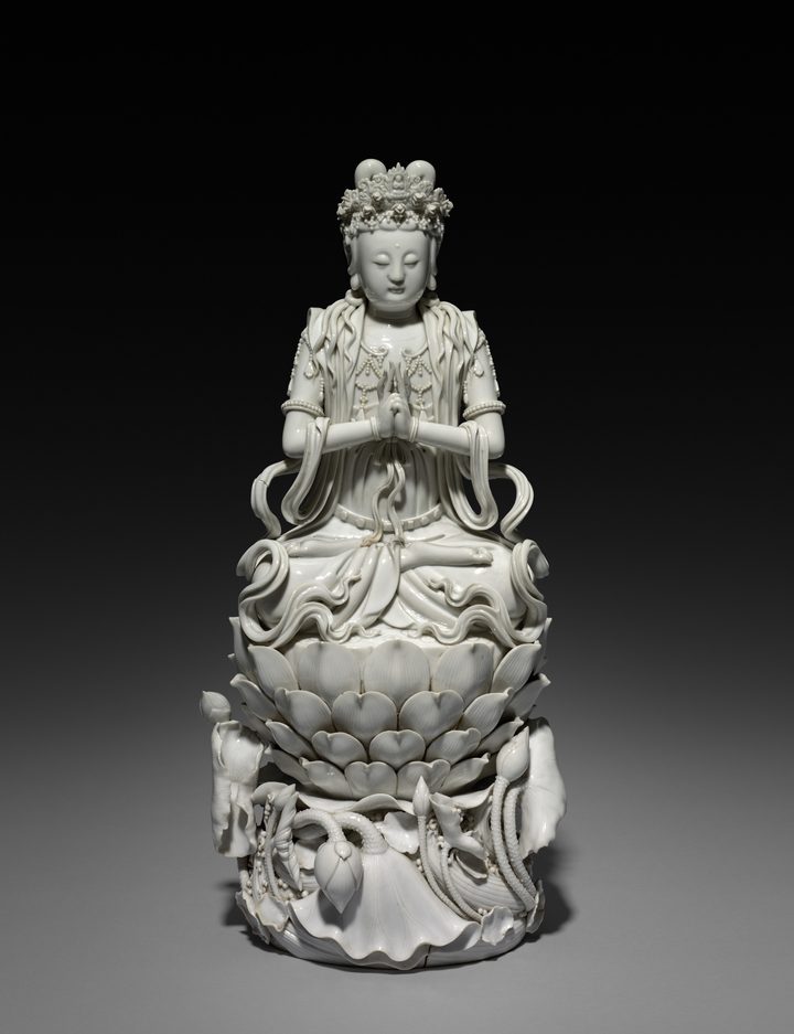
A white porcelain figure of Guanyin with a tall crown, hands joined at the chest, seated on a layered lotus above curling waves
#D1D0C6#A8A79C#7E7D72#4A483E
PorcelainBodhisattva Guanyin of the South Sea, China (1600s)

A white porcelain figure from the Dehua kilns in Fujian, at the Cleveland Museum of Art. Dehua porcelain, known in the West as blanc de Chine, contains very little iron and fires to a warm white or pale ivory, traditionally called “ivory white” or “milk white”. In the photo the glaze is a soft gray-cream, about #D1D0C6.

#D1D0C6#A8A79C#7E7D72#4A483E
Source: Cleveland Museum of Art

Palettes are sampled in-house.

Questions

What color is off-white?

A white with a faint tint of yellow, gray or beige. The code here is #FAF9F6 (RGB 250, 249, 246), but off-white names a family of soft whites rather than one fixed color.

What is the hex code for off-white?

#FAF9F6 is the most common web value. No standard defines it and there is no CSS keyword for off-white, so you will also see codes such as #FAF0E6 (CSS linen) or #F5F5F5 (CSS whitesmoke).

What is the difference between off-white and ivory?

Ivory (#FFFFF0) is a white with a clear yellow tint. Off-white is the broader name: it includes ivory, but the common off-white code is grayer and closer to pure white.

What is the difference between off-white and cream?

Cream (#FFFDD0) is noticeably yellow. Off-white is much closer to white, with only a hint of warmth.

Why use off-white instead of pure white?

Many designers find it softer on a page or a wall. The British Dyslexia Association suggests avoiding white backgrounds because white can seem too dazzling, though research on screen backgrounds has not yet compared white with off-white.

What colors go with off-white?

Charcoal, navy and black for crisp contrast, and sage, terracotta or blush for a warmer, softer look.