Pastel yellow

A soft, pale yellow named after the chalky sticks artists draw with.

Overview

Pastel yellow is a soft, pale yellow. Its usual web code is #FDFD96: red and green almost at full strength and equal, with blue at about three-fifths, which gives a clean, light yellow with no lean toward orange.

The name comes from art. Pastels are sticks of powdered pigment, and makers lighten each color by mixing in chalk, which is how “pastel” came to mean any pale color. Merriam-Webster defines pastel yellow as a light greenish yellow.

No color standard defines pastel yellow. The web code comes from Wikipedia’s list of colors, where it has never had a source. The average pastel yellow in the xkcd color survey was close but a little stronger, #FFFE71.

Pastel yellow needs dark text. It pairs well with lilac, sky blue and mint for a soft pastel set, and with gray or navy for contrast.

HEX#FDFD96
RGBrgb(253, 253, 150)
HSLhsl(60, 96%, 79%)
HSV60°, 41%, 99%
CMYK0, 0, 41, 1
OKLCHoklch(97.2% 0.126 108.5)
Every code converts from the HEX value #FDFD96. #FDFD96 comes from Wikipedia’s list of colors, where it has no source. It once appeared in the article on shades of yellow, marked as needing a citation, and has since been removed there. No color standard defines pastel yellow, and it is not a CSS keyword. Merriam-Webster defines pastel yellow as “a variable color averaging a light greenish yellow”, and Wikipedia notes that there is no official list of pastel color codes. CMYK is a screen-based estimate; print results vary.
Pastel yellow color card, hex #FDFD96: “Pastel, present and future”

Pastel yellow on the color map

People’s average pastel yellow in the xkcd survey sits right beside the base: the same hue, a little stronger. The dictionary’s light greenish yellow is slightly darker, just below it. Both fall inside the outline, so people and the dictionary roughly agree here. The outline is an approximate range, not a measured one.

Shades and tints

Tints with white

Shades with black

Tones with gray

Pastel yellow sits in the middle. Tints add white, shades add black and tones add gray, in 10% steps out from it. Tap any swatch to copy its code.

Light and dark pastel yellow

#FEFECA
Light pastel yellowMixed 50% with white. Close to cream.
#FFFF99
Pale yellowPractically the same color, a hair stronger, with a page of its own. See pale yellow
#FDFD96
Pastel yellowThe reference color.
#FFFD74
Butter yellowStronger and richer, with a page of its own. See butter yellow
#CACA78
Dusty pastel yellowMixed 20% with black. A muted yellow with a khaki tint.

Colors that go with pastel yellow

Pairings that work in rooms, outfits and interfaces.

Pastel yellow and lilac

Two soft pastels, one warm and one cool. Gentle and springlike.

Pastel yellow and sky blue

Light and airy. Suits nurseries and children’s books.

Pastel yellow and mint

Fresh and sweet. Good for cafés, ice cream and spring sales.

Pastel yellow and gray

Calm and modern. Yellow adds warmth without shouting.

Pastel yellow and navy

High contrast. Pastel yellow reads well on a dark navy.

Pastel yellow and coral

Warm and cheerful. Good for summer and parties.

Color-wheel palettes

Pick a palette to see where its colors sit on the color wheel. The caret marks pastel yellow. Tap a band to copy its code.

Similar colors

Lemon chiffon66%Pale goldenrod65%Maize72%Cream66%Butter yellow84%Pale yellow97%Pastel yellow

Lined up by hue around pastel yellow. Hover a color to see how similar it is.The bar under each name shows how similar it is. Similarity comes from the distance between the two colors in OKLab, a model of how we see color.

Pastel yellow vs cream

Pastel yellow#FDFD96 · hue 60°
  • Clearly yellow, and more saturated
  • Named after the artist’s medium
  • No lean toward orange
Cream#FFFDD0 · hue 57°
  • Paler, almost white
  • Named after dairy cream
  • A touch warmer

Meaning

  • Artists’ pastels
  • Soft and soothing
  • Light and bright

Pastel yellow reads as soft, light and cheerful: sunshine with the glare taken out. Pastel colors in general are often described as soothing and calming. As with most named colors, mood research tests broad hues and qualities such as brightness, not pastel yellow itself.

Named after an art medium

Dictionary

Pastels are sticks of pigment held together with a binder. Makers produce each color in steps from pure pigment to near-white by mixing in chalk, and that is where “pastel” as a word for pale colors comes from. Dictionaries list the sense as “any of various pale or light colors”.1, 2
A family, not a single color

Definition

Pastel names a group of colors with high lightness and low to medium saturation, not one fixed shade. There is no official list of pastel color codes.3

Pleasant and calm, but yellow

One lab study

In a 1994 lab study, brighter colors felt more pleasant and less saturated colors felt calmer, which suits pastels. The same study found yellow and green-yellow the least pleasant hues, so pastel yellow pulls both ways.4

Sources (4)
  1. Wikipedia, “Pastel”, on how pastels are made.
  2. Merriam-Webster, “pastel”, definitions and etymology.
  3. Wikipedia, “Pastel (color)”.
  4. Valdez, P. & Mehrabian, A. (1994). Effects of color on emotions. Journal of Experimental Psychology: General, 123(4), 394–409. doi:10.1037/0096-3445.123.4.394

History

Pastel yellow has no recorded first use of its own. Its story is the story of the word pastel, which went from an art supply to a whole family of colors.

  1. 1499

    Leonardo da Vinci learns of the pastel medium from the French artist Jean Perréal, who arrives in Milan that year.1

  2. 1612

    First known use of “pastel” in English, for the colored paste and the crayons made from it.2

  3. 1700s

    Pastel becomes fashionable for portraits, in the hands of artists such as Rosalba Carriera and Maurice Quentin de La Tour.1

  4. 1884

    First known use of “pastel” as an adjective.2

  5. 1890s

    Odilon Redon, known for his black charcoal drawings, turns to pastel and oil.3

  6. 1901

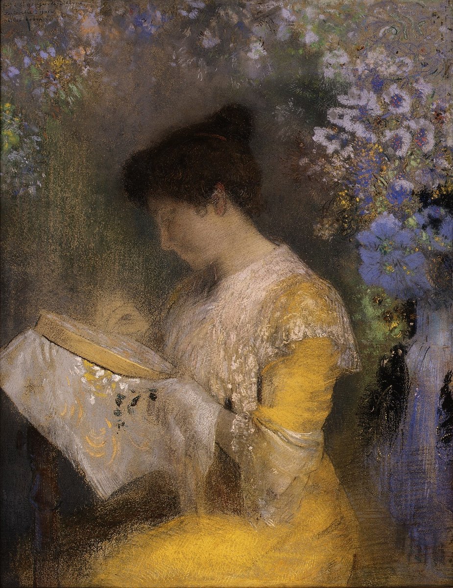
    Redon draws Madame Arthur Fontaine in pastel, now at the Metropolitan Museum of Art.4

Sources (4)
  1. Wikipedia, “Pastel”, history of the medium, citing Geneviève Monnier, “Pastel”, Oxford Art Online.
  2. Merriam-Webster, “pastel”, etymology and first known use.
  3. Wikipedia, “Odilon Redon”.
  4. Metropolitan Museum of Art, “Madame Arthur Fontaine (Marie Escudier, 1865–1946)”, Odilon Redon, 1901 (60.54).

Pastel yellow in use

A pastel drawing of a woman in a golden-yellow dress with a white lace bodice, bent over an embroidery hoop, with blurred blue and lilac flowers behind her
#DFAE41#C59537#95899A#504338
PastelMadame Arthur Fontaine (1901)

A pastel portrait by Odilon Redon at the Metropolitan Museum of Art, with blue and lilac flowers behind the sitter. Her dress samples as a warm golden yellow, #DFAE41 at its lightest, far deeper than pastel yellow. It shows the gap between the two meanings of the word: the medium can be bold, even when the color named after it is soft.

#DFAE41#C59537#95899A#504338
Source: Metropolitan Museum of Art

Palettes are sampled in-house.

Questions

What color is pastel yellow?

A soft, pale yellow with no lean toward orange. The usual web code is #FDFD96 (RGB 253, 253, 150).

What is the difference between pastel yellow and cream?

Pastel yellow (#FDFD96) is clearly yellow. Cream (#FFFDD0) is paler, almost white, with only a hint of yellow.

What is the difference between pastel yellow and butter yellow?

Butter yellow (#FFFD74) is stronger and richer. Pastel yellow is softer, with more white in it.

What colors go with pastel yellow?

Lilac, sky blue and mint for a soft pastel set, gray for a calm, modern look, and navy for strong contrast.

Why is it called pastel?

After pastels, the sticks of powdered pigment that artists draw with. Makers lighten each color with chalk, so “pastel” came to mean any pale color.

Is there an official pastel yellow code?

No. No color standard or CSS keyword defines it. #FDFD96 is the common web value, and close neighbors such as pale yellow (#FFFF99) look almost the same.