Persimmon is a vivid reddish orange, the color of a fully ripe persimmon. Its code is #EC5800: red at more than 90%, green at about a third and no blue at all. That puts it close to the center of the ISCC-NBS color group vivid reddish orange, brighter than burnt orange and a little less red than international orange.
English took the word from Virginia Algonquian, and Merriam-Webster dates it to 1612. That year John Smith wrote that the fruit the Powhatan called putchamins is “first greene, then yellow, and red when it is ripe”, and that an unripe one “will drawe a mans mouth awrie”. Growers in Florida describe the same order today. The trees belong to Diospyros, the genus of ebony, and most persimmons sold now are the Japanese kind, the kaki.
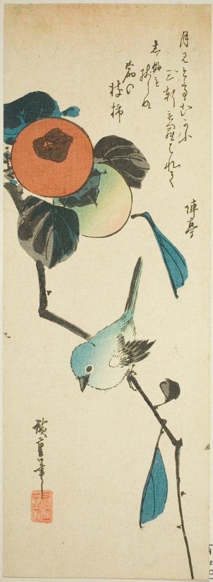
As a color name, persimmon goes back to 1922. The code is less settled than the fruit. Wikipedia gives #EC5800 as its match for the persimmon in Maerz and Paul’s A Dictionary of Color (1930), but the 1955 ISCC-NBS dictionary files that same sample as a strong brown, about #80461B. Other color dictionaries put persimmon in strong reddish orange, and in an old Japanese print the ripe fruit reads a softer #CB7A4D.
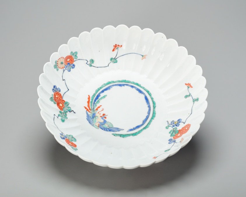
On screens, persimmon holds black text well, at about 6:1. White text reaches about 3.5:1, so keep it large and bold. It pairs with navy, deep teal, olive and cream. In Japan, the porcelain family name Kakiemon is said to come from the first potter’s skill with persimmon colors; one of their bowls is below.