A step out of mourning
Historical recordVictorian widows wore black for the first stages of mourning. In the last six months, called half-mourning, muted colors such as gray, purple and lilac were allowed.1
A soft, grayish purple named after the lilac shrub, from a Persian word for bluish.
Lilac is a soft, light purple with a gray cast. Its usual web code is #C8A2C8: red and blue exactly equal, with a little less green. That gives a muted purple that leans neither toward blue nor toward red.
The name comes from the lilac shrub, whose fragrant spring flowers range from white to deep purple. The word reached English through French and Arabic from the Persian nīlak, “bluish”. Lilac has been a color name in English since 1775.
No standard defines the web code, and people picture lilac bluer and brighter: the average lilac in the xkcd color survey was #CEA2FD. Even Van Gogh’s lilac has moved. He wrote that he painted his bedroom walls “pale lilac”, but in his paintings of the room they now look blue.
Lilac is light, so pair it with dark text. It looks calm with sage green, cream and gray, rich next to deep plum, and fresh with pale yellow.
| HEX | #C8A2C8 | |
|---|---|---|
| RGB | rgb(200, 162, 200) | |
| HSL | hsl(300, 26%, 71%) | |
| HSV | 300°, 19%, 78% | |
| CMYK | 0, 19, 0, 22 | |
| OKLCH | oklch(75.9% 0.068 326.2) |
People’s average lilac in the xkcd survey is bluer, stronger and a touch lighter, inside the outline near its left edge. The dictionary’s pale purple sits just below the web code: grayer and a little darker. The outline is an approximate range, not a measured one.
Tints with white
Shades with black
Tones with gray
Pairings that work in rooms, outfits and interfaces.
Two soft, muted garden colors. Calm and natural.
Light and gentle. A favorite for weddings and stationery.
A light purple and a deep one. Rich without shouting.
Quiet and modern. Gray keeps lilac grown-up.
Purple and yellow, both softened. Fresh and springlike.
Deep contrast. Navy gives lilac structure.
Pick a palette to see where its colors sit on the color wheel. The caret marks lilac. Tap a band to copy its code.
Lined up by hue around lilac. Hover a color to see how similar it is.The bar under each name shows how similar it is. Similarity comes from the distance between the two colors in OKLab, a model of how we see color.
Lilac reads as gentle and springlike, the color of the shrub’s fragrant flowers. In Victorian Britain it was a color of late mourning, worn as widows eased back into everyday dress. Since 1901 it has wrapped one of Europe’s best-known chocolate bars, and it gave its name to an illusion that spread across the internet. Mood research tests broad hues such as purple, not lilac itself, so this section sticks to documented uses.
Victorian widows wore black for the first stages of mourning. In the last six months, called half-mourning, muted colors such as gray, purple and lilac were allowed.1
Milka chocolate was launched in a lilac wrapper in 1901. Its maker says the brand’s script logo was trademarked in 1962 together with its lilac purple color, and Lila, the brand’s lilac cow, has fronted its advertising since 1973.2
In 2005 Jeremy Hinton made an animation of twelve blurred lilac discs in a ring, vanishing one at a time. Stare at the center and a green disc seems to race around the ring while the lilac discs fade from view. Named the lilac chaser, it was copied across the web within days.3, 4
Lilac was a garden shrub before it was a color. The word came west with the plant, and the color name followed in the 1700s.
Lilacs reach the gardens of northern Europe from Ottoman gardens. The shrub grows wild in the Balkans.1
First known use of “lilac” in English, for the shrub. The word came through French and Arabic from the Persian nīlak, “bluish”.2
First recorded use of “lilac” as a color name in English.3
In Arles, Vincent van Gogh paints his bedroom and writes that the walls are “pale lilac”. He paints two more versions in 1889.4
Milka chocolate is launched in a lilac wrapper.5
New Hampshire makes the purple lilac its state flower.6
The lilac chaser illusion appears online and spreads within days.7
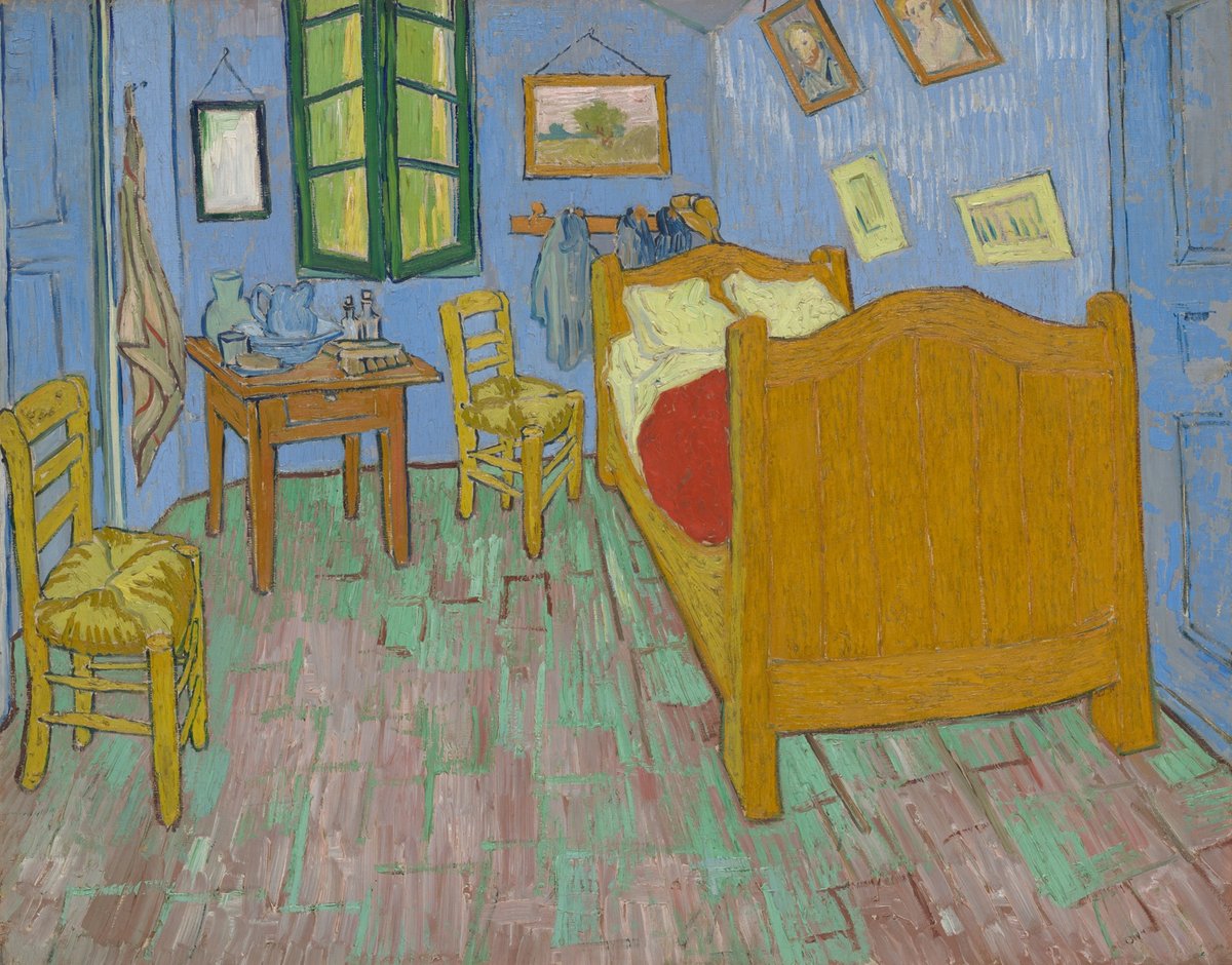
Van Gogh’s second version of his bedroom in Arles, at the Art Institute of Chicago. He described the walls as “pale lilac”, but here they read as a soft blue, about #768FA8. For the first version, the Van Gogh Museum reports that the walls were originally purple and have discolored.
Sampled from the Art Institute of Chicago’s photograph (1926.417), released as CC0 (public domain). Van Gogh’s description of the walls is quoted on the same page. The finding on the first version comes from the Van Gogh Museum. Colors in a photo shift with the lighting, so read the codes as close, not exact.
Palettes are sampled in-house.
A soft, light purple with a grayish cast. The usual web code is #C8A2C8 (RGB 200, 162, 200). Dictionaries describe lilac as a pale to moderate purple.
Lavender (#B57EDC) is bluer and more saturated. Lilac (#C8A2C8) is grayer, with equal parts red and blue, and looks softer and pinker.
Purple. Its code has equal red and blue, so it leans neither way, but its grayness can make it look pinkish next to bluer purples. People’s average lilac in the xkcd survey leans blue.
Classic mauve (#E0B0FF) is lighter and clearer and leans toward blue. Lilac (#C8A2C8) is grayer, with equal parts red and blue.
Sage green, cream and gray for a soft look, deep plum for richness, navy for contrast, and pale yellow for something springlike.
After the lilac shrub. The word reached English through French and Arabic from the Persian nīlak, “bluish”. Lilac has been a color name since 1775.
No. #C8A2C8 is the common web value, but no standard defines it, and lilac is not a CSS keyword.