Linked to love and anger
Tested on red onlyAcross 30 countries, people link red with both love and anger. It is the only color tied this strongly to a positive and a negative feeling. Burgundy itself was not tested.1
A deep red with a slight purple lean, named after the red wine of Burgundy in eastern France.
Burgundy is a dark red with a slight purple lean, the color of red wine held up to the light. Its standard code is #800020: half-strength red, no green and a little blue.
The name comes from the red wines of Burgundy in eastern France, made mainly from Pinot Noir. English speakers have used it for the color since the 1880s, and #800020 matches the burgundy sample in Maerz and Paul’s 1930 A Dictionary of Color.
Next to maroon, its closest neighbor, burgundy looks cooler and more purple. Next to crimson, it looks darker and calmer. In everyday speech the names blur: when thousands of people named colors in an online survey, their average “burgundy” and average “maroon” came out almost the same.
You may have one in your pocket. Since 1981, EU countries have agreed on a burgundy cover for their passports.
| HEX | #800020 | |
|---|---|---|
| RGB | rgb(128, 0, 32) | |
| HSL | hsl(345, 100%, 25%) | |
| HSV | 345°, 100%, 50% | |
| CMYK | 0, 100, 75, 50 | |
| OKLCH | oklch(38.0% 0.152 18.6) |
In the xkcd color survey, people’s average “burgundy” (#610023) and average “maroon” (#650021) came out almost identical, and both are darker than the usual web codes. The outline is an approximate range, not a measured one.
Tints with white
Shades with black
Tones with gray
Pairings that work in rooms, outfits and interfaces.
Serious and tailored. The classic for suits, libraries and finance.
Warm and festive. Strong for menus, invitations and autumn.
Soft contrast. Popular for weddings and beauty brands.
Heritage and outdoorsy. Think tweed, leather and wood.
Modern and sharp. Good for interfaces and packaging.
Calm and bookish. The safest choice for long text.
Pick a palette to see where its colors sit on the color wheel. The caret marks burgundy. Tap a band to copy its code.
Lined up by hue around burgundy. Hover a color to see how similar it is.The bar under each name shows how similar it is. Similarity comes from the distance between the two colors in OKLab, a model of how we see color.
In Western fashion and design, burgundy usually reads as rich, serious and grown-up: wine lists, leather-bound books, autumn coats. It keeps some of red’s warmth but loses its alarm, which is why it turns up on menus and book covers more than on warning signs. Most of that is convention rather than science. Studies of color and emotion test basic color words such as “red”, not burgundy itself.
Across 30 countries, people link red with both love and anger. It is the only color tied this strongly to a positive and a negative feeling. Burgundy itself was not tested.1
Red is often said to make people look more attractive. A 2018 review of the studies found a small effect for men rating women, a very small one for women rating men, and signs that early results were overstated.2
Claims that a color changes mood or behavior need care. A major review calls the research “at a nascent stage” and says more work is needed before firm recommendations.3
Burgundy is one of many colors named after a drink. The wine came first, by well over a thousand years. The color name followed once the wine was famous enough to lend its name to a shade.
Archaeological finds show vines growing in the region that later becomes Burgundy.1
Duke Philip the Bold tries to ban the Gamay grape from the duchy, calling it an “evil and disloyal plant”. Pinot Noir is still the main grape of red Burgundy today.2
First recorded use of “burgundy” as a color name in English.3
Maerz and Paul’s A Dictionary of Color prints a burgundy sample that matches #800020.4
European Community countries agree on a common passport with a cover in “burgundy red”.5
The UK starts issuing burgundy passports.6
After leaving the EU, the UK switches its new passports back to blue.6

The NFL team’s colors are burgundy and gold. Its official burgundy, #5A1414, has no purple lean at all, so by web codes it sits closer to maroon. The names really are used loosely.
Official codes from the team’s 2026 logo guide. The logo is the primary mark from the same guide.
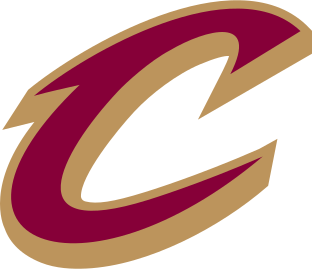
The NBA team calls its colors wine, gold and black. Its wine, #860038, has a little more blue than this page’s burgundy, so it leans slightly purple.
The colors are the fills in the team’s primary logo, from the logo file the NBA serves. The logo shown is that file. The color names come from the team’s 2022 logo announcement.
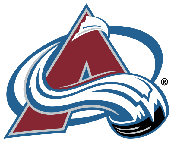
One of the NHL team’s official colors is Avalanche Burgundy, with blue, silver and black. The burgundy in its logo file, #862633, is redder and a little lighter than this page’s code.
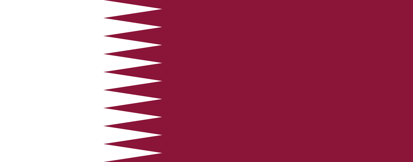
Qatar calls its flag color maroon. On screen, at #8A1538, it leans purple and sits closer to burgundy than to CSS maroon.
The color is set by Qatar’s Law No. 14 of 2012 as Pantone 1955 C, as given by Wikipedia and Flags of the World. #8A1538 is Pantone’s screen value. The flag is drawn in-house from its official proportions, 11:28 with nine white points.
FSU’s garnet is burgundy by another name: a muted wine red with a slight purple lean. The brand guide says it should never be lightened.
Official codes from the university’s brand guide. The logo is the university’s own lockup from its logo page.
Logos belong to their owners and are shown unaltered, only to show where each palette comes from. Palettes are sampled in-house.
A dark red with a slight purple lean. Its usual code is #800020, which is RGB 128, 0, 32. It is darker than crimson and cooler than maroon.
Maroon (#800000) is pure dark red, so it looks warmer and a little brown. Burgundy (#800020) adds a small amount of blue, which pushes it toward purple and wine. In everyday speech the two overlap a lot.
Navy, gold, blush pink, forest green and cream are the most reliable. Navy and forest green keep it serious; gold and cream make it feel warm and festive.
In 1981 the member states agreed on a common passport design, and that agreement named “burgundy red” as the cover color. Almost every EU country still follows it.
Start with a strong red, add a little blue or purple until it cools, then darken it with a touch of black or burnt umber. Add the dark colors in small amounts, because they take over quickly.
It is a warm red at heart, but the blue in it makes it one of the cooler reds. That is why it sits comfortably next to both gold and navy.

