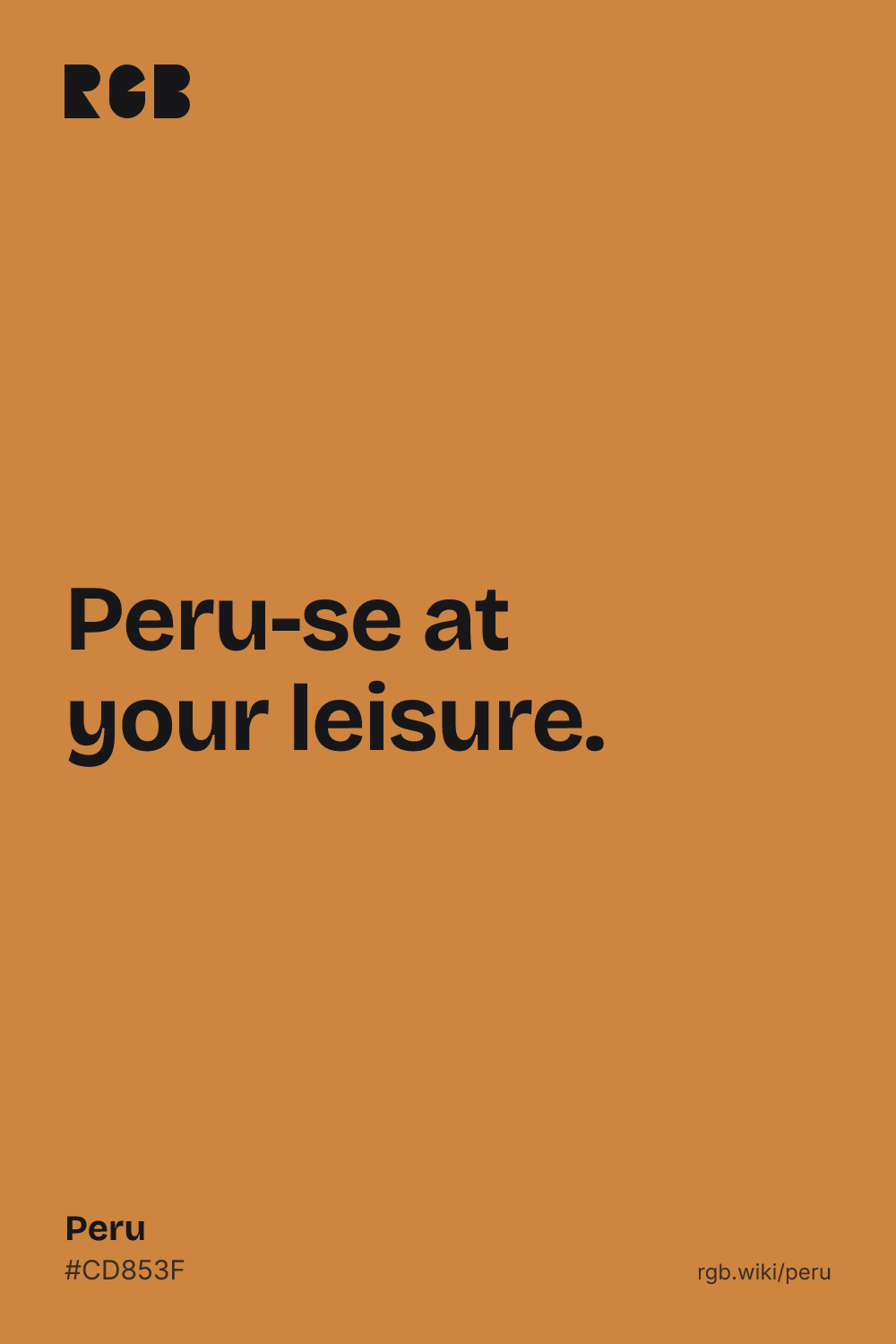
Peru is a warm, medium orange brown, like toasted pastry or a terracotta pot in sunlight. Its code is #CD853F: red strong, green about two thirds as strong and blue low, which gives a brown with plenty of orange in it. It sits almost on top of the common code for bronze, #CD7F32, which is a touch more orange.
The name is the CSS keyword peru. It entered the X Window System’s color list in 1989, when Paul Raveling, a programmer at USC’s Information Sciences Institute, retuned the list on his own monitor and added new colors, and the web adopted that list in 2001. The first X list, from 1987, has no peru, although some sources give that year. Raveling’s notes say his light colors came from paint samples, but peru is not among them, and no note explains why he named a brown after a country. The same values also appear in that list as tan3, a darker step of tan.
The name has an older relative. Maerz and Paul’s 1930 A Dictionary of Color prints a Peruvian brown and records it as a color name from 1924. Wikipedia says the web color matches that sample, but the 1955 ISCC-NBS dictionary files Peruvian brown as a brownish orange or light brown, centered around #AE6938 and #A67B5B: darker and duller than the code.
Peru the country uses other colors. Its flag is red and white, and a 2025 draft regulation proposes red #E30613 for it. On screens, peru works best with dark text: black on peru has a contrast of about 7:1, white only about 3:1, so keep white text large. It pairs well with navy, teal, cream and deep brown.