Oatmeal

A pale, flecked beige named after porridge oats, and after the paper that looked like them.

Overview

Oatmeal is a pale beige with a little gray in it. Its code here is #D9CCB4: red, green and blue all high and close together, with blue a step behind, so it reads as a soft, warm off-white, darker than cream and lighter than greige.

The name comes from the food. Oatmeal, meal ground from oats, has been an English word since the 14th century. As a color, it borrows the look of dry rolled oats: pale, a little gray, and never quite one shade.

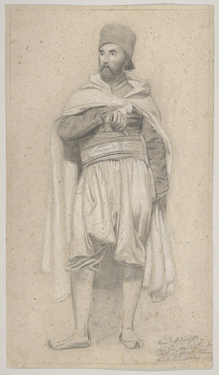
That mixed look is the key to the name. Oatmeal paper was a coarse paper with a flecked surface of sawdust or chaff, used for wallpaper and by artists. Museum catalogs still use the term for drawing and printing papers, and the paper of one 1840s drawing at the Met photographs at almost exactly #D9CCB4.

No color standard defines oatmeal. The oldest dictionary entry found, from 1950, puts it at a yellower, darker grayish yellow, the same block the web’s ecru comes from. Today oatmeal is a knitwear and interiors neutral. Use dark text on it: white text is unreadable.

HEX#D9CCB4
RGBrgb(217, 204, 180)
HSLhsl(39, 33%, 78%)
HSV39°, 17%, 85%
CMYK0, 6, 17, 15
OKLCHoklch(84.9% 0.035 82.9)
Every code converts from the HEX value #D9CCB4. No color standard defines oatmeal. #D9CCB4 is the code most color lists use. The only dictionary entry found, in the 1950 Descriptive Color Names Dictionary, falls in the ISCC-NBS block grayish yellow, centered on #C2B280, which is yellower and darker. CMYK is a screen-based estimate; print results vary.
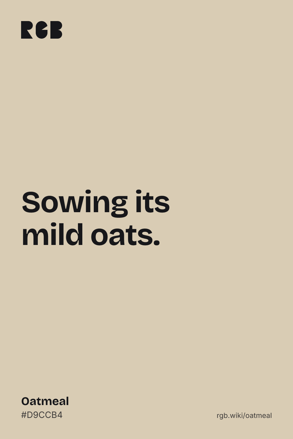
Oatmeal color card, hex #D9CCB4: “Sowing its mild oats”

Oatmeal on the color map

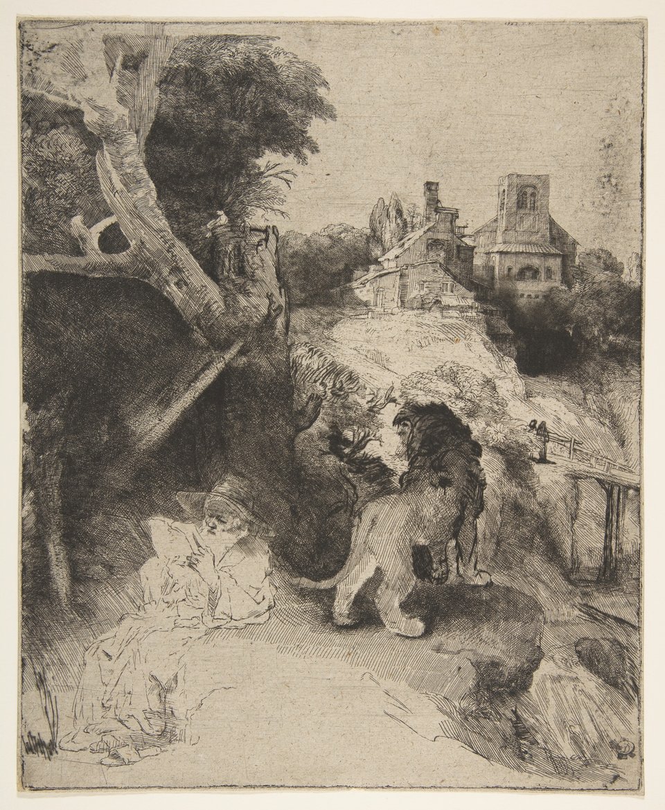
The Simonsen paper sits right on top of this page’s code, and the Rembrandt paper a little darker, both well inside the outline. The 1950 dictionary’s oatmeal sits below the code and out toward yellow, near the edge of the outline. Photographs shift with lighting, and the outline is an approximate range, not a measured one.

Shades and tints

Tints with white

Shades with black

Tones with gray

Oatmeal sits in the middle. Tints add white, shades add black and tones add gray, in 10% steps out from it. Tap any swatch to copy its code.

Light and dark oatmeal

#F4F0E8
Pale oatmealMixed 70% with white. A soft off-white for backgrounds.
#E8E0D2
Light oatmealMixed 40% with white. A calm wall color.
#D9CCB4
OatmealThe reference color.
#C2B280
1950 oatmealThe ISCC-NBS grayish yellow that the 1950 dictionary gives for oatmeal. The same code the web uses for ecru. See ecru
#988F7E
Dark oatmealMixed 30% with black. A soft brown-gray.

Colors that go with oatmeal

Pairings that work in rooms, outfits and interfaces.

Oatmeal and espresso

Warm and simple, like oats and coffee. Dark brown text reads well on light oatmeal.

Oatmeal and white

Light and airy. Oatmeal adds warmth to a white room.

Oatmeal and sage

Natural and quiet. Good for bedrooms and linen.

Oatmeal and navy

A classic knitwear pairing: an oatmeal sweater with navy.

Oatmeal and rust

Earthy and warm, with a strong red-brown accent.

Oatmeal paper and ink

Taken from old drawings: flecked paper, graphite gray and brown-black ink.

Color-wheel palettes

Pick a palette to see where its colors sit on the color wheel. The caret marks oatmeal. Tap a band to copy its code.

Similar colors

Apricot75%Nude78%OatmealLight gray80%Silver73%Bone79%Oyster90%

Lined up by hue around oatmeal. Hover a color to see how similar it is.The bar under each name shows how similar it is. Similarity comes from the distance between the two colors in OKLab, a model of how we see color.

Oatmeal vs ecru

Oatmeal#D9CCB4 · hue 39°
  • Paler and grayer
  • Named after rolled oats and flecked paper
  • No standard: a common list value
Ecru#C2B280 · hue 45°
  • Darker and more yellow
  • Named after raw, unbleached cloth
  • The ISCC-NBS grayish yellow, where 1950 put oatmeal too

Meaning

  • Porridge oats
  • Flecked paper
  • Wallpaper
  • Knitwear

Oatmeal reads as plain, warm and homely, a breakfast color. Its name points to the food, but also to a texture: oatmeal paper, flecked with sawdust or chaff, covered walls and held artists’ drawings long before oatmeal became a fashion neutral. Research on color and emotion has never tested oatmeal itself.

Named after ground oats

Word history

Oatmeal is meal made from oats, and porridge made from it. Merriam-Webster dates the word to the 14th century. It does not list oatmeal as a color, and neither did the 1930 Dictionary of Color, so the color sense is much younger than the food.1, 2
Oatmeal paper: a flecked surface

Reference works

Oatmeal paper is a coarse, cheap paper whose surface was coated with sawdust or chaff, sometimes dyed, and it was often used for wallpaper. Merriam-Webster defines oatmeal wallpaper the same way. Cooper Hewitt adds that the paper is not made from cereal: its lumpy texture comes from bits of rag and wood mixed into the pulp.3, 4, 5

The fashion neutral after camel

Fashion press

Fashion writers describe oatmeal as a softer, warmer neutral. Vogue Scandinavia placed it “somewhere between cream and ecru, sand and off-white” in 2021, and Who What Wear called it lighter and a bit cooler than camel in 2025. This is trend writing, not research.6, 7

Pale, muted colors feel calm

One study, general

In a 1994 study with Munsell color chips, brighter colors were rated more pleasant and less arousing, and less saturated colors less arousing. Oatmeal is bright and very low in saturation, which fits its calm reputation. The study tested hue, saturation and brightness in general, not oatmeal, and these effects are ratings, not proof of a change in mood.8

Sources (8)
  1. Merriam-Webster, “oatmeal”, definitions and first known use.
  2. Maerz, A. & Paul, M. R. (1930). A Dictionary of Color. New York: McGraw-Hill. No oatmeal appears in the list of its color names transcribed by Aubrey Jaffer, “Maerz and Paul color names”.
  3. Museum of Fine Arts, Boston. “Oatmeal paper”. CAMEO: Conservation and Art Materials Encyclopedia Online.
  4. Merriam-Webster, “oatmeal paper”, definition.
  5. Rasche, A. (2014, October 20). “New Jersey Nouveau”. Cooper Hewitt, Smithsonian Design Museum.
  6. Forsberg, J. (2021, August 20). “This season’s new neutral is oatmeal, and here’s how to wear it”. Vogue Scandinavia.
  7. Payer, A. (2025, October 14). “This Is the Low-Key Color Trend People Are Suddenly Wearing More Than Camel”. Who What Wear.
  8. Valdez, P. & Mehrabian, A. (1994). Effects of color on emotions. Journal of Experimental Psychology: General, 123(4), 394–409.

History

Oatmeal was a food for centuries and a paper for a long time before it was a color. The color name only shows up in dictionaries in the mid-20th century.

  1. 1300s

    First known use of “oatmeal” in English, for meal made from oats.1

  2. c. 1653

    Rembrandt etches St. Jerome Reading in an Italian Landscape. The Met catalogs its impression as printed on oatmeal paper.2

  3. c. 1843

    The Danish painter Niels Simonsen draws A Turkish Warrior in graphite and white on oatmeal paper.3

  4. 1901–1945

    In Arts and Crafts houses, solid-color oatmeal wallpapers, often overprinted with patterns, are recommended for dens, libraries, halls and dining rooms.4

  5. c. 1905

    A sidewall paper designed by Albert Ainsworth in Hackensack, New Jersey, is machine-printed on yellow oatmeal paper. It is now at Cooper Hewitt.5

  6. 1930

    Maerz and Paul’s A Dictionary of Color lists ecru, beige, biscuit, wheat and cream, but no oatmeal.6

  7. 1950

    The Descriptive Color Names Dictionary lists oatmeal as a color. The 1955 ISCC-NBS dictionary files it as grayish yellow.7

  8. 2021

    Vogue Scandinavia calls oatmeal the season’s new neutral, “somewhere between cream and ecru, sand and off-white”.8

Sources (8)
  1. Merriam-Webster, “oatmeal”, first known use.
  2. Metropolitan Museum of Art, Rembrandt, St. Jerome Reading in an Italian Landscape, ca. 1653, 41.1.17. Medium: “Etching, drypoint, and engraving on oatmeal paper”.
  3. Metropolitan Museum of Art, Niels Simonsen, A Turkish Warrior, 1843 (?), 2012.539.4. Medium: “Graphite, heightened with white, on oatmeal paper”.
  4. Stark, S. (2010, July 20). “Wallpaper, 1901–1945”. Arts & Crafts Homes.
  5. Rasche, A. (2014, October 20). “New Jersey Nouveau”. Cooper Hewitt, Smithsonian Design Museum.
  6. Maerz, A. & Paul, M. R. (1930). A Dictionary of Color. New York: McGraw-Hill. Checked against Aubrey Jaffer’s transcription, “Maerz and Paul color names”.
  7. Kelly, K. L. & Judd, D. B. (1955). The ISCC-NBS Method of Designating Colors and a Dictionary of Color Names. National Bureau of Standards Circular 553. PDF at NIST. The oatmeal entry of the Descriptive Color Names Dictionary, as transcribed by John Foster and Aubrey Jaffer.
  8. Forsberg, J. (2021, August 20). “This season’s new neutral is oatmeal, and here’s how to wear it”. Vogue Scandinavia.

Oatmeal in use

A pencil drawing of a bearded man in a fez, a short jacket, a wide sash and baggy trousers, wrapped in a cloak, on pale grayish beige paper
#D3C7B3#B7AD9B#A09789#837D72
DrawingA Turkish Warrior by Niels Simonsen (about 1843)

A standing figure in graphite, heightened with white, on a sheet the Met catalogs as oatmeal paper. The bare paper reads about #D7C9B3 in the photo, almost exactly this page’s oatmeal, and the white chalk and gray pencil sit close to it in tone.

#D3C7B3#B7AD9B#A09789#837D72
Source: The Met
An etching of a saint reading under a large tree, with a lion beside him and buildings on a hill behind, printed in dark ink on pale beige paper
#C8BAA3#AB9E8A#6A6155#4B453E
PrintSt. Jerome Reading in an Italian Landscape by Rembrandt (about 1653)

Saint Jerome reads in the shade of a tree while his lion looks out over a hill town. The Met’s impression is printed on oatmeal paper, which reads about #CCBDA6 in the sky, a little darker than this page’s code, under brown-black ink.

#C8BAA3#AB9E8A#6A6155#4B453E
Source: The Met

Palettes are sampled in-house.

Questions

What color is oatmeal?

A pale beige with a touch of gray, like dry rolled oats. The code here is #D9CCB4 (RGB 217, 204, 180). No standard defines it, so oatmeal yarns, paints and fabrics vary.

What is the hex code for oatmeal?

#D9CCB4 is the code most color lists use. A 1950 color dictionary put oatmeal at a darker, yellower grayish yellow, about #C2B280.

Is oatmeal the same as beige?

Close, but not the same. The web’s beige (#F5F5DC) is lighter and more yellow, almost an off-white. Oatmeal is darker and grayer, a muted, slightly brown beige.

What is the difference between oatmeal and greige?

Greige (#BAB1A4) is darker and grayer. Oatmeal (#D9CCB4) is lighter and warmer, closer to beige.

What is oatmeal paper?

A coarse paper with a flecked, textured surface, made by coating it with sawdust or chaff, sometimes dyed. It was used for wallpaper, and museums use the term for some drawing and printing papers. It has nothing to do with cereal.

Is oatmeal a warm or cool color?

Warm. Its red and green run a little ahead of blue, which gives it a soft beige cast, though the gray in it keeps it calm rather than golden.

What colors go with oatmeal?

Dark brown and navy for contrast, sage for something natural, rust for warmth, and white for a light, airy room. Use dark text on oatmeal, never white.