“Green of Greece”
DictionaryVerdigris comes from Middle English vertegrese, borrowed from the Anglo-French vert de Grece, “green of Greece.” The modern spelling follows French vert-de-gris, whose last syllable was reshaped to match gris, “gray.”1
A soft blue-green named after the green crust that forms on copper.
Verdigris is a soft, medium blue-green. Its usual code, #43B3AE, sits between teal and turquoise: lighter and softer than teal, darker and grayer than turquoise.
The name comes from the Anglo-French vert de Grece, “green of Greece.” Strictly, verdigris is a pigment: copper acetates made by letting vinegar act on copper, a method Pliny the Elder described in the first century. It was the most vibrant green painters had until the 19th century, but it is so reactive that it often darkens to brown, and can even eat into paper.
The word is also used loosely for any green crust on copper, brass or bronze. That is why the Statue of Liberty’s green is often called verdigris, even though its patina is mostly a copper sulfate, not the copper acetate of the pigment.
On screen, #43B3AE is a fresh, airy color that needs dark text. It pairs well with copper, walnut brown, stone gray and coral.
| HEX | #43B3AE | |
|---|---|---|
| RGB | rgb(67, 179, 174) | |
| HSL | hsl(177, 46%, 48%) | |
| HSV | 177°, 63%, 70% | |
| CMYK | 63, 0, 3, 30 | |
| OKLCH | oklch(70.3% 0.100 191.0) |
The Statue of Liberty sample sits inside the outline, to the left and a little higher: greener and lighter than the reference. The dictionary’s light green sits just past the left edge, at about the same lightness. Its moderate yellowish green sits far to the left and lower: much yellower and darker. The outline is an approximate range, not a measured one.
Tints with white
Shades with black
Tones with gray
Pairings that work in rooms, outfits and interfaces.
The metal and its green crust. Warm, cool and very natural.
Rich and grounded, like an old garden gate.
Calm and weathered, like bronze on a stone plinth.
Near-opposites. Bright, summery and friendly.
Moody and modern. Good for dark interfaces.
Old and precious, like a gilded copper dome.
Pick a palette to see where its colors sit on the color wheel. The caret marks verdigris. Tap a band to copy its code.
Lined up by hue around verdigris. Hover a color to see how similar it is.The bar under each name shows how similar it is. Similarity comes from the distance between the two colors in OKLab, a model of how we see color.
Verdigris is tied to age and weather: old copper roofs, bronze statues and Renaissance paintings. Research on color and emotion tests broad words like “green” and “blue”, not verdigris, so there is no evidence for moods tied to this color itself.
Verdigris comes from Middle English vertegrese, borrowed from the Anglo-French vert de Grece, “green of Greece.” The modern spelling follows French vert-de-gris, whose last syllable was reshaped to match gris, “gray.”1
When the Statue of Liberty was finished in 1886 it was brown, like a penny, and it took about 30 years to turn green. X-ray analysis of its patina found mainly brochantite, a basic copper sulfate, with antlerite in the areas most exposed to the weather. Neither is the copper acetate of true verdigris.2, 3
Verdigris is the most reactive of the copper pigments and often ages to dark brown or black. The Cleveland Museum of Art notes that it has darkened and damaged the paper of a Mughal manuscript page from about 1560, and caused acid damage to an Indian court portrait from about 1700.4, 5, 6
Verdigris is one of the oldest manufactured greens, and one of the most troublesome.
Pliny the Elder describes how verdigris is made: copper hung over strong vinegar in closed casks, or copper vessels packed in grape husks and scraped after ten days.1
The word, from the Anglo-French for “green of Greece,” first appears in English, as the name of the pigment.2
Rogier van der Weyden paints the green robe in The Magdalen Reading with verdigris and lead-tin yellow, using more verdigris in the shadows.3
Painters at the Mughal court of Akbar use verdigris in a Tuti-nama (Tales of a Parrot) manuscript. Over time it darkens and damages the paper.4
A portrait of Rana Amar Singh II of Mewar is painted on a green ground. The verdigris later causes acid damage to the paper.5
New green pigments, emerald green and then viridian, arrive, and painters stop using verdigris.3, 6
The Statue of Liberty is finished in copper, brown like a penny. It takes about 30 years to turn fully green.7
An X-ray study of the statue’s patina finds mostly brochantite, a basic copper sulfate, with less stable antlerite where it faces the weather of New York Harbor.8
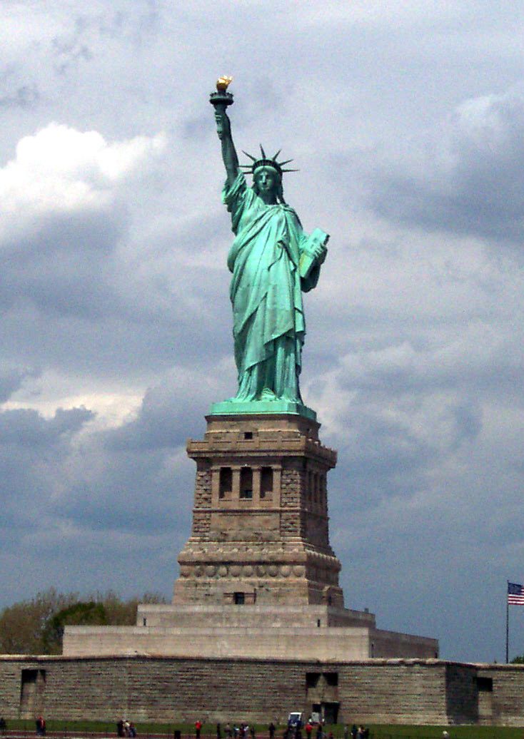
The copper statue in New York Harbor was brown like a new penny when it was finished and took about 30 years to turn green. Its patina is mostly brochantite, a copper sulfate, so strictly it is not verdigris, but it is the green most people picture. In this cloudy-day photo it reads lighter and greener than #43B3AE.
Sampled from the statue only, in a National Park Service photograph (NPS Photo). As a work of the US government, it is in the public domain. The patina makeup is from Matyi and Baboian (1986). Colors in a photo shift with the lighting, so read the codes as close, not exact.
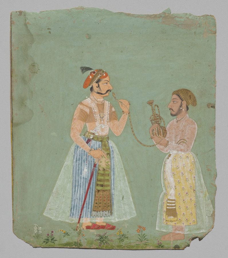
A court portrait from the kingdom of Mewar in Rajasthan, India, now at the Cleveland Museum of Art. The museum notes that its green pigment, verdigris, has caused acid damage to the paper. The green ground now reads as a soft gray-green, far from the fresh blue-green of the code.
Sampled from the Cleveland Museum of Art’s photograph (1991.170), released as CC0 (public domain). The note on verdigris is from the museum’s record. Colors in a photo shift with the lighting, so read the codes as close, not exact.
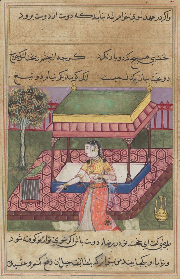
A page from a Tuti-nama (Tales of a Parrot) made at the Mughal court of Akbar, now at the Cleveland Museum of Art. A woman stands in a garden pavilion while a parrot speaks to her from its cage. The museum notes that the verdigris has darkened and damaged the paper; its greens now read as dull olive.
Sampled from the Cleveland Museum of Art’s photograph (1962.279.258.a), released as CC0 (public domain). The note on verdigris is from the museum’s record. Colors in a photo shift with the lighting, so read the codes as close, not exact.
Palettes are sampled in-house.
A soft, medium blue-green. The usual code is #43B3AE (RGB 67, 179, 174). The historic pigment ranged from green to bluish green.
Not strictly. Its green is a patina made mostly of brochantite, a copper sulfate that formed over about 30 years of weather. True verdigris is copper acetate, made with vinegar. Dictionaries do also use the word loosely for any green crust on copper.
The pigment is. Merriam-Webster describes it as a poisonous pigment, and it is rarely sold to artists today because of its toxicity. The color code itself is just a color.
Merriam-Webster lists VUR-duh-grees first, and also accepts endings like -gris and -gree.
Teal (#008080) is darker and deeper. Verdigris (#43B3AE) is lighter and softer, with a touch more green.
Copper and gold for warmth, walnut brown or charcoal for depth, stone gray for calm, and coral for a lively contrast.