Pastel green

A light, fresh green, much brighter than its pastel name suggests.

Overview

Pastel green is a light, fresh green. The code used here, #77DD77, is the one most color lists give. It is light, but its green is fairly strong, so it looks brighter than most colors called pastel, which are usually pale and grayed.

No standard defines pastel green, so sites give different codes. In 1955, the ISCC-NBS dictionary filed the samples named pastel green in a 1950 merchandise color dictionary under six groups, from very pale green to moderate yellow green. Merriam-Webster calls it “a variable color averaging a light yellowish green.”

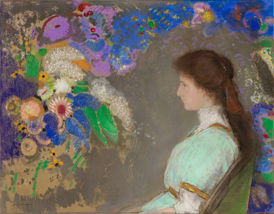
Pastel greens in art are often much grayer. In Odilon Redon’s 1910 pastel portrait of Violette Heymann, the dress is about #AFCAB5, a soft gray mint. People’s average pastel green in the xkcd survey, #B0FF9D, is lighter and a little yellower than this code.

Pastel green looks fresh and springlike. It pairs well with peach, lavender and white, and it needs dark text: white text on it is hard to read.

HEX#77DD77
RGBrgb(119, 221, 119)
HSLhsl(120, 60%, 67%)
HSV120°, 46%, 87%
CMYK46, 0, 46, 13
OKLCHoklch(81.2% 0.169 143.8)
Every code converts from the HEX value #77DD77. #77DD77 is the pastel green most color lists and websites use, but no standard defines it. Pastel green has no CSS keyword, and Maerz and Paul’s 1930 A Dictionary of Color has no entry for it. Merriam-Webster defines it as a variable color averaging a light yellowish green. Treat this code as typical, not official. CMYK is a screen-based estimate; print results vary.
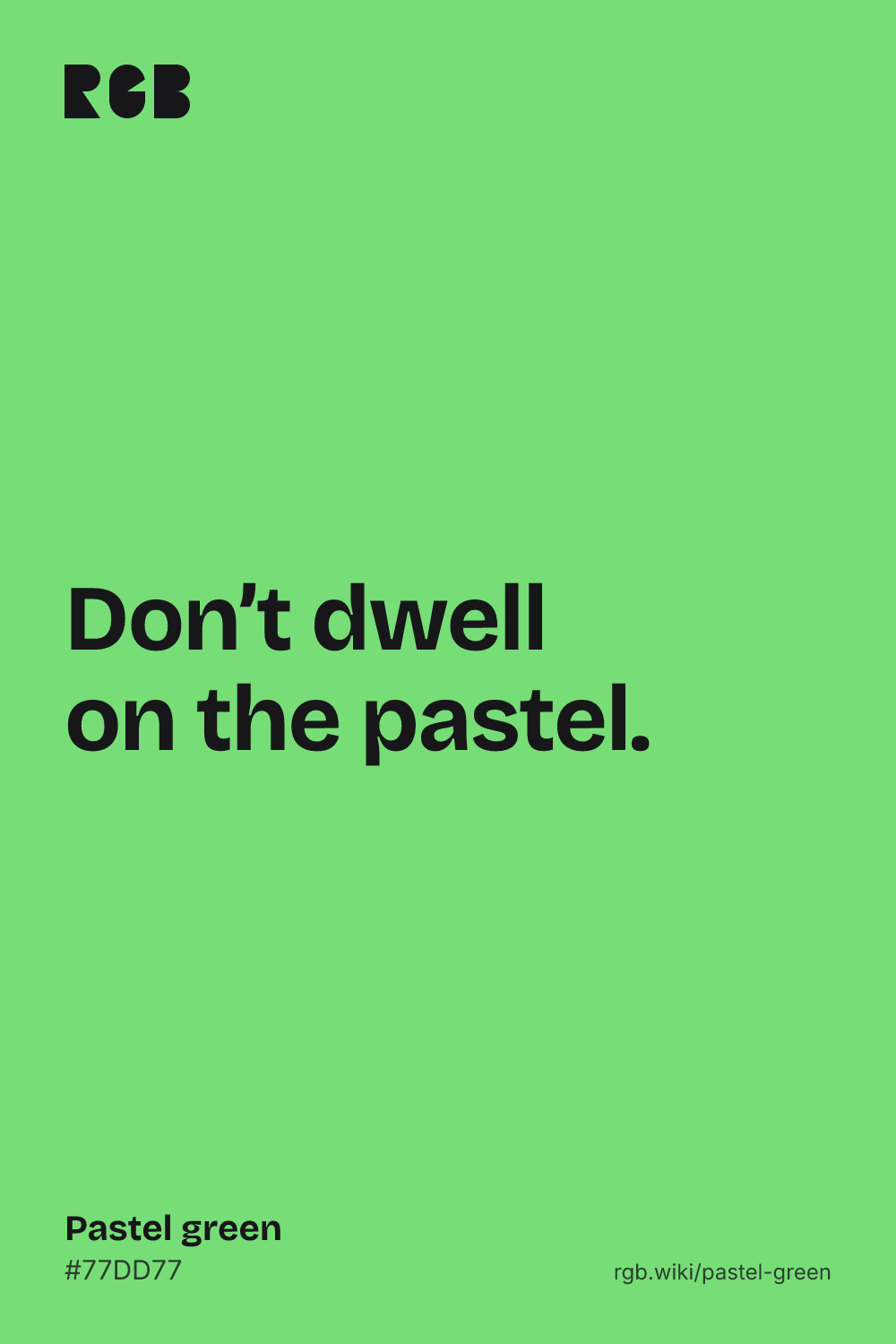
Pastel green color card, hex #77DD77: “Don’t dwell on the pastel”

Pastel green on the color map

People’s average pastel green in the xkcd survey sits above the outline and a little to the left: lighter and a little yellower. The dictionary’s light yellowish green sits inside it, a little darker, and Redon’s dress sits inside it too, a little toward blue. Both are much grayer than the web code, which this map cannot show, since it plots hue and lightness, not how vivid a color is. The outline is an approximate range, not a measured one.

Shades and tints

Tints with white

Shades with black

Tones with gray

Pastel green sits in the middle. Tints add white, shades add black and tones add gray, in 10% steps out from it. Tap any swatch to copy its code.

Light and dark pastel green

#C9F1C9
Pale pastel greenMixed 60% with white. A soft tint for backgrounds.
#98FF98
Mint greenLighter and more vivid. See mint green
#ACE1AF
CeladonGrayer and softer, named after a glazed stoneware. See celadon
#77DD77
Pastel greenThe reference color.
#56AE57
Dark pastel greenWhat people called dark pastel green in the xkcd survey. Good for text-safe accents.

Colors that go with pastel green

Pairings that work in rooms, outfits and interfaces.

Pastel green and peach

Fresh and warm. Good for spring and food brands.

Pastel green and lavender

A classic spring pastel pair. Keep one dark color for text.

Pastel green and white

Clean and bright, with a deep green for buttons.

Pastel green and navy

Pastel green pops against a dark, steady blue.

Pastel green and pink

Sweet and playful, like a 1950s kitchen.

Pastel green and charcoal

Muted and modern. Strong enough for interfaces.

Color-wheel palettes

Pick a palette to see where its colors sit on the color wheel. The caret marks pastel green. Tap a band to copy its code.

Similar colors

Yellow-green69%Brat green65%Kiwi70%Pistachio66%Pastel greenMalachite64%Emerald green64%

Lined up by hue around pastel green. Hover a color to see how similar it is.The bar under each name shows how similar it is. Similarity comes from the distance between the two colors in OKLab, a model of how we see color.

Pastel green vs mint green

Pastel green#77DD77 · hue 120°
  • Darker and a little softer
  • No standard code
  • Named after the art medium
Mint green#98FF98 · hue 120°
  • Lighter
  • More vivid
  • The same hue

Meaning

  • Chalk pastels
  • Spring
  • 1950s kitchens
  • No standard

Pastel green reads as fresh, light and springlike. Like all pastels, it takes its name from the chalky art medium, by way of a 19th-century fashion for pale drawings that made pastel shades mean light, grayed colors. Mood research tests broad hues such as green, not pastel green itself, so this page makes no claims about how it makes people feel.

Six greens, one name

Dictionary record

The 1955 ISCC-NBS dictionary filed the samples named pastel green in a 1950 merchandise color dictionary under six groups: very pale green, pale green, pale yellow green, grayish yellow green, light yellowish green and moderate yellow green.1
Brighter than a true pastel

Calculated

By the ISCC-NBS system, the web code’s nearest named color is brilliant yellowish green, not a pale or grayish one. People’s average pastel green in the xkcd survey is lighter still, but just as vivid.2, 3

Green in the 1950s kitchen

Museum record

General Electric first made colored appliances in 1954, and rivals followed with colors such as fern green, buttercup yellow and lagoon blue. By 1955, paints, linoleum and fabrics followed the same pastel color scheme.4, 5

Sources (5)
  1. Kelly, K. L. & Judd, D. B. (1955). The ISCC-NBS Method of Designating Colors and a Dictionary of Color Names. National Bureau of Standards Circular 553. Internet Archive.
  2. ISCC-NBS centroid colors as sRGB, converted by John Foster, in Aubrey Jaffer’s color-name dictionaries.
  3. Munroe, R. (2010). “Color survey results”. xkcd blog. The survey’s color averages are released as CC0 data.
  4. Wisconsin Historical Society, “1950s Pink Kitchen”, museum object feature story.
  5. Green, B. (2019). “Mixing Food and Matching Colors”. Cooper Hewitt, Smithsonian Design Museum.

History

Pastel green is a young name. It grew out of the pastel medium and the 19th-century idea of pastel shades, and came into its own with mid-century merchandise.

  1. 1500s

    Pastel, a stick of powdered pigment, white filler and a little binder, is first used, notably by Leonardo da Vinci.1

  2. 1880s

    A vogue for pale, washed-out pastel drawings makes pastel mean any light, grayed color.2

  3. 1910

    Odilon Redon draws Violette Heymann in pastel, in a soft gray-green dress among bright flowers.3

  4. 1930

    Maerz and Paul’s A Dictionary of Color lists pastel blue and pastel pink, among other pastel names, but no pastel green.2

  5. 1950

    A merchandise color dictionary for the mass market lists pastel green.4

  6. 1954

    General Electric makes its first colored appliances. Rivals add fern green, buttercup yellow and lagoon blue.5

  7. 1955

    The ISCC-NBS dictionary files pastel green under six groups, from very pale green to moderate yellow green.4

  8. 2010

    In the xkcd color survey, people’s average pastel green is #B0FF9D, lighter and yellower than the web code.6

Sources (6)
  1. The Metropolitan Museum of Art (2020). “Pastel”, Materials and Techniques.
  2. Maerz, A. & Paul, M. R. (1930). A Dictionary of Color. New York: McGraw-Hill. Note on “Pastel”, p. 172, and index, p. 201. Internet Archive.
  3. Cleveland Museum of Art, “Violette Heymann”, Odilon Redon, 1910, pastel on gray wove paper (1926.1976).
  4. Kelly, K. L. & Judd, D. B. (1955). The ISCC-NBS Method of Designating Colors and a Dictionary of Color Names. National Bureau of Standards Circular 553. Internet Archive.
  5. Wisconsin Historical Society, “1950s Pink Kitchen”, museum object feature story.
  6. Munroe, R. (2010). “Color survey results”. xkcd blog. The survey’s color averages are released as CC0 data.

Pastel green in use

A pastel portrait of a young woman in profile with long brown hair and a pale green dress, seated beside bright blue, purple, white and green flowers on a gray ground
#AFCAB5#6E6457#977F6C#3D4756
DrawingViolette Heymann by Odilon Redon (1910)

A large pastel portrait at the Cleveland Museum of Art of the young niece of the Paris collector Marcel Kapferer, sitting beside a wall of bright flowers. Redon, known early on for black-and-white drawings, turned to pastel and color later in his career. Her dress, about #AFCAB5, is a soft gray mint, far grayer than the web code.

#AFCAB5#6E6457#977F6C#3D4756
Source: Cleveland Museum

Palettes are sampled in-house.

Questions

What color is pastel green?

A light, fresh green. The most common code is #77DD77 (RGB 119, 221, 119), but no standard defines it.

What is the hex code for pastel green?

There is no official one. #77DD77 is the code most color lists use. Other sources differ: people’s average pastel green in the xkcd survey is a lighter #B0FF9D.

Is pastel green the same as mint green?

No, but they are close. Both have the same hue. Mint green (#98FF98) is lighter and more vivid; pastel green (#77DD77) is a little darker and softer.

What makes a color pastel?

High lightness and low saturation: a pale color softened toward gray or white. The name comes from pastel, an art medium of powdered pigment mixed with a white filler and a little binder.

What colors go with pastel green?

Peach, lavender and pink for a soft spring scheme, white for a clean look, and navy or charcoal for contrast.

Why is it called pastel green?

After pastel shades, the light, grayed colors linked with pastel drawings since the 1880s. The name was in use for merchandise by 1950.