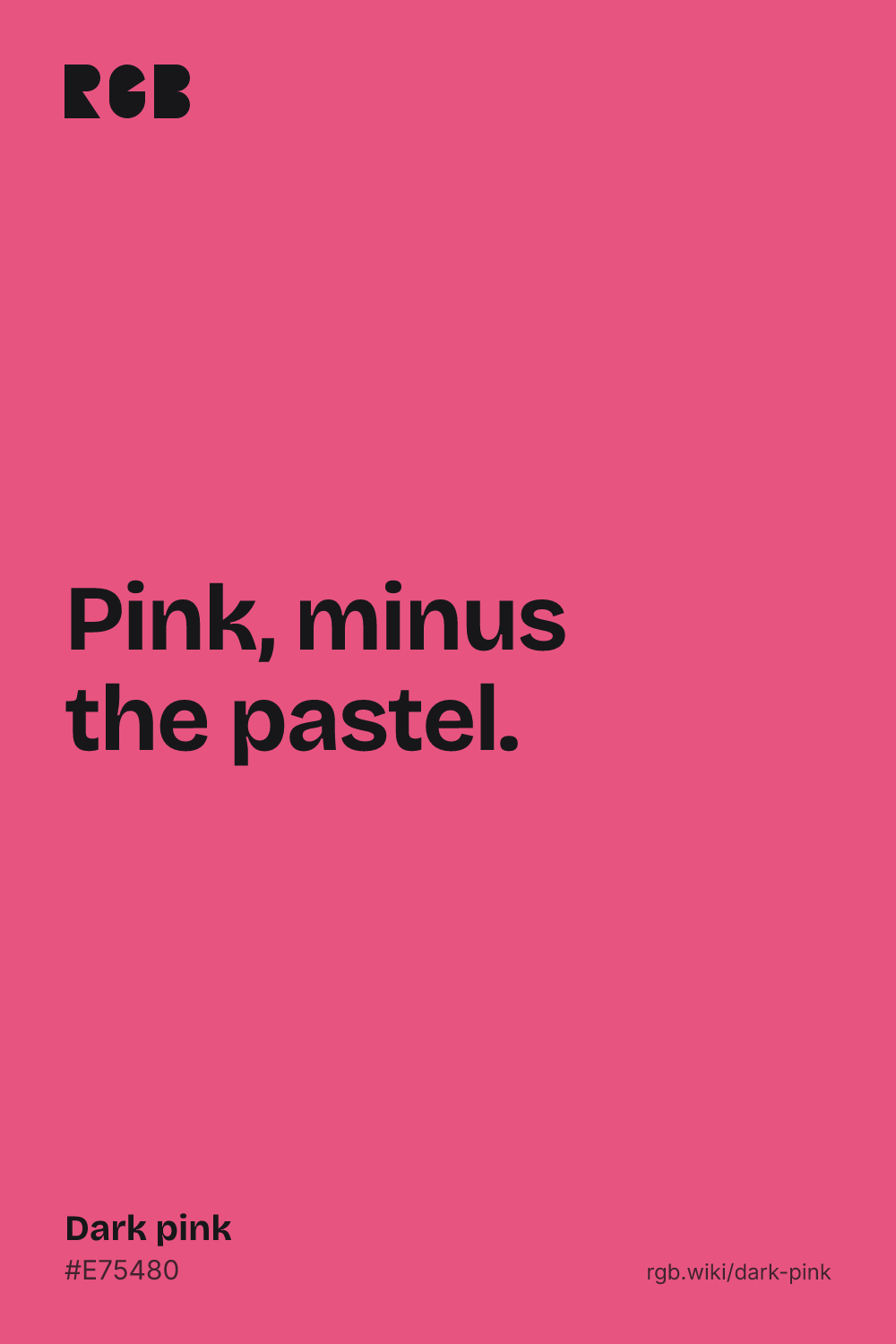
Dark pink is a deep, strong pink, like the inside of a ripe watermelon. Its code is #E75480: red at 91%, blue at 50% and green at 33%. It is pink with most of the white taken out. The hue, 342°, is a red that leans slightly toward purple.
The code comes from an unlikely place. Dark pink isn’t a CSS keyword: the web’s color list has deep pink, #FF1493, and hot pink, #FF69B4, both brighter and more purple, but no dark pink. A standard for printers does define one. The Printer Working Group’s 2013 names for paper colors give dark pink as #E75480.
In everyday use, dark pink is a little darker still. In Randall Munroe’s 2010 xkcd color survey, people’s average dark pink was #CB416B: the same hue, a step deeper. The 1955 ISCC-NBS color dictionary disagrees with both. Its dark pink is a grayed, dusty pink around #C08081, the color this site lists as dusty rose. Most dark pinks go by other names, such as rose, raspberry, cerise and blush.
On screens, dark pink takes dark text: black on it has a contrast of about 6:1. White reaches only about 3.5:1, enough for large headings but not for body text. It pairs well with navy and charcoal, with pale pink and cream, and with mint green and gold.