Shocking pink

The brash pink Elsa Schiaparelli named in 1937, meant to startle rather than to soothe.

Overview

Shocking pink is a vivid pink that leans toward purple. Its usual code is #FC0FC0: red near full strength, blue at 75% and almost no green. That puts it between neon pink, which is purpler, and hot pink, which is lighter and softer.

Few colors have a known author. In the 1930s the Paris designer Elsa Schiaparelli made this brash pink her signature, and on April 29, 1937, her house launched a perfume named Shocking, in a bottle by the painter Leonor Fini shaped like a dressmaker’s bust. The color came out with the perfume, and Merriam-Webster dates the name “shocking pink” to the same year. Schiaparelli later called her memoir Shocking Life (1954).

No standard defines the color. The code comes from Wikipedia, which says it matches the lettering on the original perfume box, and the color dictionaries have no entry for it. People in the xkcd color survey picked a slightly redder pink, #FE02A2, and a crayon color renamed shocking pink in 1990 is lighter and purpler. In North America the same loud pink was called hot pink by the 1950s.

On screens, #FC0FC0 works best as an accent. Black text reads well on it; white text only at large sizes. Schiaparelli used it as a single flash on black, and it clashes happily with tangerine and crimson.
HEX#FC0FC0
RGBrgb(252, 15, 192)
HSLhsl(315, 98%, 52%)
HSV315°, 94%, 99%
CMYK0, 94, 24, 1
OKLCHoklch(66.6% 0.281 343.0)
Every code converts from the HEX value #FC0FC0. #FC0FC0 is the shocking pink most color lists use. It comes from Wikipedia’s “Shades of pink”, which says it matches the pink lettering on the original Shocking perfume box and cites a 2012 fashion blog post for the code. No color standard defines shocking pink: the ISCC-NBS dictionaries have no entry for it, and Merriam-Webster defines it only as “a striking, vivid, bright, or intense pink”. CMYK is a screen-based estimate; print results vary.
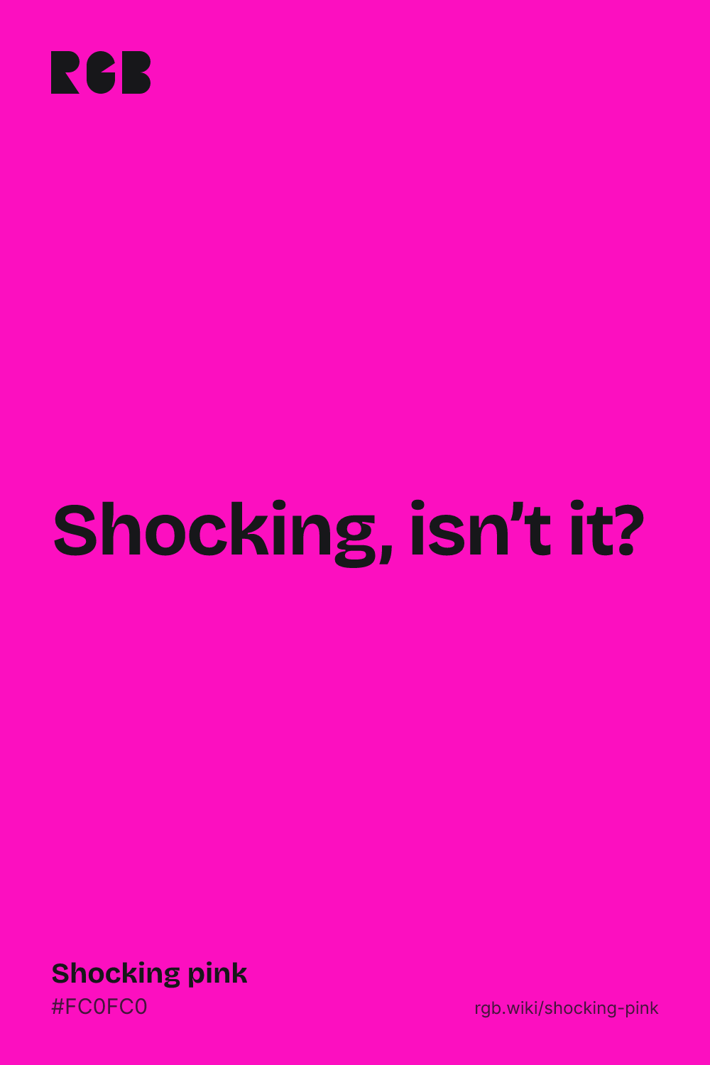
Shocking pink color card, hex #FC0FC0: “Shocking, isn’t it”

Shocking pink on the color map

People’s average shocking pink in the xkcd survey sits just to the right of the code, inside the outline: a touch redder and about as light. The crayon called shocking pink sits just outside the outline, above it and to the left: much lighter and purpler. The outline is an approximate range, not a measured one.

Shades and tints

Tints with white

Shades with black

Tones with gray

Shocking pink sits in the middle. Tints add white, shades add black and tones add gray, in 10% steps out from it. Tap any swatch to copy its code.

Light and dark shocking pink

#FE9FE6
Pale shocking pinkMixed 60% with white. A candy pink for backgrounds.
#FF6FFF
Crayon shocking pinkA crayon color, called ultra pink from 1972 and shocking pink since 1990. Lighter and purpler; no standard defines it.
#FC0FC0
Shocking pinkThe reference color.
#FE02A2
Everyday shocking pinkThe xkcd survey average for shocking pink, a touch redder than the code.
#FF1493
Deep pinkThe CSS keyword deeppink, a redder neighbor. See deep pink
#970973
Deep shocking pinkMixed 40% with black. Dark enough for white text, for buttons and headings.

Colors that go with shocking pink

Pairings that work in rooms, outfits and interfaces.

Black with a pink heel

Schiaparelli’s shoe hat of 1937–38 was all black except for its shocking pink heel. One loud accent on black.

Vreeland’s clash

The editor Diana Vreeland wore shocking pink with tangerine and crimson. Loud on purpose.

Shocking pink and navy

Navy steadies the pink for a website or a brand. Confident, not childish.

Perfume counter

Gold, ivory and black with a flash of pink, for packaging and beauty brands. Luxurious and a little theatrical.

Shocking pink and lime

Near-opposites that make each other glow. Festive, for posters and events.

Shocking pink, tone on tone

Pale and deep versions of the same pink. Bold but unified.

Color-wheel palettes

Pick a palette to see where its colors sit on the color wheel. The caret marks shocking pink. Tap a band to copy its code.

Similar colors

Pink-purple60%Fuchsia53%Neon pink64%Shocking pinkBarbie pink77%Deep pink65%Magenta64%

Lined up by hue around shocking pink. Hover a color to see how similar it is.The bar under each name shows how similar it is. Similarity comes from the distance between the two colors in OKLab, a model of how we see color.

Shocking pink vs hot pink

Shocking pink#FC0FC0 · hue 315°
  • Deeper and more intense, leaning purple
  • Named by Schiaparelli in 1937
  • No standard code; #FC0FC0 is the usual one
Hot pink#FF69B4 · hue 330°
  • Lighter and softer, leaning red
  • The American name for loud pink by the 1950s
  • The CSS keyword hotpink

Meaning

  • Shocking perfume
  • Paris couture
  • Made to startle
  • Warning color

Shocking pink was named to startle. Elsa Schiaparelli gave the color and her 1937 perfume the same name, and for her and her clients it stood for daring, not sweetness. In nature the same loud pink can be a warning. Studies of color and emotion test vividness or the broad word pink, not shocking pink itself, so most of what is said about its mood is convention.

Named by its designer

Historical record

Schiaparelli described her pink as “bright, impossible, impudent, becoming, life giving, like all the lights and the birds and the fish in the world put together”. Her house says she launched the perfume Shocking and its signature color, Shocking Pink, at the same time, and the V&A dates both to 1937.1, 2, 3

Power, not sweetness

Color historian

The color historian Kassia St Clair writes that this was not the pale pink of 18th-century painting but a “full-blooded, decidedly brash hue”. The editor Diana Vreeland paired it with tangerine and crimson, and for the women who took it up, St Clair argues, it signaled power and a mind of their own.4

The diamond story is unconfirmed

Retold story

Shocking pink is often said to have been inspired by the Tête de Bélier, a 17.27-carat pink diamond owned by Daisy Fellowes, one of Schiaparelli’s best clients. The story comes from later accounts, a 1997 newspaper article and a 2016 book, and we could not find it in Schiaparelli’s own words.5

A warning in nature

Biology

The shocking pink dragon millipede of Thailand, described in 2007, is named for its color. Its bright pink warns predators that it can release cyanide.6, 7

Vivid colors feel more rousing

One lab study

In a 1994 study with color chips, people rated more saturated colors as more arousing. Shocking pink is one of the most saturated pinks a screen can show, but the study did not test it by name.8

Sources (8)
  1. Smithsonian Magazine (2026). “This Fashion Designer Collaborated With Salvador Dalí and Jean Cocteau to Imagine Fabulous Surrealist Ensembles”, on the V&A exhibition Schiaparelli: Fashion Becomes Art.
  2. Schiaparelli, “L’histoire de la maison”, the fashion house’s own history.
  3. Victoria and Albert Museum (2026). “Elsa Schiaparelli: a timeline”.
  4. St Clair, K. (2020, September 16). “Elsa Schiaparelli and the power of shocking pink”. ELLE Decoration UK.
  5. Wikipedia, “Elsa Schiaparelli”, citing Kassia St Clair, The Secret Lives of Colour (2016), pp. 126–127, and Mitchell Owens, “Jewelry That Gleams With Wicked Memories”, The New York Times, 13 April 1997.
  6. Enghoff, H., Sutcharit, C. & Panha, S. (2007). The shocking pink dragon millipede, Desmoxytes purpurosea, a colourful new species from Thailand. Zootaxa, 1563, 31–36. doi:10.11646/zootaxa.1563.1.3
  7. Bai, N. (2008, December 16). “New Species Alert! Hot Pink Millipede, Collosal Spider, and Tiny Deer Emerge”. Discover.
  8. Valdez, P. & Mehrabian, A. (1994). Effects of color on emotions. Journal of Experimental Psychology: General, 123(4), 394–409. doi:10.1037/0096-3445.123.4.394

History

Shocking pink is one of the few color names with a known author and a launch date. Elsa Schiaparelli named it with a perfume in 1937, Americans soon renamed it hot pink, and the web code is said to come from the perfume’s box.

  1. 1937

    On April 29, Maison Schiaparelli launches the perfume Shocking, in a bottle designed by the painter Leonor Fini.1 Shaped like a dressmaker’s bust, it recalls the curves of Mae West, whom Schiaparelli dresses that year for the film Every Day’s a Holiday.2, 3 The color is launched with the perfume, and “shocking pink” is first recorded as a color name the same year.2, 3, 4

  2. 1937–38

    Schiaparelli’s shoe hat, from sketches by Salvador Dalí, is made all in black. Only its shocking pink heel adds a provocative accent.1, 5

  3. 1950s

    In North America, the intense pink called shocking pink in the 1930s is now called hot pink. A 1980 color book adds that it became “kinky pink” in the 1960s.6

  4. 1952–53

    Zsa Zsa Gabor wears shocking pink in the film Moulin Rouge (1952), and Marilyn Monroe a shocking-pink strapless gown for a number in Gentlemen Prefer Blondes (1953).7

  5. 1954

    Maison Schiaparelli shows its last couture collection on February 3 and closes its salon on December 13. The perfume business carries on, and Schiaparelli publishes her memoir, Shocking Life.1, 3

  6. 1990

    A crayon color sold as ultra pink since 1972 is renamed shocking pink. It is usually shown as #FF6FFF, lighter and purpler than Schiaparelli’s pink.6

  7. 2007

    Scientists describe the shocking pink dragon millipede, Desmoxytes purpurosea, from Thailand, named for its vivid color.8

  8. 2010

    In the xkcd color survey, the average color people call shocking pink is #FE02A2, a touch redder than the web code.9

  9. 2022

    The Musée des Arts Décoratifs in Paris opens Shocking! The surreal world of Elsa Schiaparelli, on view from July 6, 2022, to January 22, 2023.1

Sources (9)
  1. Musée des Arts Décoratifs, Paris (2022). Shocking! The surreal world of Elsa Schiaparelli, exhibition press kit (PDF), pages 1, 7–8, 14 and 17.
  2. Schiaparelli, “L’histoire de la maison”, the fashion house’s own history.
  3. Victoria and Albert Museum (2026). “Elsa Schiaparelli: a timeline”.
  4. Merriam-Webster, “shocking pink”, definition and first known use.
  5. Wikipedia, “Elsa Schiaparelli”, dating the shoe hat to the fall–winter 1937–38 collection, after Richard Martin’s Fashion and Surrealism.
  6. Wikipedia, “Shades of pink”, sections Shocking pink and Ultra pink, quoting Helen Varley (ed.), Color (1980), page 139.
  7. St Clair, K. (2020, September 16). “Elsa Schiaparelli and the power of shocking pink”. ELLE Decoration UK.
  8. Enghoff, H., Sutcharit, C. & Panha, S. (2007). The shocking pink dragon millipede, Desmoxytes purpurosea, a colourful new species from Thailand. Zootaxa, 1563, 31–36. doi:10.11646/zootaxa.1563.1.3
  9. Munroe, R. (2010). “Color survey results”. xkcd blog. The survey’s color averages are released as CC0 data.

Questions

What color is shocking pink?

A vivid pink that leans toward purple. The usual code is #FC0FC0 (RGB 252, 15, 192). No standard defines it, and dictionaries describe it only as a striking, intense pink.

Who invented shocking pink?

The Paris designer Elsa Schiaparelli. She made the color her signature in the 1930s and launched it with her perfume Shocking in 1937, the year the name is first recorded.

Why is it called shocking pink?

Because it was meant to startle: a brash, intense pink at a time when pink usually meant pale and sweet. Schiaparelli used the same word for her perfume, Shocking, and for her 1954 memoir, Shocking Life.

Is shocking pink the same as hot pink?

They share a history: in North America, the pink called shocking pink in the 1930s was called hot pink by the 1950s. On screens they differ. Hot pink (#FF69B4), the CSS keyword, is lighter and softer; shocking pink (#FC0FC0) is deeper and more purple.

What is the difference between shocking pink and neon pink?

Neon pink (#FF10F0) is purpler and close to the CSS color fuchsia. Shocking pink (#FC0FC0) is a little redder and deeper. Neon pink is named after fluorescent dyes; shocking pink after a Paris perfume.

Was shocking pink inspired by a diamond?

That is a popular story: the color is said to come from the Tête de Bélier, a pink diamond owned by Schiaparelli’s client Daisy Fellowes. It appears in later accounts, and we could not confirm it in Schiaparelli’s own words.

Can I use white text on shocking pink?

Only for large text: white reaches a contrast of 3.5 to 1. Black text reaches about 6 to 1 and is easier to read. For white body text, use a deeper shade such as #970973.

What colors go with shocking pink?

Black, as Schiaparelli used it. Navy and white for a cleaner look, tangerine and crimson for a deliberate clash, and gold with ivory for something luxurious.