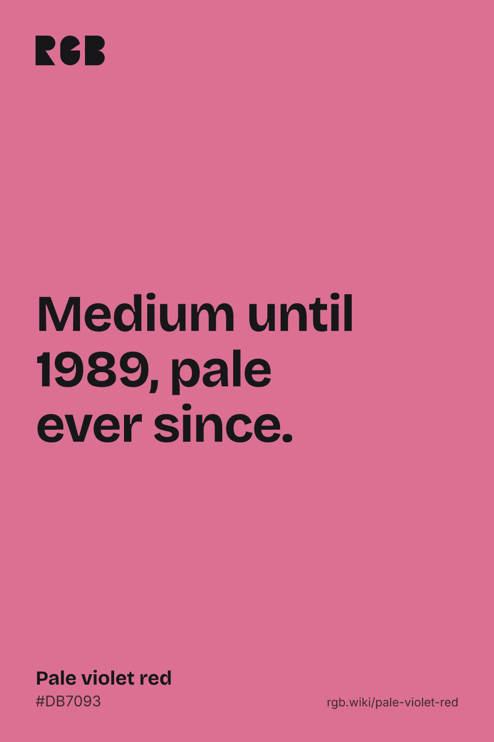
Pale violet red is a soft, cool rose pink, like a dusky pink rose or a pink cheek on a cold day. Its code is #DB7093: red strong, blue in the middle and green lowest. That small surplus of blue over green pulls the hue to 340°, a red tipped toward violet, and the white mixed in makes it pink rather than red.
The name is the CSS keyword palevioletred, but the color is older than the name. In the X Window System’s first color list, from 1986, the same 219 112 147 was called medium violet red. It was one of six names in that list built from the same three numbers, 112, 147 and 219, in different orders; another became medium purple. In 1989 Paul Raveling kept the value but called it pale violet red, and gave “medium violet red” to a much deeper, more saturated 199 21 133, the color the web now calls mediumvioletred and this site files under red-violet. No surviving note says why.
“Violet” comes from the flower, through Old French from the Latin viola, and as a color dictionaries define it as a reddish blue. So the name reads as a red leaning toward the blue of violets, softened. That fits the code. People see it more simply: in the xkcd color survey, the closest common name is “muted pink”, #D1768F, almost the same color. Its nearest neighbors on this site are blush and puce.
On screens, pale violet red needs dark text: black on it has a contrast of about 6.8:1, white only about 3.1:1, enough for large headings but not for body text. It pairs well with deep teal, navy, sage green and a near-black plum.