Sepia

A warm brown named after cuttlefish ink, and the tone of old photographs.

Overview

Sepia is a deep, warm brown. Its usual code is #704214: red at under half strength, less green and very little blue, which makes a dark reddish brown.

The name is the Latin form of the Greek sēpia, cuttlefish. Sepia was first a pigment: the brown ink of the cuttlefish. Greeks and Romans wrote with it, and artists drew with it until the 1800s.

Today the word most often means the brown of old photographs. Sepia toning turned the silver of a black-and-white print brown and helped it last, and photo filters copy that look. Real sepia varies. Merriam-Webster calls it a brownish gray to dark olive brown, darker and grayer than the web code, while people’s average sepia in the xkcd color survey is lighter and more orange.

Sepia is dark enough for text, and white text reads well on it. It pairs well with cream, dusty blue, sage and gold.

HEX#704214
RGBrgb(112, 66, 20)
HSLhsl(30, 70%, 26%)
HSV30°, 82%, 44%
CMYK0, 41, 82, 56
OKLCHoklch(42.6% 0.086 61.1)
Every code converts from the HEX value #704214. #704214 matches the sepia of Maerz and Paul’s A Dictionary of Color (1930), plate 8, sample A10, according to Wikipedia, but no standard confirms it: the 1955 ISCC-NBS dictionary files that same sepia as a dark olive brown, and Merriam-Webster defines the color as a brownish gray to dark olive brown. CMYK is a screen-based estimate; print results vary.
Sepia color card, hex #704214: “Sepia later”

Sepia on the color map

People’s average sepia in the xkcd survey is lighter, with almost the same hue, just above the top edge of the outline. The dictionary’s sepia is darker, grayer and more olive, just below the outline on the yellow side. The outline is an approximate range, not a measured one.

Shades and tints

Tints with white

Shades with black

Tones with gray

Sepia sits in the middle. Tints add white, shades add black and tones add gray, in 10% steps out from it. Tap any swatch to copy its code.

Light and dark sepia

#D4C6B8
Pale sepiaMixed 70% with white. A warm, grayish cream.
#A98E72
Light sepiaMixed 40% with white. A soft, dusty brown.
#704214
SepiaThe reference color.
#4E2E0E
Dark sepiaMixed 30% with black. A deep chocolate brown.
#3B3121
Dictionary sepiaThe dark olive brown where the 1955 ISCC-NBS dictionary files Maerz and Paul’s sepia.

Colors that go with sepia

Pairings that work in rooms, outfits and interfaces.

Sepia and cream

The look of an old photograph. Warm and nostalgic.

Sepia and dusty blue

Warm brown and cool blue. Calm and grown-up.

Sepia and sage

Earthy and soft, like a garden in autumn.

Sepia and gold

Rich and warm. Good for labels and invitations.

Sepia and rose

Vintage and romantic.

Sepia and white

Simple and readable. Sepia makes a softer text color than black.

Color-wheel palettes

Pick a palette to see where its colors sit on the color wheel. The caret marks sepia. Tap a band to copy its code.

Similar colors

Walnut91%Russet82%Toffee75%Coffee79%Chocolate89%SepiaDark brown89%

Lined up by hue around sepia. Hover a color to see how similar it is.The bar under each name shows how similar it is. Similarity comes from the distance between the two colors in OKLab, a model of how we see color.

Sepia vs umber

Sepia#704214 · hue 30°
  • Warmer and more saturated
  • Named after cuttlefish ink
  • Also the tone of old photos
Umber#635147 · hue 21°
  • Grayer and more muted
  • An earth pigment
  • Darkened by manganese

Meaning

  • Cuttlefish
  • Ink drawing
  • Watercolor
  • Old photographs

Sepia means two things: an ink from the cuttlefish, and the brown tone of old photographs. Both are about materials rather than moods. The color is now often linked with antique photographs, and photo filters use it to make new pictures look old. Mood research tests broad words such as brown, not sepia itself, so this section sticks to documented uses and dictionaries.

Made from cuttlefish ink

Documented use

Sepia began as a pigment: a brown ink from the cuttlefish, whose dark color comes from melanin. Greeks and Romans wrote with it. In the late 1700s, Jakob Seydelmann of Dresden developed a concentrated sepia for watercolors and oil paints.1, 2, 3
A tone that protects photos

Documented use

Sepia toning converts the metallic silver of a black-and-white print into silver sulfide. That gives the print its warm brown tone and makes it much more resistant to sulfur pollution in the air, so toned prints last longer.4

Darker in the dictionary

Dictionaries and survey

Merriam-Webster defines sepia as a brownish gray to dark olive brown, and the 1955 ISCC-NBS dictionary files Maerz and Paul’s sepia as a dark olive brown. The usual web code is warmer and redder, and people’s average sepia in the xkcd survey is lighter still.1, 5, 6

Sources (6)
  1. Merriam-Webster, “sepia”, definitions, etymology and first known use.
  2. Wikipedia, “Cephalopod ink”.
  3. Wikipedia, “Sepia (color)”, in the visual arts, citing Gettens and Stout’s Painting Materials.
  4. Wikipedia, “Photographic print toning”, sepia toning.
  5. Kelly, K. L. & Judd, D. B. (1955). The ISCC-NBS Method of Designating Colors and a Dictionary of Color Names. NBS Circular 553. Group numbers as tabulated by A. Jaffer.
  6. Munroe, R. (2010). “Color survey results”. xkcd blog. The survey’s color averages are released as CC0 data.

History

Sepia went from the sea to the writing desk, then to the artist’s paintbox and the photographer’s darkroom.

  1. Antiquity

    Greeks and Romans write with sepia ink from the cuttlefish.1

  2. Late 1700s

    Jakob Seydelmann, a professor in Dresden, develops a concentrated sepia for watercolors and oil paints.1

  3. 1797–99

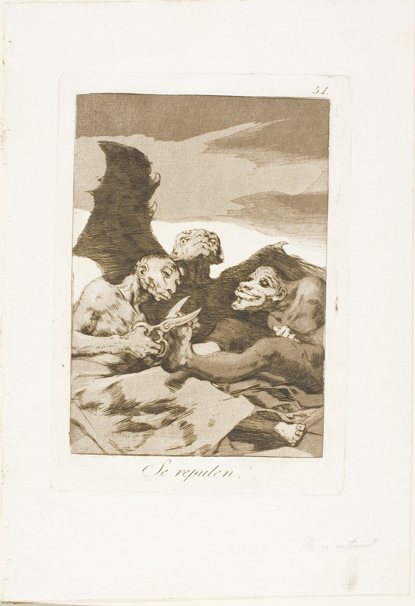
    Goya etches Los Caprichos. An impression of plate 51 at the Art Institute of Chicago is printed in sepia.2

  4. 1821

    First known use of sepia in English, for the pigment from cuttlefish ink.3

  5. About 1850

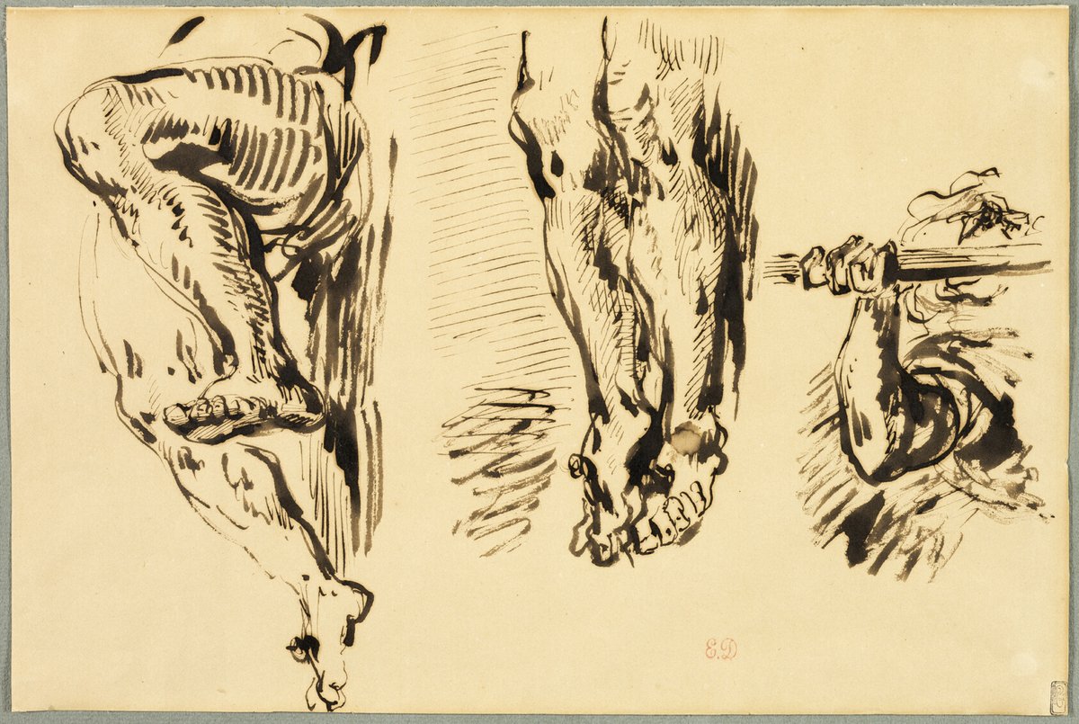
    Eugène Delacroix draws studies of the arms and legs of Christ crucified, after Rubens, in pen and sepia ink.4

  6. About 1900

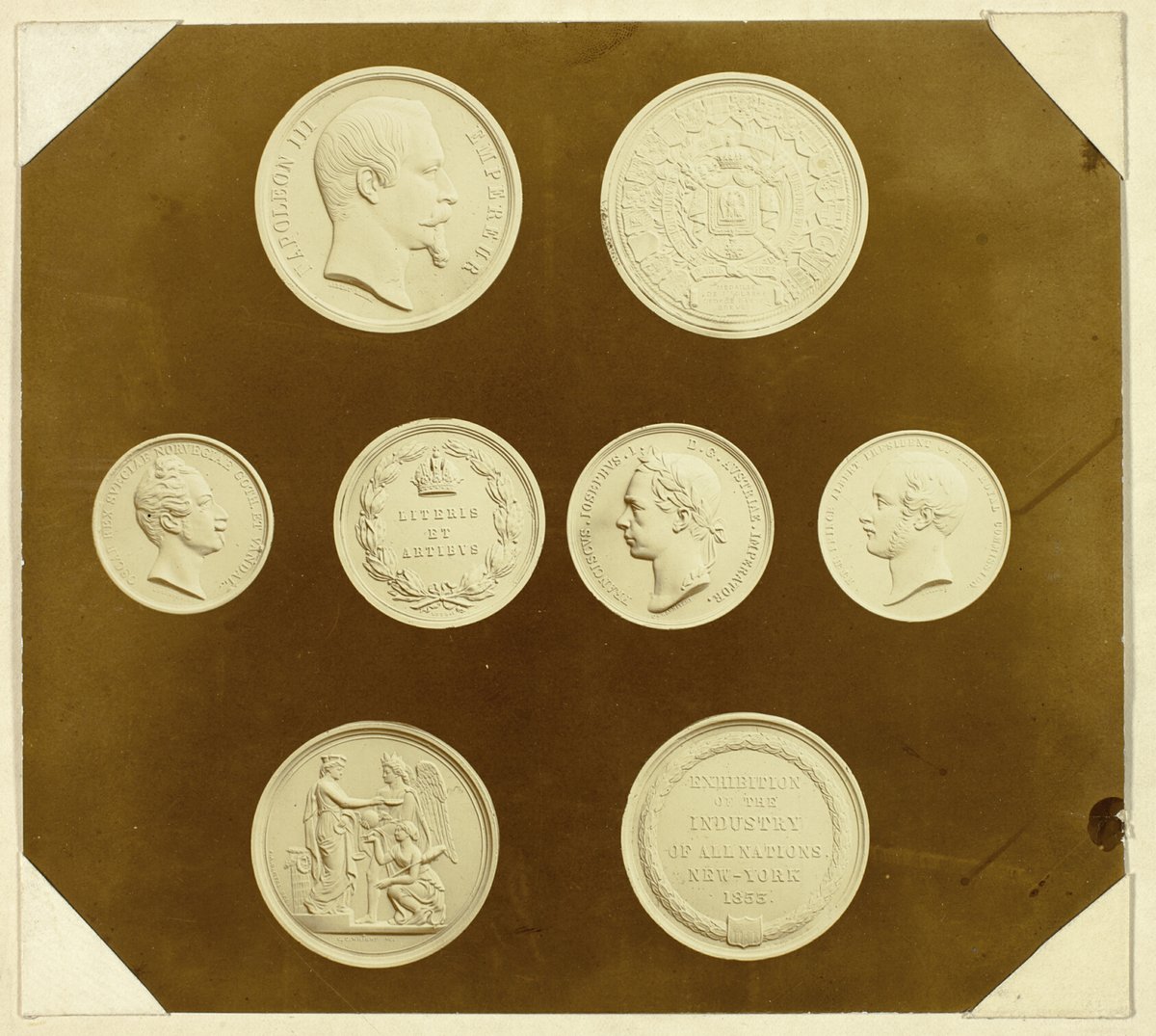
    A British photographer records the medals of the color printer George Baxter in a sepia-toned print.5

  7. 1955

    The ISCC-NBS color dictionary files the sepia of Maerz and Paul’s 1930 A Dictionary of Color as a dark olive brown.6

Sources (6)
  1. Wikipedia, “Sepia (color)”, in the visual arts, citing St. Clair’s The Secret Lives of Colour and Gettens and Stout’s Painting Materials.
  2. Art Institute of Chicago, “They Spruce Themselves Up, plate 51 from Los Caprichos”, Francisco José de Goya y Lucientes, 1797/99, etching and aquatint in sepia (1948.110.51).
  3. Merriam-Webster, “sepia”, etymology and first known use.
  4. Art Institute of Chicago, “Study of Arms and Legs of Christ Crucified”, Eugène Delacroix after Peter Paul Rubens, about 1850, pen and sepia ink on buff paper (1962.353).
  5. Art Institute of Chicago, “Medals Awarded to George Baxter, Colour Printer”, unknown photographer, about 1900, sepia-toned silver gelatin print (1947.772.1).
  6. Kelly, K. L. & Judd, D. B. (1955). The ISCC-NBS Method of Designating Colors and a Dictionary of Color Names. NBS Circular 553. Group numbers as tabulated by A. Jaffer.

Sepia in use

Three pen sketches in dark brown ink on buff paper: a bent leg, a pair of crossed feet and an arm stretched along a wooden beam
#443828#8F7953#CAB282#F0DCAE
DrawingStudy of Arms and Legs of Christ Crucified (about 1850)

Eugène Delacroix’s copy after Rubens, at the Art Institute of Chicago, drawn in pen and sepia ink on buff paper. The ink reads as a dark, grayish brown, much closer to the dictionary’s sepia than to the web code.

#443828#8F7953#CAB282#F0DCAE
Source: Art Institute of Chicago
An etching in brown ink of grotesque figures with bat-like wings, one trimming another’s claws with scissors under a dark sky, captioned “Se repulen”
#72634B#AB9779#D5C7B0
PrintThey Spruce Themselves Up (1797–99)

Plate 51 of Goya’s Los Caprichos, at the Art Institute of Chicago. This impression is printed in a brown ink the museum calls sepia: a cool, grayish brown, lighter and less red than the web code.

#72634B#AB9779#D5C7B0
Source: Art Institute of Chicago
A photograph of eight pale medals, some with heads in profile and some with lettering, arranged on a dark brown ground
#5D3E11#7A5C1F#BDAF7F#DDD5A7
PhotographMedals awarded to George Baxter (about 1900)

A sepia-toned print by an unknown British photographer, at the Art Institute of Chicago, showing medals won by the color printer George Baxter. Its dark background is about as dark as the web code but a little more golden.

#5D3E11#7A5C1F#BDAF7F#DDD5A7
Source: Art Institute of Chicago

Palettes are sampled in-house.

Questions

What color is sepia?

A deep, warm reddish brown. The usual code is #704214 (RGB 112, 66, 20).

Where does the name sepia come from?

From the Greek and Latin word for cuttlefish. Sepia was first the brown ink of the cuttlefish, used for writing and drawing.

Why are old photos sepia?

Many prints were toned: a chemical bath turned the silver image into brown silver sulfide, which also helped the prints last. Sepia filters in photo apps copy that look.

Is sepia brown or orange?

Brown. Its hue is orange, like most browns, but it is far too dark to look orange.

What is the difference between sepia and umber?

Umber (#635147) is grayer and more muted. Sepia (#704214) is warmer and more saturated.

What colors go with sepia?

Cream for a vintage look, dusty blue or sage for contrast, and gold or rose for warmth.