Coquelicot is a vivid red with a strong orange lean, the red of a field poppy. The code most color lists use, #FF3800, has red at full strength, a little green and no blue at all. The green tips it a step further toward orange than scarlet.
Coquelicot is the French name for the corn poppy, Papaver rhoeas. Merriam-Webster traces it to the French word for a rooster’s crow, and then the rooster, because the flower was compared to a rooster’s red comb. English took it as a color name in the 1790s, and it soon became a fashion color. In December 1798 Jane Austen told her sister that “coquelicot is to be all the fashion this winter.”
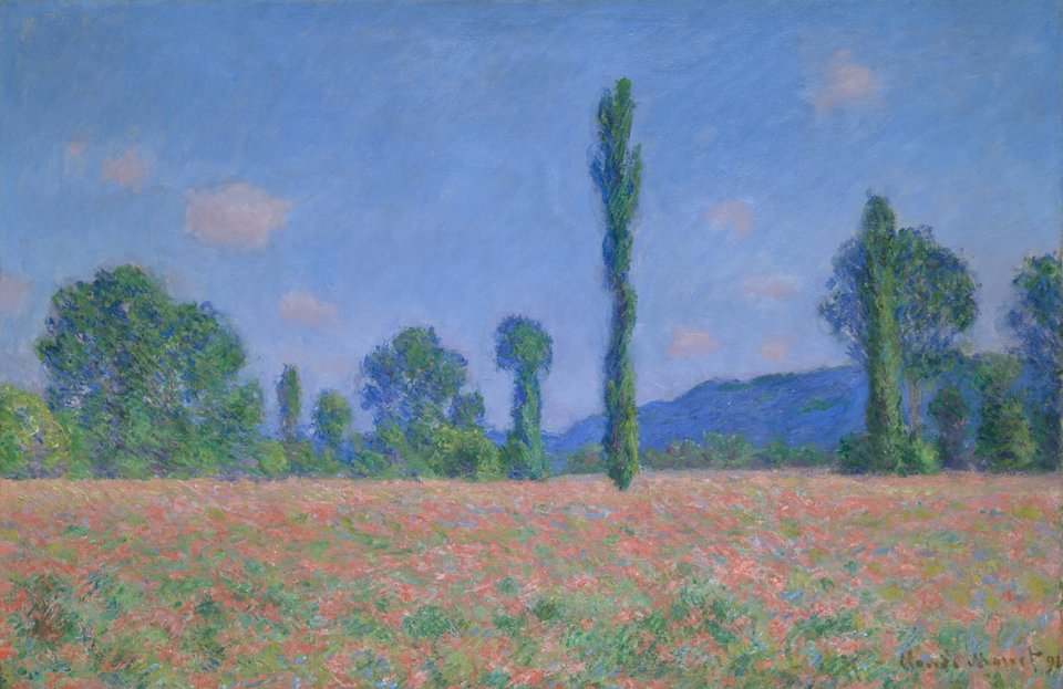
Real poppies are hard to pin down. Their petals are only three cells thick, packed with pigment and full of tiny structures that scatter light, which is why they seem to glow. Painters soften them: Monet’s poppies in Chicago sample as a dusty coral, about #C07A6E. Color dictionaries can’t decide either: the ISCC-NBS files coquelicot under both vivid red and vivid reddish orange.
Coquelicot is loud, so give it one job: a button, a headline, a logo. It pairs well with wheat gold, leaf green, cream and navy. White text on it reaches only 3.6:1, enough for large bold type; black text works better (5.8:1).