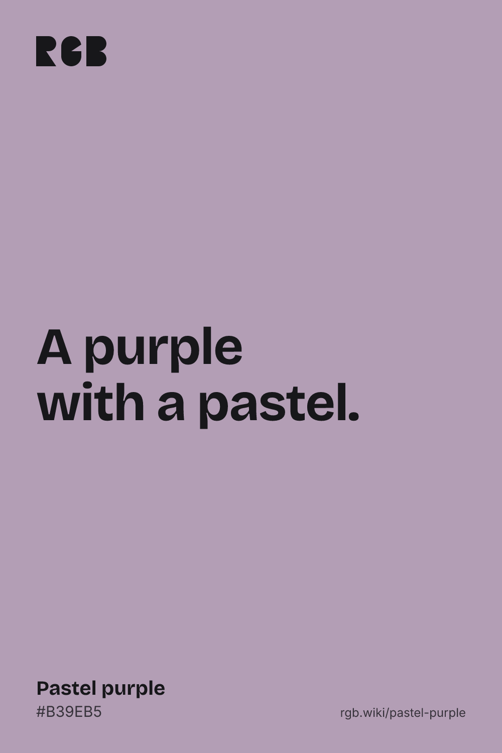
A soft, grayish light purple, quieter than most people picture.
Overview
Pastel purple is a soft, grayish light purple. The code used here, #B39EB5, is the one most color lists give. Red and blue are a little higher than green, and all three are close together, which makes it pale and muted, not far from a purple-tinged gray.
No standard defines pastel purple, and the major color dictionaries do not list the name at all. The closest color in the ISCC-NBS system is pale purple. The nearest names on record come from the 1938 Horticultural Colour Chart, made for describing flowers: its pastel lilac and pastel lavender are both filed as very pale purple.
Most people picture a stronger color. In the xkcd survey, people’s average pastel purple is #CAA0FF, a clear light violet, far more colorful than this code.
Pastel purple is gentle and quiet. It suits spring designs, stationery and calm interfaces, and it needs dark text.
HEX
#B39EB5
RGB
rgb(179, 158, 181)
HSL
hsl(295, 13%, 66%)
HSV
295°, 13%, 71%
CMYK
1, 13, 0, 29
OKLCH
oklch(72.5% 0.040 323.3)
Every code converts from the HEX value #B39EB5. #B39EB5 is the pastel purple most color lists and websites use, but no standard defines it. Pastel purple has no CSS keyword, and neither Maerz and Paul’s 1930 A Dictionary of Color nor the 1955 ISCC-NBS dictionary lists the name. Its nearest ISCC-NBS color is pale purple. Treat this code as typical, not official. CMYK is a screen-based estimate; print results vary.
Pastel purple on the color map
LighterDarker
People’s average pastel purple in the xkcd survey sits inside the outline near its left edge: a little lighter and bluer, and far more colorful, which this map cannot show, since it plots hue and lightness, not how vivid a color is. Pale purple sits inside it, a little darker and pinker. The flower chart’s very pale purple sits above the outline: much lighter. The outline is an approximate range, not a measured one.
Shades and tints
Tintswith white
Shadeswith black
Toneswith gray
Pastel purple sits in the middle. Tints add white, shades add black and tones add gray, in 10% steps out from it. Tap any swatch to copy its code.
Light and dark pastel purple
#E1D8E1
Pale pastel purpleMixed 60% with white. A faint tint for backgrounds.
#D8BFD8
ThistleThe CSS keyword thistle. Lighter and a little pinker. See thistle
#B39EB5
Pastel purpleThe reference color.
#826D8C
Gray purpleDarker and a little bluer, with the same muted feel. See gray-purple
#6B5F6D
Dark pastel purpleMixed 40% with black. Dark enough for white text.
Colors that go with pastel purple
Pairings that work in rooms, outfits and interfaces.
Pastel purple and sage
Soft and natural. Good for gardens, weddings and wellness brands.
Pastel purple and blush
Sweet and gentle. Keep one dark color for text.
Pastel purple and butter yellow
Opposite hues, both soft. Bright and springlike.
Pastel purple and plum
Light and dark of the same family. Rich but calm.
Pastel purple and mint
Two cool pastels, fresh and airy.
Pastel purple and charcoal
Muted and modern. Strong enough for interfaces.
Color-wheel palettes
Pick a palette to see where its colors sit on the color wheel. The caret marks pastel purple. Tap a band to copy its code.
Lined up by hue around pastel purple. Hover a color to see how similar it is.The bar under each name shows how similar it is. Similarity comes from the distance between the two colors in OKLab, a model of how we see color.
Pastel purple vs lilac
Pastel purple#B39EB5 · hue 295°
Grayer and softer
A little darker
No standard code
Lilac#C8A2C8 · hue 300°
More colorful
A little lighter
A little pinker
Meaning
Chalk pastels
Flower charts
Pleasant
No standard
Pastel purple reads as soft and quiet. Like all pastels, it takes its name from the chalky art medium, by way of a 19th-century fashion for pale drawings. Flower growers had a pastel lilac and a pastel lavender by 1938. Mood research tests broad hues and lightness, not pastel purple itself, so treat the last claim below as a hint, not a rule.
Closer to gray than to violet
Calculated
By the ISCC-NBS system, the web code’s nearest named color is pale purple, a purple so muted it sits close to gray. The major dictionaries do not list pastel purple; the nearest names on record, the flower chart’s pastel lilac and pastel lavender, are filed as very pale purple.1, 2
People picture a brighter purple
Survey data
In the xkcd survey, people’s average pastel purple is #CAA0FF, a clear light violet with more than three times the color strength of the web code. The survey’s “easter purple” is stronger still, #C071FE.3
Light, soft colors feel pleasant
Lab study
In a 1994 lab study using color chips, people rated brighter colors as more pleasant, and brighter, less saturated colors as calmer. Purple was among the most pleasant hues. The study tested chips, not pastel purple itself.4
Kelly, K. L. & Judd, D. B. (1955). The ISCC-NBS Method of Designating Colors and a Dictionary of Color Names. National Bureau of Standards Circular 553. Internet Archive.
Munroe, R. (2010). “Color survey results”. xkcd blog. The survey’s color averages are released as CC0 data.
Valdez, P. & Mehrabian, A. (1994). Effects of color on emotions. Journal of Experimental Psychology: General, 123(4), 394–409. doi:10.1037/0096-3445.123.4.394
History
Pastel purple is an informal name. The color dictionaries skipped it, but flower growers and, later, web color lists filled the gap.
1500s
Pastel, a stick of powdered pigment, white filler and a little binder, is first used, notably by Leonardo da Vinci.1
1880s
A vogue for pale, washed-out pastel drawings makes pastel mean any light, grayed color.2
1930
Maerz and Paul’s A Dictionary of Color lists pastel blue and pastel pink, among other pastel names, but no pastel purple.2
1938
Robert F. Wilson of the British Colour Council develops the Horticultural Colour Chart for describing flowers. Its names include pastel lilac, pastel lavender and pastel mauve.3
1955
The ISCC-NBS dictionary files pastel lilac and pastel lavender as very pale purple, and pastel mauve as pale purplish pink.3
1994
A lab study finds that brighter colors are rated more pleasant, and names purple among the most pleasant hues.4
2010
In the xkcd color survey, people’s average pastel purple is #CAA0FF, much more colorful than the web code.5
Sources (5)
The Metropolitan Museum of Art (2020). “Pastel”, Materials and Techniques.
Maerz, A. & Paul, M. R. (1930). A Dictionary of Color. New York: McGraw-Hill. Note on “Pastel”, p. 172, and index, p. 201. Internet Archive.
Kelly, K. L. & Judd, D. B. (1955). The ISCC-NBS Method of Designating Colors and a Dictionary of Color Names. National Bureau of Standards Circular 553. Internet Archive.
Valdez, P. & Mehrabian, A. (1994). Effects of color on emotions. Journal of Experimental Psychology: General, 123(4), 394–409. doi:10.1037/0096-3445.123.4.394
Munroe, R. (2010). “Color survey results”. xkcd blog. The survey’s color averages are released as CC0 data.
Questions
What color is pastel purple?
A soft, grayish light purple. The most common code is #B39EB5 (RGB 179, 158, 181), but no standard defines it.
What is the hex code for pastel purple?
There is no official one. #B39EB5 is the code most color lists use. People’s average pastel purple in the xkcd survey is a much more colorful #CAA0FF.
What is the difference between pastel purple and lilac?
Lilac (#C8A2C8) is a little lighter, pinker and more colorful. Pastel purple (#B39EB5) is grayer and softer.
Is pastel purple the same as lavender?
No. Lavender (#B57EDC) is a much stronger, bluer purple and a little darker. Pastel purple is grayer and softer.
What makes a color pastel?
High lightness and low saturation: a pale color softened toward gray or white. The name comes from pastel, an art medium of powdered pigment mixed with a white filler and a little binder.
What colors go with pastel purple?
Sage green and mint for a soft scheme, blush and butter yellow for spring, and plum or charcoal for contrast.