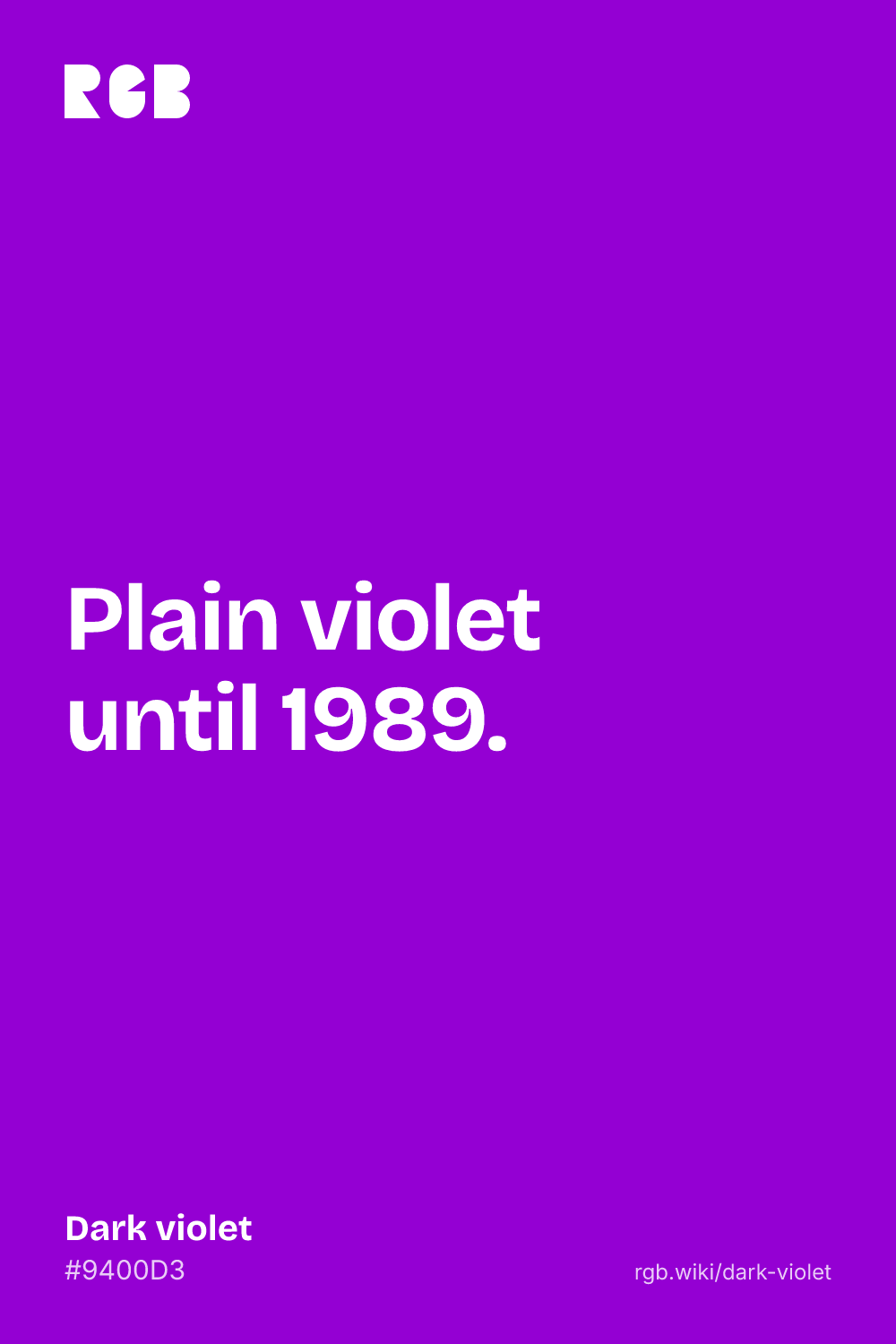
Dark violet is a vivid, deep purple that leans toward blue: bold and electric rather than dusky. Its code is #9400D3: blue at about 83%, red at 58% and no green at all. With nothing to gray it, the color is fully saturated, at a hue of 282°.
Despite the name, it is the strong one among the CSS violets. The keyword darkviolet isn’t in the X Window System’s first color list of 1986, where violet was a dim, grayish 79 47 79. In 1989 John Thomas at Tektronix, tuning the list to a box of crayons, gave plain violet exactly today’s numbers, 148 0 211. Paul Raveling’s revision of the same year has those numbers under a new name, dark violet, and makes violet a pale 238 130 238. The web adopted Raveling’s names in 2001, so CSS violet, #EE82EE, is a light pinkish lilac and the vivid violet is the one called dark.
Most measures agree it isn’t very dark. In Randall Munroe’s 2010 color survey, people’s average violet was #9A0EEA, almost the same color, while their dark violet was a near-black #34013F; the ISCC-NBS color dictionary’s dark violet is just as deep. The word comes from the flower, through Anglo-French from Latin viola, with an ending that means “small one”. The closest look-alike is blue-violet, #8A2BE2, a little bluer and lighter. Dark orchid, #9932CC, has almost the same hue but is grayer, and the site’s violet, #8F00FF, is brighter and bluer.
On screens, dark violet takes white text well: white on it has a contrast of about 6.6:1, enough for body text, while black reaches only about 3.2:1. It pairs well with gold, soft lilac, lime green and near-black backgrounds.