A cloth before a color
DictionaryMerriam-Webster’s first sense of scarlet is “scarlet cloth or clothes,” and the color comes second. The word traces back through Anglo-French and Medieval Latin to Persian saqalāt, “a kind of rich cloth.”1
A bright, orange-tinged red that was a luxury cloth before it was a color.
Scarlet is a bright red with a slight orange tinge. Its usual web code is #FF2400: red at full strength, a little green and no blue. That touch of green is what tips it toward orange.
The word goes back through Medieval Latin to a Persian word for a kind of rich cloth. In the Middle Ages, scarlet was the name of a costly wool cloth, often dyed bright red, and the cloth’s name became the color’s. It is recorded as a color name in English from 1250.
The finest scarlet was dyed with insects: first kermes from Mediterranean oaks, then cochineal from Mexico, which reached Spain in 1523. It stayed a mark of rank. British Army officers wore scarlet dyed with cochineal, while privates wore cheaper madder red until 1873. Ask people to pick scarlet today, though, and they choose a much darker red than the web code.
Scarlet is loud, so use it for the one thing you want seen: a button, a headline, a logo. It pairs well with gray, cream and navy. White text on scarlet is only readable at large, bold sizes (contrast about 3.8:1); black text works better.
| HEX | #FF2400 | |
|---|---|---|
| RGB | rgb(255, 36, 0) | |
| HSL | hsl(8, 100%, 50%) | |
| HSV | 8°, 100%, 100% | |
| CMYK | 0, 86, 100, 0 | |
| OKLCH | oklch(63.8% 0.248 31.0) |
People’s average scarlet in the xkcd survey and the dictionary’s vivid red sit close together, below the outline and a little to the left: both much darker than the web code and slightly less orange. The outline is an approximate range, not a measured one.
Tints with white
Shades with black
Tones with gray
Pairings that work in rooms, outfits and interfaces.
Ohio State’s pairing. Gray calms the red down.
Nebraska’s pairing. Warmer and softer than white.
Classic and a little military. Use scarlet as the accent.
Rich and ceremonial, like braid on a red coat.
Dramatic and high contrast. Strong on dark screens.
Clean and urgent. Good for sales and warnings.
Pick a palette to see where its colors sit on the color wheel. The caret marks scarlet. Tap a band to copy its code.
Lined up by hue around scarlet. Hover a color to see how similar it is.The bar under each name shows how similar it is. Similarity comes from the distance between the two colors in OKLab, a model of how we see color.
Scarlet reads as loud, rich and hot. It began as the name of a costly cloth, and its red came from expensive insect dyes, so for centuries it marked wealth and rank, from cardinals’ robes to army officers’ coats. In the Bible it is the color of sin. Today it is a school color at Ohio State and Nebraska. As with most named colors, mood research tests broad hues such as red, not scarlet itself.
Merriam-Webster’s first sense of scarlet is “scarlet cloth or clothes,” and the color comes second. The word traces back through Anglo-French and Medieval Latin to Persian saqalāt, “a kind of rich cloth.”1
In the British Army, privates’ coats were dyed with madder, a cheap plant dye. Officers wore cloth dyed with costly cochineal. Scarlet was adopted for all ranks only in 1873, and it stopped being general issue in August 1914.2
Merriam-Webster traces one sense of scarlet, “associated with sexual immorality,” as in “a scarlet woman,” to the word’s use in Isaiah 1:18 and Revelation 17 in the King James Bible.1
In the xkcd color survey, the average color people named scarlet is #BE0119, a deep red far darker than the web code and slightly less orange. The 1955 ISCC-NBS dictionary puts scarlet in its vivid red group, which is about as dark.3, 4
Scarlet was a cloth, then a color, then a uniform. Its story follows the insect dyes that made it.
An early recorded use of “scarlet” as a color name in English.1
The first shipments of cochineal, a stronger insect red, reach Seville from Mexico. By the end of the century most fine scarlet cloth in Europe is dyed with it.1
England’s New Model Army makes red coats its standard dress.2
The British Army adopts scarlet for all ranks. Until then only officers, sergeants and some cavalry wore it.2
Students at the University of Nebraska choose scarlet and cream as the school’s colors.3
Scarlet tunics stop being general issue when the British Army mobilizes for the First World War.2

Scarlet and gray have been Ohio State’s colors since its earliest days. Its official scarlet, #BA0C2F, is much darker than the web code and leans slightly toward crimson. The design guide reserves it for calls to action and rules out lighter tints.
The colors are Scarlet, Gray and White from the university’s Buckeye UX design system. The logo is the university’s horizontal logo file from the same site, whose Block O is filled with an older scarlet, #BB0000.

Students chose scarlet and cream in 1892, and the brand guide notes that “scarlet is a particular hue of red.” Its scarlet, #D00000, is a pure red with no orange, darker than the web code.
The colors are Scarlet, Cream and Gray from the university’s brand color page. The logo is the university’s own N icon from its web templates, drawn in the file’s red, #DD0000.
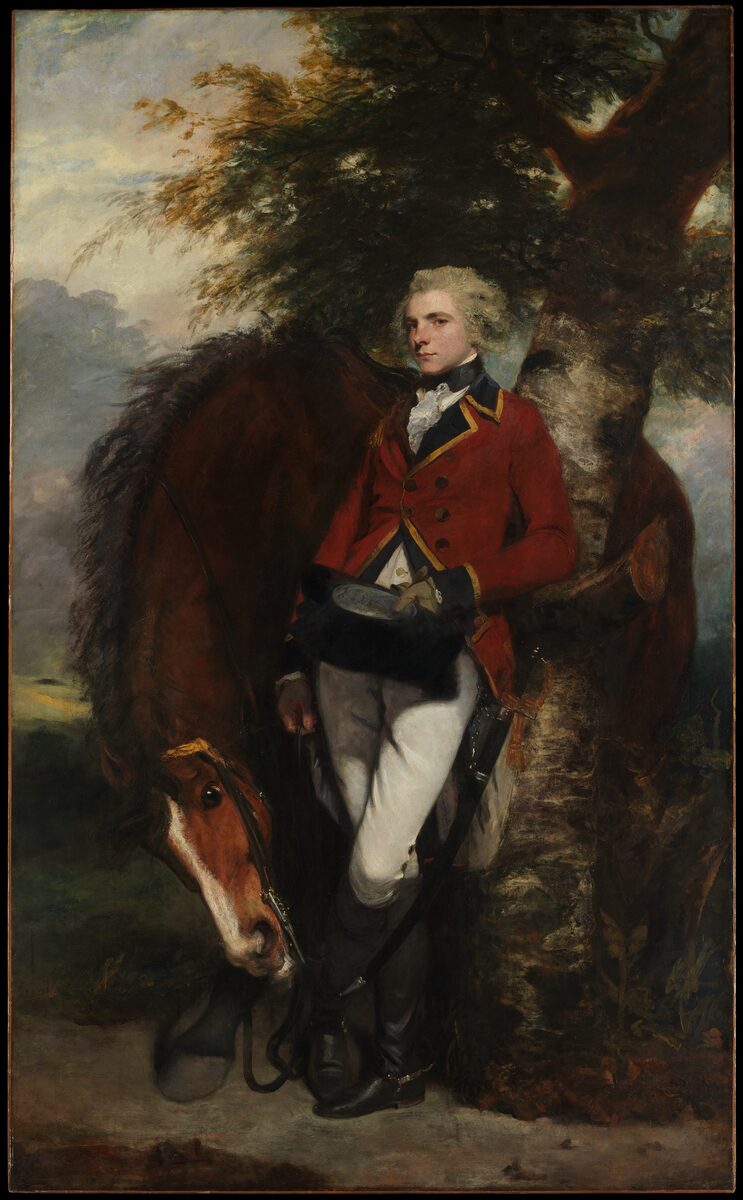
Joshua Reynolds painted this young officer of the 1st Foot Guards in his red coat, at the Metropolitan Museum of Art. An officer’s coat was dyed with costly cochineal. Sampled from the museum’s photo, the coat is a deep brownish red, far darker than the web code.
Sampled from the Metropolitan Museum of Art’s photograph (20.155.3), released as public domain (CC0) under the museum’s Open Access program. The sitter’s regiment comes from Wikipedia. Colors in a photo shift with the lighting, so read the codes as close, not exact.

YouTube’s red, #FF0033, is a little pinker than this page’s code, at about the same lightness. It fills the rounded play button in the YouTube logo.
The red is the fill of the play button in the YouTube logo served inline in the header of its website. The logo shown is that SVG, unaltered.

Pepsi’s red, #FF1400, is a touch less orange than this page’s code. It fills the top half of the globe.
The colors are the fills in Pepsi’s own logo file, served on its website. The logo shown is that file.

The insurer’s red, #F50002, is darker and a touch less orange than this page’s code. It colors the umbrella in the Travelers logo; the wordmark beside it is black.
The red is the fill in Travelers’ own logo file, served on its website. The logo shown is that file.

Tmall’s red, #FF0036, is pinker than this page’s code, a crimson-leaning red where scarlet leans orange.
The red is the fill in Tmall’s own logo file, served on its website. The logo shown is that file.

Domino’s red, #FF0000, is pure web red, a bit darker and less orange than this page’s code. It colors one half of the domino tile in the chain’s logo.
The colors are the fills in Domino’s’s own logo file, served on its website. The logo shown is that file.

Yahoo! JAPAN’s red, #FF0033, is a pinker red than this page’s code, which leans toward orange. It is the single color of the logo on the portal’s home page.
The red is the fill in the logo SVG embedded in the stylesheet of the Yahoo! JAPAN home page. The logo shown is that SVG, decoded from the stylesheet’s data URI and otherwise unaltered.
Logos belong to their owners and are shown unaltered, only to show where each palette comes from. Palettes are sampled in-house.
A bright red with a slight orange tinge. The usual web code is #FF2400 (RGB 255, 36, 0): full red, a little green and no blue.
Scarlet leans toward orange and looks bright and hot. Crimson (#DC143C) has a touch of blue, so it leans toward purple and looks a little deeper and cooler. Crimson is named after the kermes insect, scarlet after a kind of cloth.
Red. It sits about a quarter of the way from red toward orange. Dictionaries file it as a vivid red, and the scarlet people picked in the xkcd survey is darker and less orange than the web code.
No. Vermilion is named after a mercury pigment, and dictionaries describe it as more orange than scarlet. The usual web codes flip that: vermilion’s #E34234 is a little less orange, and duller, than scarlet’s #FF2400.
Gray and cream to calm it, navy for a classic look, gold for something ceremonial, and black or white for the strongest contrast.
The word goes back to a Persian word for a kind of rich cloth. In medieval Europe, scarlet was a costly wool cloth, often dyed bright red with insect dyes, and its name passed to the color.
Wealth and rank, from the price of the cloth and its use for officers’ coats. In the Bible it is the color of sin, which is where “a scarlet woman” comes from.


