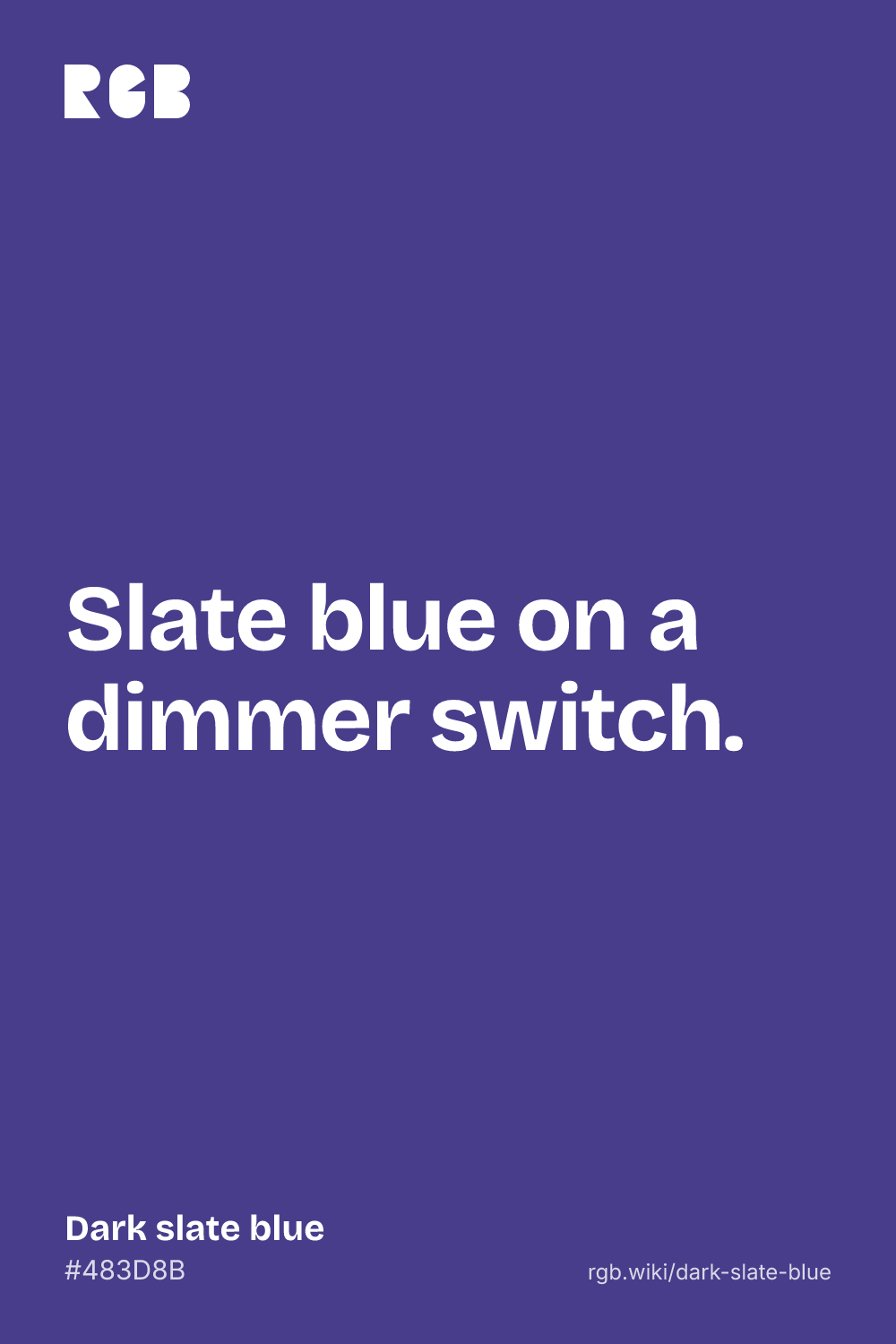
Dark slate blue is a deep, muted blue with a violet lean, like a dusk sky in its last light. Its code is #483D8B: blue at 139 out of 255, a little over half strength, with red at 72 and green at 61. Because red is a little higher than green, the hue tips past pure blue toward violet, to 248°.
In CSS it is darkslateblue, and unlike some CSS “dark” names it means exactly what it says: it is slate blue with the light turned down. Dark slate blue, slate blue, medium slate blue and the X11 list’s light slate blue, #8470FF, have the same hue and the same proportions of red, green and blue, at 55%, 80%, 93% and 100% brightness. Paul Raveling built them that way for the X Window System’s color list in 1989, along with four numbered steps. The darkest, SlateBlue4, #473C8B, is one step lower than dark slate blue in each channel.
The name has worn other colors. In the oldest surviving X color list, from 1986, dark slate blue was a true purple, #6B238E. John Thomas’s 1989 list, tuned to a box of crayons, made it a grayish navy, #333E63. Raveling’s value is the one the web adopted in 2001. It is far from real slate, a mostly gray stone that is only sometimes purple: dark slate blue is about ten times as colorful as the slates in color dictionaries. In the xkcd survey, people’s average dark slate blue, #214761, was a dark gray blue with no violet at all.
On screens, dark slate blue takes white text easily: white on it has a contrast of about 9.1:1, while black reaches only about 2.3:1. It pairs well with warm gold, pale lavender, peach and the cool grays of real slate.