Bisque

A pale peach cream named after unglazed porcelain, which is whiter than the code.

Overview

Bisque is a pale, peachy cream. Its code is #FFE4C4, the CSS keyword bisque: red at full strength, green a little lower and blue lower again, which tints white toward peach. It sits between blanched almond, which is paler, and navajo white, which is deeper and more orange.

The name comes from pottery. Bisque, or biscuit, is clay or porcelain fired without a glaze. In 1751 the Vincennes factory near Paris, which later moved to Sèvres, began using biscuit porcelain as a finished material, valued for a matte surface that looks like carved marble. Real biscuit porcelain is white, not peach: in the museum photos below, French biscuit figures read about #E5DDD3 and #EFEEEF, far paler and grayer than the code.

As a color, bisque comes from fashion. A newspaper fashion column described an outfit of linen voile in “light bisque color” in 1905, and by 1916 stores advertised georgette blouses “in White, Flesh or Bisque Color”. Maerz and Paul’s 1930 A Dictionary of Color lists bisque as an everyday textile color, dated 1925; its sample is deeper and more golden than the code, about #FAD6A5. No source we found says which bisque the name meant: the white porcelain of figures, or the skin-tinted porcelain of dolls’ heads.

The code reached screens in 1989, when the X Window System’s color list added a set of light colors copied from a paint maker’s samples, antique white and navajo white among them. The web adopted the list in 2001. Bisque has almost no contrast with white, so use it as a background under dark text: espresso brown, slate blue and deep cobalt all read well on it.
HEX#FFE4C4
RGBrgb(255, 228, 196)
HSLhsl(33, 100%, 88%)
HSV33°, 23%, 100%
CMYK0, 11, 23, 0
OKLCHoklch(93.3% 0.051 71.8)
Every code converts from the HEX value #FFE4C4. #FFE4C4 is the CSS keyword bisque, defined in the CSS Color Module Level 4 and first listed among the web’s color names in SVG 1.0 (2001). It comes from the X Window System’s 1989 color list, which copied its light colors from a paint maker’s samples. The older bisque of Maerz and Paul’s 1930 dictionary is darker: the 1955 ISCC-NBS dictionary files it as pale orange yellow (#FAD6A5) or yellowish gray. CMYK is a screen-based estimate; print results vary.
Bisque color card, hex #FFE4C4: “Bisque-y business”

Bisque on the color map

The xkcd color survey has no entry for bisque. Maerz and Paul’s 1930 bisque sits inside the outline, a little below and to the right: darker and a touch yellower. Plochere’s 1948 bisque sits well below the outline and far to the left: darker and pinker. The Vincennes figure sits just below the reference at almost the same hue; the map cannot show that it is much grayer. Colors in photos shift with the lighting, so read it as close, not exact. The outline is an approximate range, not a measured one.

Shades and tints

Tints with white

Shades with black

Tones with gray

Bisque sits in the middle. Tints add white, shades add black and tones add gray, in 10% steps out from it. Tap any swatch to copy its code.

Light and dark bisque

#FFEFDC
Pale bisqueMixed 40% with white. Almost exactly papaya whip, #FFEFD5. See papaya whip
#FFE4C4
BisqueThe reference color. The X11 list also calls it bisque1.
#FAD6A5
Dictionary bisquePale orange yellow, the ISCC-NBS centroid where the 1955 dictionary files Maerz and Paul’s 1930 bisque.
#EED5B7
Bisque 2The X11 list’s first darker step, the reference at about 93% strength. Not a CSS keyword.
#CDB79E
Bisque 3X11’s step at about 80% strength: a light tan, almost putty. Not a CSS keyword. See putty
#8B7D6B
Bisque 4X11’s darkest step, at about 55% strength: a grayish brown close to mink. Not a CSS keyword. See mink

Colors that go with bisque

Pairings that work in rooms, outfits and interfaces.

Biscuit and cobalt

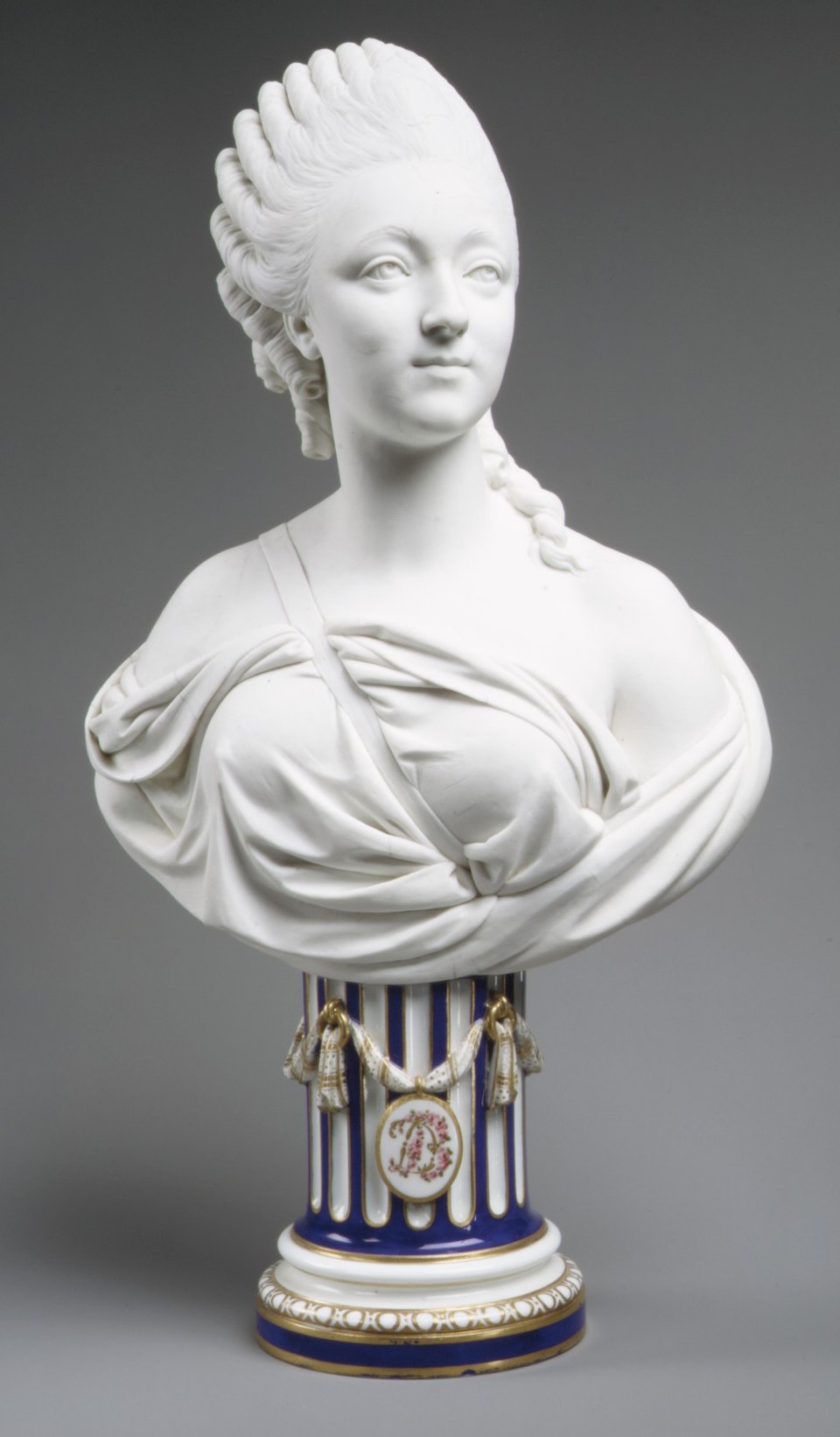
From the Sèvres bust of Madame du Barry: white biscuit above a deep blue glazed pedestal. Formal and crisp.

Vincennes figures

Bisque beside the warm grays sampled from biscuit figures of the 1750s. Quiet and tonal.

The X11 steps

Bisque with the three darker versions the X11 list gave it. Warm and calm.

Bisque and terracotta

Warm and earthy, like fired clay. Suits pottery studios, kitchens and autumn designs.

Bisque and slate blue

Soft and balanced. Slate blue cools the peach without a hard edge.

Bisque on espresso

A dark theme. Bisque text glows warm on deep brown.

Color-wheel palettes

Pick a palette to see where its colors sit on the color wheel. The caret marks bisque. Tap a band to copy its code.

Similar colors

Peach puff88%BisqueBlanched almond91%Champagne92%Moccasin90%Peach89%Parchment88%

Lined up by hue around bisque. Hover a color to see how similar it is.The bar under each name shows how similar it is. Similarity comes from the distance between the two colors in OKLab, a model of how we see color.

Bisque vs blanched almond

Bisque#FFE4C4 · hue 33°
  • A touch deeper and pinker
  • Named after unglazed porcelain
  • A fashion color by 1905
Blanched almond#FFEBCD · hue 36°
  • Paler and a little yellower
  • Named after skinned almonds
  • Its neighbor in the 1989 X11 list

Meaning

  • Unglazed porcelain
  • Early 1900s fashion
  • Doll faces
  • CSS keyword

Bisque is a name before it is a mood. It points to bisque, porcelain fired without a glaze, and it was a fashion color for blouses and gowns long before it reached screens. Studies of color and emotion test basic words such as orange or white, never bisque, so the claims below are about the word, the porcelain and the written record.

A potter’s word for biscuit

Word history

Merriam-Webster defines this bisque as biscuit, especially “unglazed china that is not to be glazed but is hard-fired and vitreous”, and dates it to 1782, formed by shortening the older word. Biscuit comes from Anglo-French for “twice-cooked bread”, and potters use it for earthenware or porcelain after the first firing and before glazing.1, 2

The soup is a different word

Dictionary record

The same dictionary lists bisque the cream soup as a separate word, borrowed from French and first recorded in English in 1647. None of its bisque entries gives a color sense, and no source we found ties the color to the soup.1

Real biscuit porcelain is white

Historical record

Biscuit porcelain is white porcelain left unglazed as a finished piece. Its matte surface looks like carved and smoothed marble, which made it a favorite for figures and busts in 18th-century Europe after Vincennes first used it in 1751. The French figures in the photos below sample at about #E5DDD3 and #EFEEEF: white to warm off-white, not peach.3

Doll faces were tinted bisque

Collecting history

Bisque dolls, most popular from 1860 to 1900 in France and Germany, had heads of unglazed porcelain that was usually tinted or painted in skin tones. Tinted bisque is closer to the code than white figures are, but no source we found says the color was named after dolls.4

A fashion color by 1905

Historical record

American newspapers describe an outfit of linen voile in a “light bisque color” in 1905, georgette blouses “in White, Flesh or Bisque Color” in a 1916 store ad, and a bride “gowned in bisque color charmeuse” in 1917. Maerz and Paul’s 1930 dictionary prints BISQUE in capitals, its mark for a name in constant everyday use, labels it a textile color and dates it to 1925. It dates biscuit, as a color name, to 1884.5, 6

Sources (6)
  1. Merriam-Webster, “bisque”, its three nouns (the soup, a handicap point, unglazed china), etymologies and first known uses.
  2. Merriam-Webster, “biscuit”, sense 2 (earthenware or porcelain after the first firing) and etymology.
  3. Wikipedia, “Biscuit porcelain”, citing W. B. Honey, Old English Porcelain: A Handbook for Collectors (revised edition, 1977), for the first use at Vincennes in 1751.
  4. Wikipedia, “Bisque doll”, citing Catherine Christopher, The Complete Book of Doll Making and Collecting (Dover, 1971), and doll-collecting guides.
  5. Library of Congress, Chronicling America: The Colfax Chronicle (Colfax, Louisiana), 14 October 1905, p. 2; The Telegraph-Courier (Kenosha, Wisconsin), 5 October 1916, p. 8; St. Johnsbury Caledonian (Vermont), 31 January 1917, p. 7.
  6. Maerz, A. & Paul, M. R. (1930). A Dictionary of Color. New York: McGraw-Hill. Index entries “1884 BISCUIT” and “1925 BISQUE” (plate 11, A3), and the index key to dates, capitals and the textile mark T. Scan at the Internet Archive.

History

Bisque was a potter’s word for more than a century before it was a color. The color name turns up in fashion news in the 1900s, reached the color dictionaries by 1930 and the screen in 1989, where it is paler than any dictionary’s sample.

  1. 1751

    The Vincennes porcelain factory near Paris first uses biscuit, porcelain left unglazed, as a finished material, an idea credited to Jean-Jacques Bachelier. Among its figures, a series of children after designs by François Boucher, the Enfants de Boucher, is reproduced again and again.1, 2

  2. 1782

    First known use of “bisque” in English for unglazed china, a shortened form of biscuit.3

  3. 1860–1900

    Bisque dolls from France and Germany are at their most popular. Their porcelain heads are usually tinted or painted a skin color.4

  4. 1884

    The earliest record Maerz and Paul later found of biscuit as a color name.5

  5. 1905

    A fashion column in The Colfax Chronicle, in Louisiana, describes an outfit of linen voile in a “light bisque color”, trimmed with lace and bright blue embroidery.6

  6. 1916

    A store ad in Kenosha, Wisconsin, offers georgette crepe blouses “in White, Flesh or Bisque Color”.7

  7. 1930

    Maerz and Paul’s A Dictionary of Color lists bisque as a textile color in constant everyday use and dates it to 1925, twenty years after the newspapers.5

  8. 1955

    The ISCC-NBS dictionary files three guides’ bisques in different places: Maerz and Paul’s as pale orange yellow, Plochere’s (1948) as yellowish pink, and Taylor, Knoche and Granville’s (1950) across four groups from grayish yellowish pink to grayish yellow.8

  9. 1989

    The X Window System’s color list adds bisque, 255 228 196, in a section of light colors copied from a paint maker’s samples, with three darker numbered versions, bisque2 to bisque4.9

  10. 2001

    SVG 1.0 makes bisque a web color keyword, as rgb(255, 228, 196). CSS later adopts the same list.10, 11

Sources (11)
  1. Wikipedia, “Biscuit porcelain”, citing W. B. Honey, Old English Porcelain: A Handbook for Collectors (revised edition, 1977).
  2. Cleveland Museum of Art, Figure Pair of the Dancer and the Bagpiper, Vincennes, 1748–52 (1961.10), on the Enfants de Boucher series.
  3. Merriam-Webster, “bisque”, noun (3), etymology and first known use.
  4. Wikipedia, “Bisque doll”.
  5. Maerz, A. & Paul, M. R. (1930). A Dictionary of Color. New York: McGraw-Hill. Index entries “1884 BISCUIT” and “1925 BISQUE”, and the index key. Scan at the Internet Archive.
  6. The Colfax Chronicle (Colfax, Louisiana), 14 October 1905, p. 2. Library of Congress, Chronicling America.
  7. The Telegraph-Courier (Kenosha, Wisconsin), 5 October 1916, p. 8. Library of Congress, Chronicling America.
  8. Kelly, K. L. & Judd, D. B. (1955). The ISCC-NBS Method of Designating Colors and a Dictionary of Color Names. National Bureau of Standards Circular 553. PDF at NIST. Tabulated by Aubrey Jaffer for Maerz and Paul, Plochere and Taylor, Knoche and Granville.
  9. The X11 color list’s README and Paul Raveling’s notes, quoted in Aubrey Jaffer, “Color-Name Dictionaries”, MIT CSAIL, with the lists raveling.txt and rgb.txt.
  10. W3C (2001). Scalable Vector Graphics (SVG) 1.0, recognized color keyword names.
  11. W3C, CSS Color Module Level 4, named colors.

Bisque in use

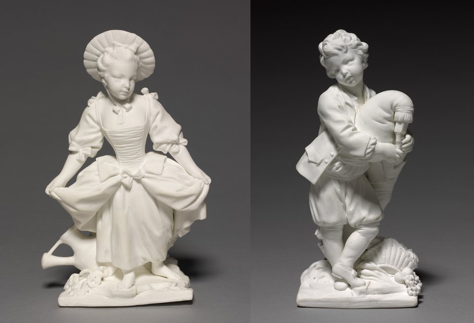
Two small white porcelain figures on a gray background: a girl in a wide bonnet holding out her full skirt, and a boy in a jacket and breeches playing the bagpipes
#E5DDD3#D0C8BB#B6AEA0#948B7B
PorcelainThe Dancer and the Bagpiper, Vincennes (1748–52)

A pair of children after designs by François Boucher, modeled by Pierre Blondeau at the Vincennes factory in the first years of biscuit porcelain. Left unglazed, the soft-paste porcelain reads as a warm off-white in the photo, about #E5DDD3: close to bisque in hue, but much grayer and paler in tint.

#E5DDD3#D0C8BB#B6AEA0#948B7B
Source: Cleveland Museum of Art
A white unglazed porcelain bust of a young woman with her hair piled high and a shawl draped over her shoulders, on a fluted deep blue and white pedestal with gold swags and a small oval medallion
#EFEEEF#D6D6D5#B7B7B5#282747
SculptureMadame du Barry, Sèvres biscuit bust (1772)

A portrait bust of Madame du Barry, modeled by Augustin Pajou and made at Sèvres in biscuit, set on a glazed, enameled and gilded pedestal, so the two finishes sit side by side. The unglazed bust reads as a cool white in the photo, about #EFEEEF, with gray shadows. The deep blue is the glazed pedestal.

#EFEEEF#D6D6D5#B7B7B5#282747
Source: The Met

Palettes are sampled in-house.

Questions

What color is bisque?

A pale, peachy cream. Its code is #FFE4C4 (RGB 255, 228, 196), the CSS keyword bisque. In HSL it is about 33°, 100%, 88%.

Why is the color called bisque?

Bisque is another word for biscuit, the potter’s name for clay or porcelain fired without a glaze. The color name was in fashion use by 1905. No source we found says exactly which bisque it meant: white porcelain figures, or the skin-tinted porcelain of dolls’ heads.

Is bisque named after the soup?

Not as far as any source shows. Dictionaries treat the cream soup as a separate word borrowed from French, and none links it to the color. The color shares its name with bisque porcelain.

Is real bisque porcelain the same color as the code?

No. Biscuit porcelain is usually white, with a matte surface like marble. Museum photos of 18th-century French biscuit figures sample at about #E5DDD3 to #EFEEEF, much paler and grayer than #FFE4C4.

What is the difference between bisque and blanched almond?

Both are CSS keywords from the same 1989 list, and they sit next to each other in it. Bisque (#FFE4C4) is a touch deeper and pinker. Blanched almond (#FFEBCD) is paler and a little yellower.

Can I use bisque for text?

Only on a dark background. On white, bisque has a contrast of about 1.2 to 1, far too low to read. Dark text on a bisque background reads very well: black on bisque is about 17 to 1.

What colors go with bisque?

Deep cobalt and slate blue for contrast, terracotta for warmth, espresso brown for text and dark themes, and the darker bisque steps for a calm, tonal look.