Powder blue

A pale blue named after powdered blue glass, once sold to whiten the laundry.

Overview

Powder blue is a pale blue with a slight green cast. Its web code is #B0E0E6, the CSS color named powderblue: plenty of green and blue with a fair amount of red, which makes it light and soft. It is almost the same as the CSS color lightblue, #ADD8E6.

The name is older than the color. For centuries powder blue was a product: powdered smalt, a blue glass colored with cobalt, sold by the barrel to blue the laundry and make linen look whiter. In China, “powder blue” porcelain was made by blowing powdered cobalt onto the pot through a bamboo tube. Both are deep blues.

Powder blue became the name of a pale color only in the 1890s. In 1930, the authors of a standard color dictionary guessed it had been matched from a pale grade of smalt. The web code comes from a list of color names drawn up for computer screens in the late 1980s, by a programmer who tuned many of its colors on his own monitor.

Powder blue is airy and calm. It pairs well with navy, gray, sand and soft pinks, and it needs dark text.

HEX#B0E0E6
RGBrgb(176, 224, 230)
HSLhsl(187, 52%, 80%)
HSV187°, 23%, 90%
CMYK23, 3, 0, 10
OKLCHoklch(87.5% 0.050 205.7)
Every code converts from the HEX value #B0E0E6. #B0E0E6 is the CSS keyword powderblue, defined in the CSS Color Module Level 4. It comes from the X11 color list of 1989 and joined the web’s color names in SVG 1.0 (2001). CMYK is a screen-based estimate; print results vary.
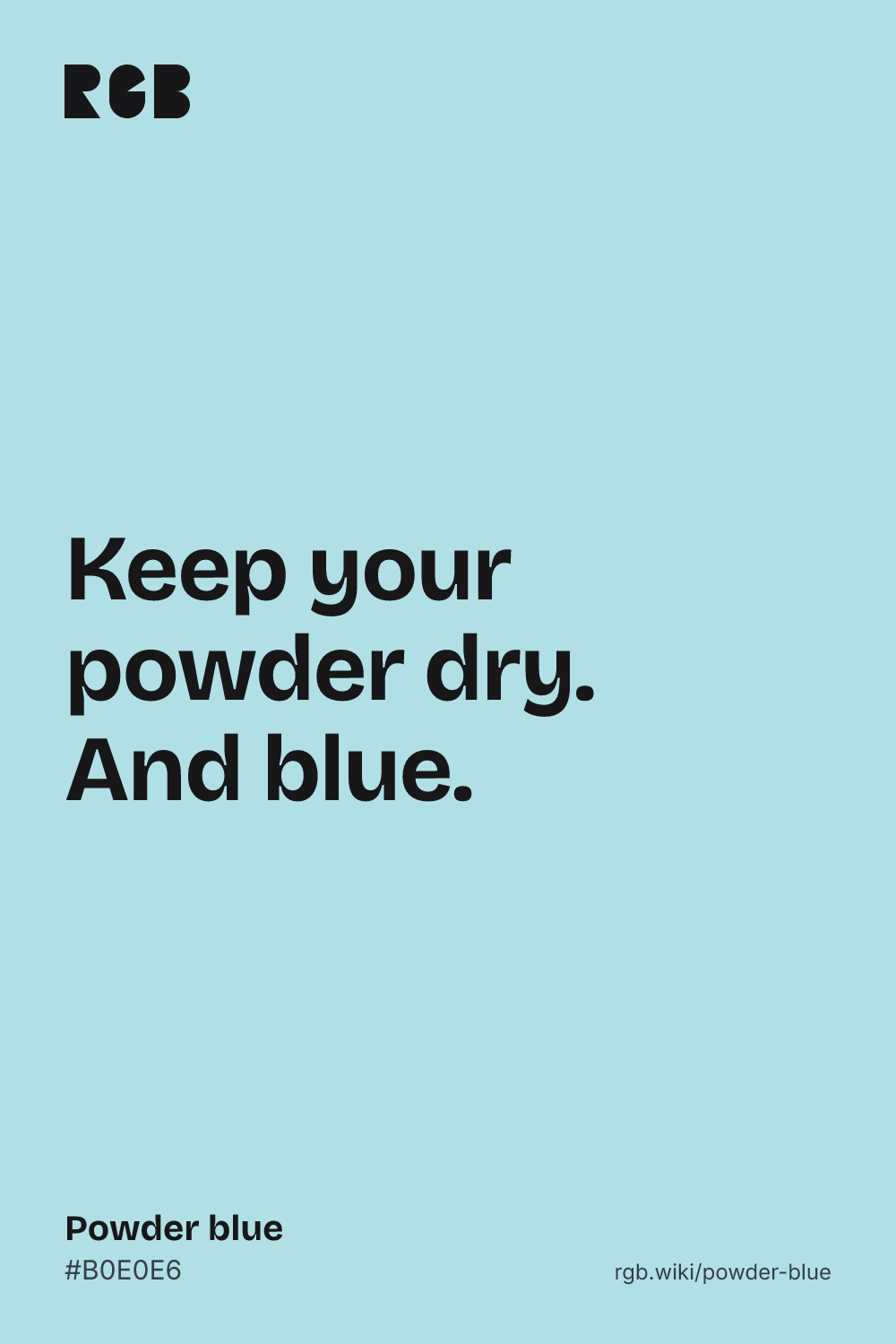
Powder blue color card, hex #B0E0E6: “Keep your powder dry. And blue”

Powder blue on the color map

People’s average powder blue in the xkcd survey is bluer than the web code, beyond the right edge of this view. Maerz and Paul’s powder blue sits outside the outline, to the right and below: grayer, darker and bluer. CSS light blue sits inside it, right next to powder blue. Powder-blue porcelain is a deep cobalt blue, far below this view. The outline is an approximate range, not a measured one.

Shades and tints

Tints with white

Shades with black

Tones with gray

Powder blue sits in the middle. Tints add white, shades add black and tones add gray, in 10% steps out from it. Tap any swatch to copy its code.

Light and dark powder blue

#D0ECF0
Pale powder blueMixed 40% with white. Almost white, with a cool tint.
#B0E0E6
Powder blueThe reference color.
#ADD8E6
Light blueThe CSS keyword lightblue. A touch bluer and darker. See light blue
#6A868A
Dark powder blueMixed 40% with black. A muted gray-blue.
#003399
SmaltPowdered cobalt glass, the deep blue first sold as powder blue. See smalt

Colors that go with powder blue

Pairings that work in rooms, outfits and interfaces.

Powder blue and navy

Crisp and classic. A safe choice for menswear and stationery.

Powder blue and blush

Soft and gentle. Popular for weddings and nurseries.

Powder blue and sand

Calm and sunny, like a beach house.

Powder blue and gray

Cool and modern. Good for clean interfaces.

Powder blue and coral

Warm against cool. Let coral be the accent.

Powder blue and gold

Bright and sporty, with lots of energy.

Color-wheel palettes

Pick a palette to see where its colors sit on the color wheel. The caret marks powder blue. Tap a band to copy its code.

Similar colors

Robin egg blue78%Duck egg blue91%Haint blue81%Ice blue77%Powder blueLight blue89%Columbia blue88%

Lined up by hue around powder blue. Hover a color to see how similar it is.The bar under each name shows how similar it is. Similarity comes from the distance between the two colors in OKLab, a model of how we see color.

Powder blue vs light blue

Powder blue#B0E0E6 · hue 187°
  • A touch greener and lighter
  • Named after powdered blue glass
  • The CSS keyword powderblue
Light blue#ADD8E6 · hue 195°
  • A touch bluer and darker
  • A plain descriptive name
  • The CSS keyword lightblue

Meaning

  • Laundry
  • Porcelain
  • Football
  • Pale sky

Powder blue reads as pale, clean and airy, but its name carries two very different blues: the smalt that whitened laundry, and the deep blown-cobalt glaze of Chinese porcelain. In sport, powder blue is the color of the Los Angeles Chargers. As with most named colors, mood research tests broad hues such as blue, not powder blue itself.

Once a laundry whitener

Historical record

English inventories from the 1600s list powder blue as a product: powdered smalt, used in the laundry far more often than as a paint. A 1675 patent describes making it from waste indigo dust, to make linen look whiter.1
On porcelain, a deep blue

Museum record

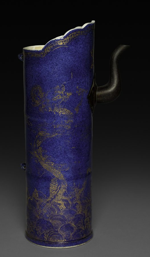
Chinese potters called the powder-blue glaze chuiqing, “blown blue”: powdered cobalt was blown onto the pot through a bamboo cane with fine gauze over one end. These dark blue wares were made for export from the late 1600s.2

The Chargers’ color

Team record

In 2020 the Los Angeles Chargers made Powder Blue and Sunshine Gold their only colors. Their powder blue, #0080C6 in the league’s logo file, is a strong mid blue, much deeper than the web code.3, 4

Sources (4)
  1. Cox, N. & Dannehl, K. (2007). Dictionary of Traded Goods and Commodities 1550–1820, entries “Powder blue” and “Blue starch”. University of Wolverhampton, via British History Online.
  2. Victoria and Albert Museum, “Vase”, porcelain with powder-blue glaze and gilded decoration, Jingdezhen, China, about 1700–10 (O179420).
  3. Los Angeles Chargers (2020). “Los Angeles Chargers introduce updated Bolt mark and new logotype”, March 24, 2020.
  4. National Football League, Los Angeles Chargers logo file (fills #0080C6 and #FFC20E).

History

Powder blue was a product before it was a color: a blue powder for the laundry and a cobalt glaze for porcelain. The pale color name came in the 1890s, and the web code a century later.

  1. 1614

    An English inventory lists powder blue next to blue starch and stone blue, all used to blue the laundry.1

  2. 1675

    An English patent describes making powder blue from waste indigo dust, to make linen look whiter.1

  3. Late 1600s

    Potters at Jingdezhen, China, blow powdered cobalt onto porcelain through a bamboo cane, making the deep powder-blue glaze for export.2

  4. 1894

    First recorded use of “powder blue” as the name of a pale blue.3

  5. 1930

    Maerz and Paul’s A Dictionary of Color finds that paint makers’ powder blues vary, and suggests the color was matched from a pale grade of smalt.3

  6. 1989

    “Powder blue” ships in the X11 color list for computer screens, in Paul Raveling’s revision, tuned on his own monitor.4, 5

  7. 2001

    SVG 1.0 adds “powderblue” to the web’s color names, as #B0E0E6.6

  8. 2020

    The Los Angeles Chargers make Powder Blue and Sunshine Gold their only colors.7

Sources (7)
  1. Cox, N. & Dannehl, K. (2007). Dictionary of Traded Goods and Commodities 1550–1820, entries “Powder blue” and “Blue starch”. University of Wolverhampton, via British History Online.
  2. Victoria and Albert Museum, “Vase”, porcelain with powder-blue glaze and gilded decoration, Jingdezhen, China, about 1700–10 (O179420).
  3. Maerz, A. & Paul, M. R. (1930). A Dictionary of Color. New York: McGraw-Hill. Note on “Powder Blue”, p. 174, and index, p. 202. Internet Archive.
  4. X.Org Foundation, rgb: notes on the alternative color databases and Paul Raveling’s list, which first has “powder blue” at 176 224 230.
  5. Wikipedia, “X11 color names”, history; X11 Release 4 shipped the merged list in December 1989 (X.Org archive).
  6. W3C (2001). Scalable Vector Graphics (SVG) 1.0, recognized color keyword names.
  7. Los Angeles Chargers (2020). “Los Angeles Chargers introduce updated Bolt mark and new logotype”, March 24, 2020.

Powder blue in use

A tall cylindrical porcelain ewer with a dark, speckled blue glaze, gold dragons above gold waves, and a dark metal spout
#363469#2B2857#211C45#675E56
PorcelainEwer with dragons, China (1662–1722)

A porcelain ewer from the Jingdezhen kilns, made under the Kangxi emperor and now at the Cleveland Museum of Art, with gold dragons over a powder-blue glaze. Its blue, about #2B2857, is a deep, speckled cobalt: the first powder blue, nothing like the pale web code.

#363469#2B2857#211C45#675E56
Source: Cleveland Museum

Logos belong to their owners and are shown unaltered, only to show where each palette comes from. Palettes are sampled in-house.

Questions

What color is powder blue?

A pale blue with a slight green cast. The web code is #B0E0E6 (RGB 176, 224, 230), the CSS color named powderblue.

Why is it called powder blue?

After powder blue the product: powdered smalt, a blue glass colored with cobalt, sold for centuries to blue the laundry. The name came to mean a pale blue in the 1890s.

What is the difference between powder blue and baby blue?

Baby blue (#89CFF0) is stronger and a little darker. Powder blue (#B0E0E6) is paler, softer and slightly greener.

Is powder blue the same as light blue?

Almost. In CSS, powderblue is #B0E0E6 and lightblue is #ADD8E6. Light blue is a touch bluer and darker, but side by side they are hard to tell apart.

What colors go with powder blue?

Navy and gray for a crisp look, sand and white for a beach feel, and blush or coral for warm contrast.

What is powder-blue porcelain?

A Chinese glaze called chuiqing, “blown blue”, made by blowing powdered cobalt onto the pot through a bamboo cane. It fires to a deep, speckled blue, much darker than the web color.