A soft, grayish pale blue whose name first belonged to a woad dye.
Overview
Pastel blue is a soft, pale blue with a gray cast. The code used here, #AEC6CF, is the one most color lists give: red, green and blue all fairly high and close together, which makes it light and muted. It sits close to blue-gray.
No standard defines pastel blue, so sites give different codes. Pastels in general are pale, softened colors, named after the chalky art medium. In 1930, the authors of a standard color dictionary traced that sense to a vogue for pale, washed-out pastel drawings in the 1880s, which left “all the light, grayed colors of a certain class” known as pastel shades.
The name itself is older. Pastel is a French name for woad, a plant that gives a blue dye, and in 1789 “pastel blue” meant the grayish blue of woad-dyed cloth. By the 1950s, makers used it for pale blues of several kinds, and people today picture a much stronger blue than this code.
Pastel blue is gentle and easy to live with. It suits spring designs, bedrooms and calm interfaces, and it needs dark text.
HEX
#AEC6CF
RGB
rgb(174, 198, 207)
HSL
hsl(196, 26%, 75%)
HSV
196°, 16%, 81%
CMYK
16, 4, 0, 19
OKLCH
oklch(81.1% 0.029 222.4)
Every code converts from the HEX value #AEC6CF. #AEC6CF is the pastel blue most color lists and websites use, but no standard defines it. Pastel blue has no CSS keyword. Merriam-Webster defines it as a pale blue, and the 1955 ISCC-NBS dictionary files samples named pastel blue under four groups, from very pale blue to grayish blue. Treat this code as typical, not official. CMYK is a screen-based estimate; print results vary.
Pastel blue on the color map
LighterDarker
People’s average pastel blue in the xkcd survey is a much stronger, more purple blue, at the right edge of this view. The dictionary’s pale blue sits just outside the outline, below and to the right: darker and a little bluer. The textile card’s very pale blue sits inside it, a little lighter. Maerz and Paul’s woad-dyed pastel blue is far darker, below this view. The outline is an approximate range, not a measured one.
Shades and tints
Tintswith white
Shadeswith black
Toneswith gray
Pastel blue sits in the middle. Tints add white, shades add black and tones add gray, in 10% steps out from it. Tap any swatch to copy its code.
Light and dark pastel blue
#DFE8EC
Pale pastel blueMixed 60% with white. A whisper of blue for backgrounds.
#B0E0E6
Powder blueThe CSS keyword powderblue. Lighter, clearer and a little greener. See powder blue
#AEC6CF
Pastel blueThe reference color.
#7E9CB8
Dusty blueDarker and a little bluer, with the same muted feel. See dusty blue
#5A7BA6
WoadThe plant dye whose French name, pastel, gave pastel blue its name. See woad
Colors that go with pastel blue
Pairings that work in rooms, outfits and interfaces.
Pastel blue and blush
The classic pastel pair. Soft and sweet.
Pastel blue and navy
Calm, with a strong anchor. Good for stationery and finance.
Pastel blue and butter yellow
Bright and springlike. Good for Easter and kids’ brands.
Pastel blue and mint
All pastels, light and fresh. Keep one dark color for text.
Pastel blue and terracotta
Warm earth against a cool sky.
Pastel blue and charcoal
Muted and modern. Strong enough for interfaces.
Color-wheel palettes
Pick a palette to see where its colors sit on the color wheel. The caret marks pastel blue. Tap a band to copy its code.
Lined up by hue around pastel blue. Hover a color to see how similar it is.The bar under each name shows how similar it is. Similarity comes from the distance between the two colors in OKLab, a model of how we see color.
Pastel blue vs baby blue
Pastel blue#AEC6CF · hue 196°
Grayer and softer
No standard code
Named after a dye, then the art medium
Baby blue#89CFF0 · hue 199°
Clearer and more saturated
About the same lightness
Almost the same hue
Meaning
Chalk pastels
Woad dye
Soft sky
The 1980s
No standard
Pastel blue reads as soft, calm and airy, a spring sky seen through haze. Like all pastels, it takes its meaning from the chalky art medium, by way of a 19th-century fashion for pale drawings. It had a moment on 1980s television, when pastel sets and suits defined Miami Vice. As with most named colors, mood research tests broad hues such as blue, not pastel blue itself.
First the name of a woad blue
Historical record
In 1930, Maerz and Paul wrote that pastel blue first meant the blue of woad, a dye plant called pastel in French, and dated the name to 1789. The 1955 ISCC-NBS dictionary files their pastel blue as a grayish blue, far darker than today’s code.1, 2
A name with no fixed color
Dictionary record
Besides Maerz and Paul’s woad blue, the 1955 ISCC-NBS dictionary files samples named pastel blue under three more groups: very pale blue on the national textile color card, and light greenish blue and pale blue in a merchandise color dictionary.2
Pastels on 1980s TV
Press account
Miami Vice, which began in 1984, set its stars against pastel backdrops under a famous production rule: “No earth tones.” Demand for lighter pastels in men’s clothing rose during the show’s run.3, 4
Sources (4)
Maerz, A. & Paul, M. R. (1930). A Dictionary of Color. New York: McGraw-Hill. Note on “Pastel”, p. 172, and index, p. 201. Internet Archive.
Kelly, K. L. & Judd, D. B. (1955). The ISCC-NBS Method of Designating Colors and a Dictionary of Color Names. National Bureau of Standards Circular 553. Internet Archive.
Wikipedia, “Miami Vice”, citing Time (1985) and The Washington Post (2006).
History
Pastel blue began as the color of a dye and became the name of a whole family of pale, soft blues.
1500s
Toulouse grows rich on woad, the blue dye plant also known in French as pastel.1, 2
1700s
Pastel drawing, with sticks of powdered pigment and white filler, flourishes in Europe.3
1789
First recorded use of “pastel blue”, for the color of woad-dyed cloth.2
1880s
A vogue for pale, washed-out pastel drawings leads people to link pastel blue with the crayons. Pastel starts to mean any soft, pale color.2
1930
Maerz and Paul’s A Dictionary of Color calls the crayon link a mistake, but a convenient one: light, grayed colors are now “pastel shades”.2
1955
The ISCC-NBS dictionary finds samples named pastel blue ranging from very pale blue to grayish blue.4
1984
Miami Vice debuts on NBC, with pastel sets and a “No earth tones” rule.5, 6
2010
In the xkcd color survey, people’s average pastel blue is a much stronger blue, #A2BFFE.7
Sources (7)
Wikipedia, “Isatis tinctoria” (woad), history of the Toulouse woad trade.
Maerz, A. & Paul, M. R. (1930). A Dictionary of Color. New York: McGraw-Hill. Note on “Pastel”, p. 172, and index, p. 201. Internet Archive.
The Metropolitan Museum of Art (2020). “Pastel”, Materials and Techniques.
Kelly, K. L. & Judd, D. B. (1955). The ISCC-NBS Method of Designating Colors and a Dictionary of Color Names. National Bureau of Standards Circular 553. Internet Archive.
Wikipedia, “Miami Vice”, citing Time (1985) and The Washington Post (2006).
Munroe, R. (2010). “Color survey results”. xkcd blog. The survey’s color averages are released as CC0 data.
Pastel blue in use
#7395A6#9A9FA0#AFAEAB#C6C1BC
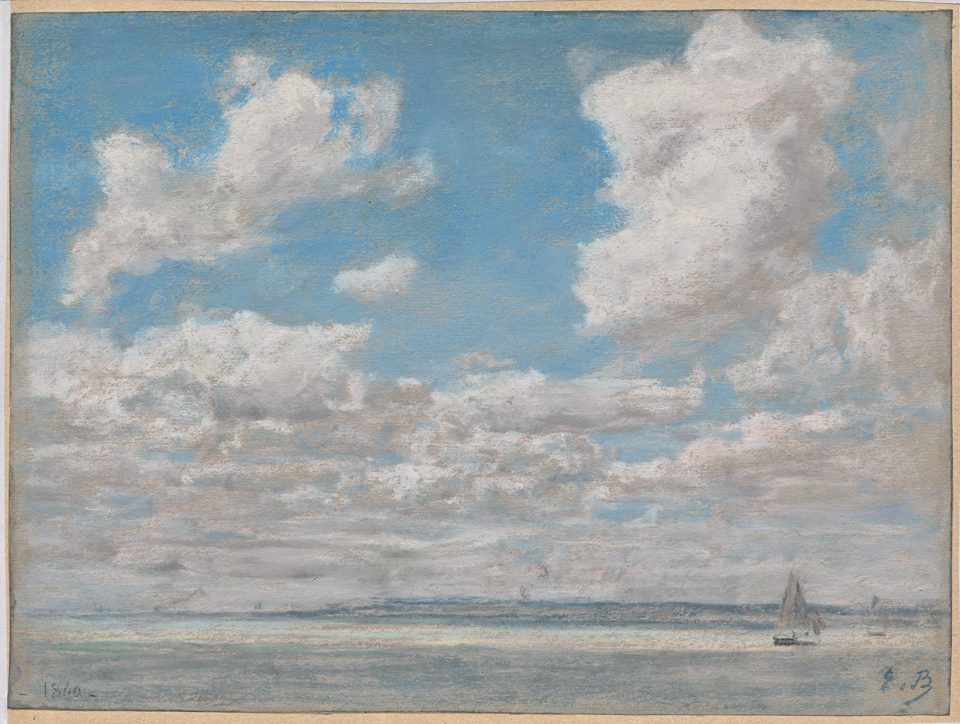
DrawingSeascape with Open Sky by Eugène Boudin (1860)
A pastel sky study by the French painter who encouraged the young Monet to paint outdoors, now at the Cleveland Museum of Art. The critic Charles Baudelaire praised these seascape pastels for their “meteorological beauty”. The blue of the sky, about #7395A6, has almost the same hue as the web code but is darker and grayer.
#7395A6#9A9FA0#AFAEAB#C6C1BC
Source: Cleveland Museum
Source
Sampled from the Cleveland Museum of Art’s photograph (2020.116), released as CC0 (public domain). Colors in a photo shift with the lighting, so read the codes as close, not exact.
Palettes are sampled in-house.
Questions
What color is pastel blue?
A soft, pale blue with a gray cast. The most common code is #AEC6CF (RGB 174, 198, 207), but no standard defines it.
What is the hex code for pastel blue?
There is no official one. #AEC6CF is the code most color lists use. Other sources differ: people’s average pastel blue in the xkcd survey is a much stronger #A2BFFE.
What makes a color pastel?
High lightness and low saturation: a pale color softened toward gray or white. The name comes from pastel, an art medium of powdered pigment mixed with a white filler and a little binder.
What is the difference between pastel blue and baby blue?
Baby blue (#89CFF0) is clearer and more saturated. Pastel blue (#AEC6CF) has almost the same light sky-blue hue but is grayer and softer.
Why is it called pastel blue?
Pastel is a French name for woad, a blue dye plant, and pastel blue first meant the color of woad-dyed cloth. In the 1880s people began to link the name with pastel crayons, and pastel came to mean any soft, pale color.
What colors go with pastel blue?
Blush pink and butter yellow for a soft pastel scheme, navy or charcoal for contrast, and terracotta for warmth.