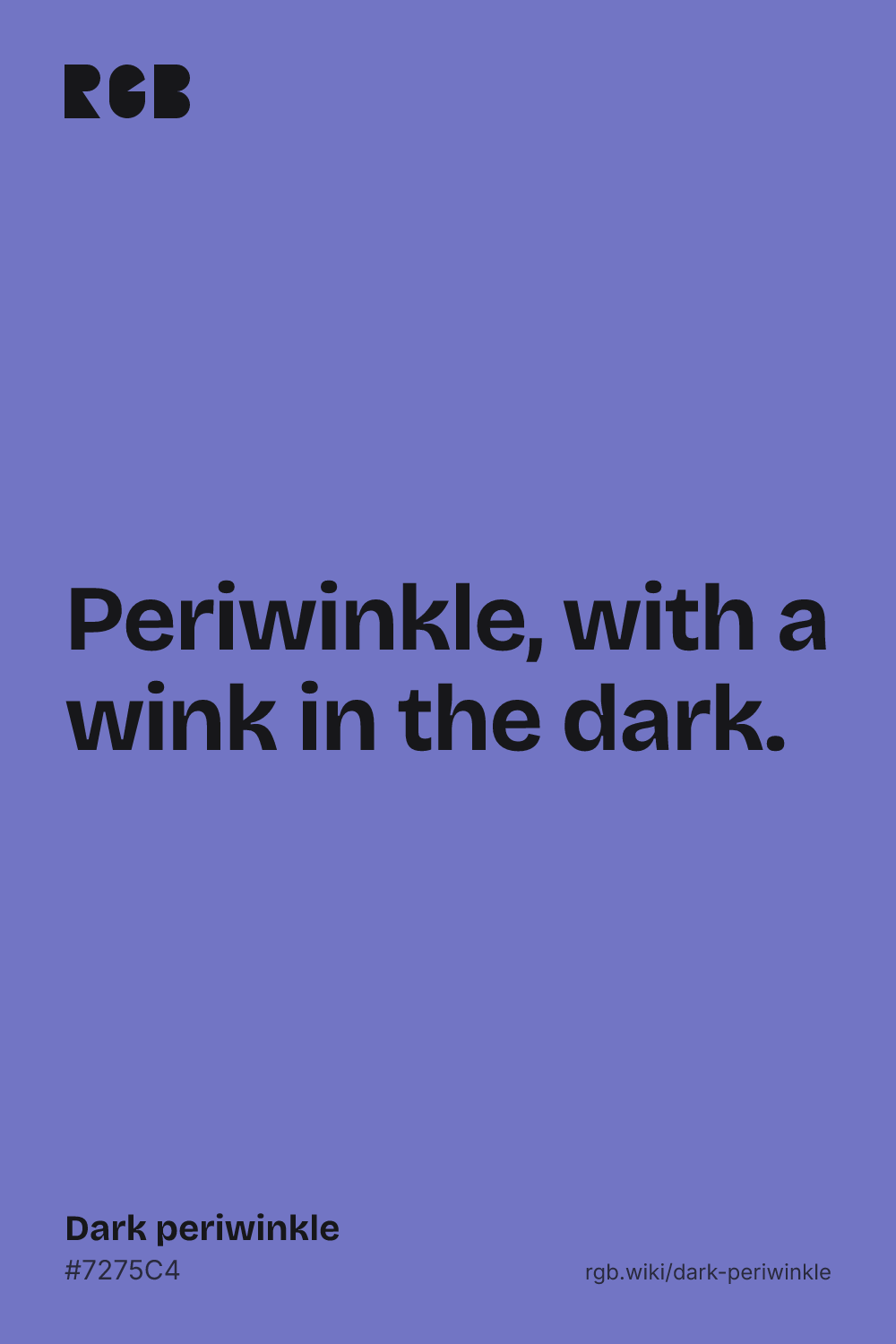
A deeper, stronger periwinkle: a soft blue with a violet lean.
Overview
Dark periwinkle is a medium blue with a violet lean, a deeper take on periwinkle. Its code, #7275C4, has red and green almost equal at under half strength and blue at about three quarters, which gives a soft blue-violet.
No standard defines dark periwinkle, and no color dictionary we checked lists the name. Yet it sits close to what people mean by plain periwinkle. In the xkcd color survey, the average periwinkle, #8E82FE, and the average dark periwinkle, #665FD1, are both strong blue-violets, far deeper than the classic #CCCCFF.
Older color dictionaries also pictured periwinkle as a mid-tone. The 1955 ISCC-NBS dictionary files Maerz and Paul’s periwinkle as a pale to grayish purplish blue, and the Standard Color Card of America’s periwinkle as a light purplish blue, around #8791BF: a little lighter and grayer than dark periwinkle.
Dark periwinkle is calm and friendly, and strong enough for buttons and accents. White text on it is readable only at large sizes; near-black text works better. It pairs well with butter yellow, peach, navy and silver gray.
HEX
#7275C4
RGB
rgb(114, 117, 196)
HSL
hsl(238, 41%, 61%)
HSV
238°, 42%, 77%
CMYK
42, 40, 0, 23
OKLCH
oklch(59.5% 0.119 280.5)
Every code converts from the HEX value #7275C4. #7275C4 is a common web value for dark periwinkle, but no standard defines it, and no color dictionary we checked lists the name. People’s average dark periwinkle in the xkcd color survey is a little darker and more vivid, #665FD1. Treat this code as typical, not official. CMYK is a screen-based estimate; print results vary.
Dark periwinkle on the color map
LighterDarker
People’s average dark periwinkle sits just below the reference and their plain periwinkle just above it, both inside the outline: in everyday speech the two names overlap. The dictionary periwinkles sit a little lighter and to the left, also inside the outline, though they are much grayer. The classic pale periwinkle, #CCCCFF, is far above, near the top edge of this view. The outline is an approximate range, not a measured one.
Shades and tints
Tintswith white
Shadeswith black
Toneswith gray
Dark periwinkle sits in the middle. Tints add white, shades add black and tones add gray, in 10% steps out from it. Tap any swatch to copy its code.
Light and dark dark periwinkle
#CCCCFF
PeriwinkleThe pale classic periwinkle, with a page of its own. See periwinkle
#8E82FE
Bright periwinklePeople’s average periwinkle in the xkcd survey: lighter and more vivid.
#7275C4
Dark periwinkleThe reference color.
#505289
Deep periwinkleMixed 30% with black. A dusky blue-violet for text and borders.
Colors that go with dark periwinkle
Pairings that work in rooms, outfits and interfaces.
Dark periwinkle and butter yellow
Near-opposites. Cheerful and springlike.
Dark periwinkle and navy
Tonal and crisp. Good for uniforms and stationery.
Dark periwinkle and peach
Warm meets cool. Soft and friendly.
Dark periwinkle and silver
Quiet and modern. Good for interfaces.
Periwinkle, light and dark
One hue from pale to deep. Calm and coordinated.
Dark periwinkle and sage
Garden colors. Soft and natural.
Color-wheel palettes
Pick a palette to see where its colors sit on the color wheel. The caret marks dark periwinkle. Tap a band to copy its code.
Lined up by hue around dark periwinkle. Hover a color to see how similar it is.The bar under each name shows how similar it is. Similarity comes from the distance between the two colors in OKLab, a model of how we see color.
Dark periwinkle vs periwinkle
Dark periwinkle#7275C4 · hue 238°
Medium depth, strong enough for accents
Close to what people call periwinkle
No standard code
Periwinkle#CCCCFF · hue 240°
Pale and airy, a pastel
The classic web code for periwinkle
Named after the periwinkle flower
Meaning
Periwinkle flower
Calm
Friendliness
Color dictionaries
Baseball
Dark periwinkle feels calm and friendly, like periwinkle with more confidence. It keeps blue’s steadiness, with a little of violet’s warmth. In 1997 periwinkle even became a baseball color, for the Anaheim Angels. Like most named colors, dark periwinkle has not been studied on its own: the research below tests purple-blue hues and dark colors in general, or how people name periwinkle.
Purple-blue was the least arousing hue
One lab study
In a 1994 study with Munsell color chips, purple-blue was among the most pleasant hues and, with yellow-red, the least arousing. Darker colors were rated more dominant. Dark periwinkle is a purple-blue, but it was not tested by name.1
Blues remind people of things they like
Tested on blue only
A 2010 study found that people like colors linked to things they like, such as blues with clear skies and clean water. Periwinkle was not tested by name.2
People’s periwinkle is darker
Online survey
In the xkcd color survey, where people named over five million colors online, the average periwinkle (#8E82FE) was a strong blue-violet, far from the pale classic code, #CCCCFF. The average dark periwinkle (#665FD1) was only a step deeper.3
Sources (3)
Valdez, P. & Mehrabian, A. (1994). Effects of color on emotions. Journal of Experimental Psychology: General, 123(4), 394–409. doi:10.1037/0096-3445.123.4.394
Palmer, S. E. & Schloss, K. B. (2010). An ecological valence theory of human color preference. Proceedings of the National Academy of Sciences, 107(19), 8877–8882. doi:10.1073/pnas.0906172107
Munroe, R. (2010). “Color survey results”. xkcd blog. The survey’s color averages are released as CC0 data.
History
Periwinkle was a plant name for centuries before it was a color. “Dark periwinkle” is newer still: no color dictionary we checked lists it, and its best record is a 2010 online survey.
Before 1100s
Old English has a name for the plant, perwince, from the Latin pervinca.1
1922
First recorded use of “periwinkle” as a color name in English.2
1930
Maerz and Paul’s A Dictionary of Color prints a periwinkle sample on its plate 43.3
1941
The Textile Color Card Association’s Standard Color Card of America (9th edition) includes a Periwinkle.3
1955
The ISCC-NBS dictionary files Maerz and Paul’s periwinkle as pale and grayish purplish blue, and the textile card’s as light purplish blue: mid-tones, much deeper than today’s pale web periwinkle.3
1997
Baseball’s Anaheim Angels unveil uniforms with navy, periwinkle and red as their main colors, including an alternate navy jersey with periwinkle sleeves.4
2010
In the xkcd color survey, people’s average periwinkle comes out at #8E82FE and their dark periwinkle at #665FD1.5
Sources (5)
Merriam-Webster, “periwinkle”, etymology and first known use.
Oxford English Dictionary, 2nd ed. (1989), as cited in Wikipedia, “Periwinkle (color)”.
Kelly, K. L. & Judd, D. B. (1955). The ISCC-NBS Method of Designating Colors and a Dictionary of Color Names. NBS Circular 553, color-name lists for groups 199 (light purplish blue), 203 (pale purplish blue) and 204 (grayish purplish blue), citing Maerz and Paul (1930) and the Standard Color Card of America, 9th ed. (1941). NIST PDF.
Munroe, R. (2010). “Color survey results”. xkcd blog. The survey’s color averages are released as CC0 data.
Questions
What color is dark periwinkle?
A medium blue with a violet lean. A common code is #7275C4 (RGB 114, 117, 196), but no standard defines it.
What is the difference between dark periwinkle and periwinkle?
The classic periwinkle code, #CCCCFF, is a pale pastel. Dark periwinkle (#7275C4) is much deeper and stronger. In everyday speech the two overlap: people’s average periwinkle in the xkcd survey is far closer to dark periwinkle than to #CCCCFF.
Is dark periwinkle blue or purple?
A blue with a violet lean: its blue is far stronger than its red and green, which are almost equal. Color dictionaries file periwinkles among the purplish blues.
What colors go with dark periwinkle?
Butter yellow and peach for warm contrast, navy and silver gray for a crisp look, and pale periwinkle for a tonal scheme.
Can you put white text on dark periwinkle?
Only at large sizes. White on #7275C4 has a contrast ratio of about 4.2 to 1, below the 4.5 to 1 that web accessibility guidelines ask for in body text. Near-black text reads better.
Where does the name periwinkle come from?
From the periwinkle plant, a creeping evergreen with blue-violet flowers. English has had the plant name since before the 12th century, and periwinkle became a color name in 1922.