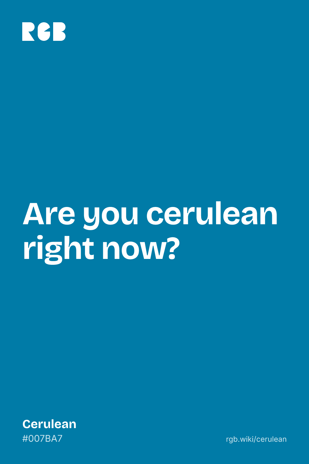
A deep sky blue with a touch of green, named after the Latin word for the heavens.
Overview
Cerulean is a deep sky blue with a hint of green. The code used here is #007BA7: no red, about half green and two-thirds blue.
The word comes from the Latin caeruleus, “dark blue”, which most likely goes back to caelum, “sky”. It has been an English color word since the 1590s, and writers still reach for it to describe skies and tropical water.
Painters know cerulean blue as a pigment: a cobalt and tin compound sold to artists from the 1850s. It is greener than cobalt blue, and Monet used it when it was still new, in 1877.
Sources disagree on the exact shade. The 1930 color dictionary this code is credited to treated cerulean as a lighter sky blue. Either way, cerulean pairs well with sand, coral and white, and with navy for depth.
HEX
#007BA7
RGB
rgb(0, 123, 167)
HSL
hsl(196, 100%, 33%)
HSV
196°, 100%, 65%
CMYK
100, 26, 0, 35
OKLCH
oklch(54.8% 0.112 232.4)
Every code converts from the HEX value #007BA7. #007BA7 is the cerulean listed on Wikipedia, credited to Maerz and Paul’s A Dictionary of Color (1930). We could not confirm it. The 1955 ISCC-NBS dictionary, which sorted that book’s colors into standard groups, puts its cerulean with the light blues, as the same color as sky blue, and its cerulean blue with the vivid greenish blues, close to this code. CMYK is a screen-based estimate; print results vary.
Cerulean on the color map
LighterDarker
People’s average cerulean in the xkcd survey is brighter and a little bluer than the code. The dictionary’s cerulean, a light sky blue, sits higher up, above the outline. The outline is an approximate range, not a measured one.
Shades and tints
Tintswith white
Shadeswith black
Toneswith gray
Cerulean sits in the middle. Tints add white, shades add black and tones add gray, in 10% steps out from it. Tap any swatch to copy its code.
Light and dark cerulean
#B2D7E5
Pale ceruleanMixed 70% with white. An airy, watery blue.
#70A3CC
Dictionary ceruleanMaerz and Paul’s cerulean as the ISCC-NBS dictionary groups it: a light blue, the same as sky blue.
#007BA7
CeruleanThe reference color.
#004A64
Dark ceruleanMixed 40% with black. A deep sea blue.
Colors that go with cerulean
Pairings that work in rooms, outfits and interfaces.
Cerulean and coral
Near-opposites: cool sea and warm coral. Bright and beachy.
Cerulean and sand
Sea and shore. Relaxed and natural.
Cerulean and white
Crisp and clean. Good for interfaces and summer branding.
Cerulean and navy
Tonal and deep. A calm pick for corporate work.
Cerulean and mustard
Retro and bold. A mid-century favorite.
Cerulean and blush
Soft and fresh. Suits spring and weddings.
Color-wheel palettes
Pick a palette to see where its colors sit on the color wheel. The caret marks cerulean. Tap a band to copy its code.
Lined up by hue around cerulean. Hover a color to see how similar it is.The bar under each name shows how similar it is. Similarity comes from the distance between the two colors in OKLab, a model of how we see color.
Cerulean vs azure
Cerulean#007BA7 · hue 196°
Darker, with a hint of green
From the Latin word for sky
Also a painters’ pigment
Azure#007FFF · hue 210°
Brighter and bluer
From the Persian word for lapis lazuli
No green lean
Meaning
Sky
Sea
Travel
Painting
Fashion
Cerulean is the blue of clear skies and warm, shallow seas, and the word still carries that sense of open air and holidays. It is also a painter’s color, greener than cobalt blue. Since 2006 it has been a byword for how fashion trends spread, thanks to one film speech. As with most named colors, mood research tests broad hues such as blue, not cerulean itself.
Named after the sky
Word history
Cerulean comes from the Latin caeruleus, “dark blue”, which most likely comes from caelum, “sky”. Merriam-Webster defines it as resembling the blue of the sky and notes that it shows up most in literature, especially travel writing.1
Monet’s new greenish blue
Lab analysis
When Monet painted the Gare Saint-Lazare in 1877, cerulean blue was a new pigment. Analysis at the National Gallery in London found it mixed with cobalt blue in most of the painting’s blues, and almost pure in the shadows of the station roof. Its greenish tone probably let it replace Prussian blue.2
A fashion lesson, partly made up
Film history
In The Devil Wears Prada (2006), Miranda Priestly traces a bargain cerulean sweater back to designer runways. The screenwriter later said Meryl Streep picked cerulean from a list of blues, and that much of the fashion history in the speech was invented.3
Sources (3)
Merriam-Webster, “cerulean”, definition, etymology and usage note.
Roy, A. (1985). The palettes of three Impressionist paintings. National Gallery Technical Bulletin, 9. National Gallery, London.
Cerulean was a poet’s word for the sky long before it was a paint. The pigment arrived in the 19th century and went straight onto Impressionist canvases.
1590
First recorded use of “cerulean” as a color name in English, from the Latin caeruleus.1, 2
1789
Swiss chemist Albrecht Höpfner heats cobalt and tin oxides together and gets a blue, the compound later sold as cerulean blue.2
1859
An advertisement in The Times of London offers “Caeruleum, a new permanent color prepared for the use of artists”.2
1877
Monet uses the new cerulean blue in The Gare Saint-Lazare, mixed with cobalt blue.3
1955
The ISCC-NBS dictionary of color names records Maerz and Paul’s cerulean (1930) as a light blue, the same as sky blue, and their cerulean blue as a vivid greenish blue.4
2006
The Devil Wears Prada makes cerulean famous with Miranda Priestly’s speech about a blue sweater.5
Sources (5)
Merriam-Webster, “cerulean”, definition, etymology and usage note.
Wikipedia, “Cerulean”, citing Maerz and Paul’s A Dictionary of Color (1930) and Eastaugh et al., The Pigment Compendium (2004).
Roy, A. (1985). The palettes of three Impressionist paintings. National Gallery Technical Bulletin, 9. National Gallery, London.
Kelly, K. L. & Judd, D. B. (1955). The ISCC-NBS Method of Designating Colors and a Dictionary of Color Names. National Bureau of Standards Circular 553. PDF at NIST.
A deep sky blue with a hint of green. The code used here is #007BA7 (RGB 0, 123, 167). Some sources use a lighter, softer sky blue.
What is the difference between cerulean and azure?
Azure (#007FFF) is brighter and bluer, with no green lean. Cerulean (#007BA7) is darker and slightly greenish. Cerulean comes from the Latin word for sky, azure from the Persian word for lapis lazuli.
Is cerulean blue or green?
Blue. It leans a little toward green, and cerulean blue paint is greener than cobalt blue, but dictionaries define cerulean as the blue of the sky.
What colors go with cerulean?
Coral for warm contrast, sand and white for a fresh seaside look, navy for something deep and calm, and mustard for a retro feel.
Why is it called cerulean?
From the Latin caeruleus, “dark blue”, which most likely comes from caelum, “sky”. It has been used as a color word in English since the 1590s.
What is cerulean blue paint?
A pigment made from cobalt and tin oxides. It was first made in 1789, but artists’ suppliers only began selling it around 1860, and it caught on in the 1870s once it came as oil paint. It is a stable, slightly greenish blue.