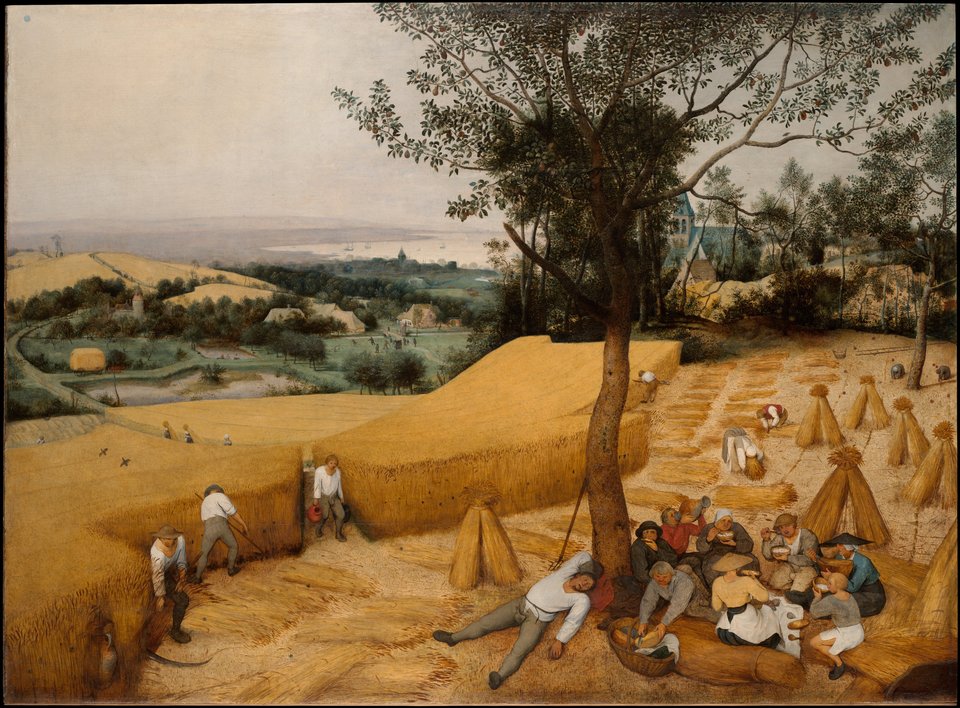
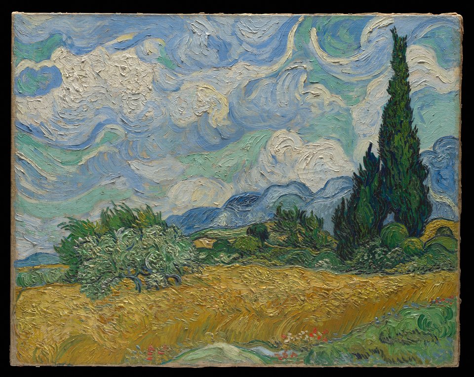
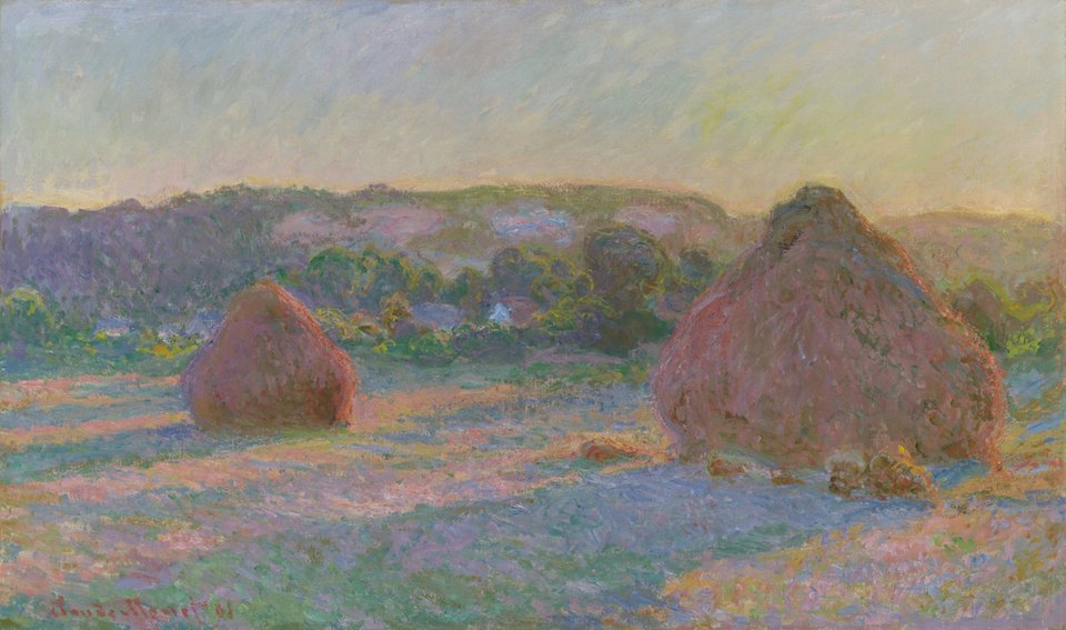
Wheat is a pale, golden beige. Its code, #F5DEB3, is the CSS keyword wheat: red near full strength, green a little lower and blue lower again, which tints white toward a soft gold. It looks more like flour or pale straw than a field at harvest. In museum photos, the ripe wheat in Bruegel’s The Harvesters samples around #CF9746, a deep gold, and the people in the xkcd color survey picked a brighter, yellower #FBDD7E for “wheat”.
The code itself came from a complaint. The X Window System’s first color list, in 1987, defined wheat as 216 216 191, a grayish pale yellow (#D8D8BF). When Paul Raveling retuned the list on his own monitor in 1989, he wrote that some old values had been “obnoxious enough to bring complaints from users (like ‘That’s Wheat???!!!’)”. His new wheat, 245 222 179, is the one the web adopted in 2001 and CSS still uses.
The name is much older than any screen. The word wheat goes back to Old English, and Merriam-Webster says the grain was probably named from the stem of “white”, for its pale ears or flour. As a color name, Maerz and Paul’s 1930 A Dictionary of Color records it from 1711. The 1955 ISCC-NBS dictionary files their wheat sample as a pale to moderate orange yellow, from about #FAD6A5, close to the web code, to #E3A857.
On screens, wheat makes a warm page background. Black text on it has a contrast of about 16:1, while white text manages only 1.3:1, so use dark text. It pairs well with navy, olive and deep brown. Next to navajo white it is a little grayer and more golden; next to beige it is warmer and deeper.