Snow is white with the faintest warm, pinkish tint. Its code is #FFFAFA: red at full strength, with green and blue just below it at 250 out of 255. On its own it passes for plain white. Beside a cool white such as ghost white it looks warm, even faintly rosy. The name is the CSS keyword snow, which came to computers in 1989 as the first entry in a list of light colors copied from a paint maker’s samples.
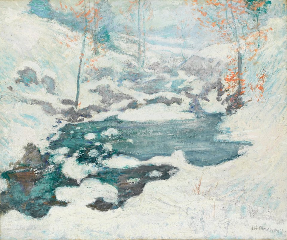
Real snow is white for a different reason than paint. Ice is clear, but snow is a heap of tiny ice grains with air between them. Light changes direction at every surface between ice and air, and ice absorbs almost no visible light, so nearly all of it finds its way back out. Clean snow reflects more than 98% of visible light, every color about equally, and that even return is what we see as white.
Snow is not always white. Look into a deep hole in a snowbank, or at glacier ice, and the light inside is blue: on a long path through ice, a little red is absorbed at each step and only blue survives. In summer, high snowfields can turn pink or red where snow algae bloom, the “watermelon snow” noticed since Aristotle. The red pigment that shields the algae from sunlight also darkens the snow, so it melts faster.
On screens, snow makes a page or card background that feels soft rather than stark. Black text on it has a contrast of 20.3:1, while white text is unreadable. Pair it with navy or charcoal for crisp text, with glacier blues for a winter look, or with rose for warmth. Next to white smoke, a neutral gray, it is lighter and slightly warmer.