Floral white is white with the faintest warm, creamy tint. Its code is #FFFAF0: red at full strength, green at 250 and blue at 240, so it tips white a hair toward cream. On its own it passes for plain white; beside ghost white it looks warm, and beside ivory it looks a little peachier and less yellow.
The name is the CSS keyword floralwhite. It reached computers in 1989, in the set of light colors that Paul Raveling copied from a paint maker’s samples for the X Window System’s color list, which the web later adopted. We found no use of “floral white” as a color name before that list. In older print the two words mean something else: a flower pattern on a white ground, as in a 1919 sale of “floral white ground cretonne curtains”.
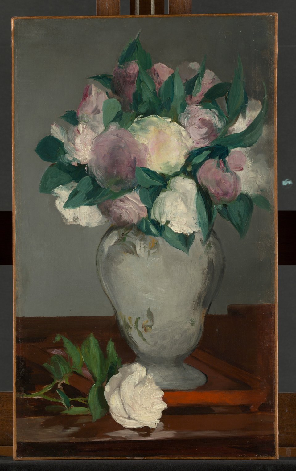
Real white flowers are rarely this clean. Their whiteness comes less from pigment than from light scattered back by air spaces and other structures inside the petal, and many contain pigments that absorb ultraviolet, so a bee, which sees ultraviolet, does not see them as white at all. In paintings, white petals are cream to tan: the peonies in Édouard Manet’s Peonies of 1864–65 photograph at about #CFC2A2.
On screens, floral white makes a soft page or card background, warmer than pure white without reading as cream. Black text on it has a contrast of 20.2:1, while white text vanishes. Pair it with sage and leaf greens, peony pink, navy or warm charcoal. It sits right beside old lace in the 1989 list, and old lace is the same tint taken one step darker.