A dark, slightly cool gray named after the shiny black mineral in pencils.
Overview
Graphite is a dark gray with a faint cool tint. Its usual code is #41424C: red and green almost equal, with blue a little ahead, at about a quarter of full brightness. That small lift in blue gives it a hint of violet and keeps it from looking like a flat gray.
The name comes from the mineral, a pure form of carbon. The German mineralogist Abraham Gottlob Werner named it in 1789, from the Greek graphein, “to write”, because it leaves a mark so easily. Before that it was called black lead or plumbago, because people mistook it for lead ore. Pencil “lead” has no lead in it at all.
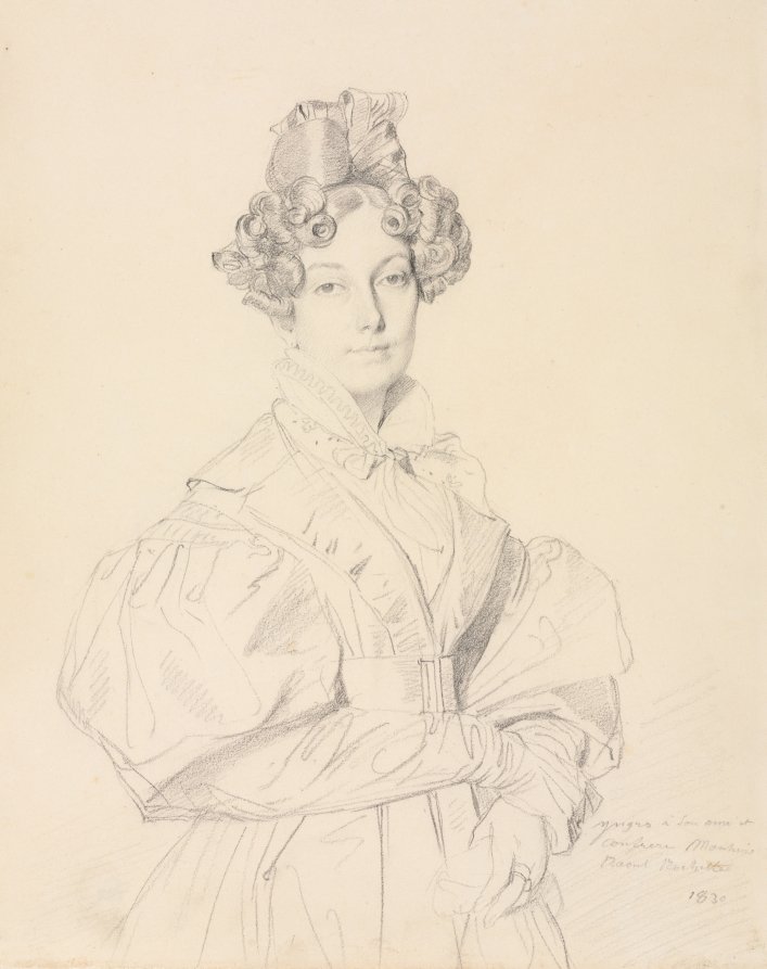
Graphite is black, but it shines like a metal, so it looks silvery gray. Its carbon atoms lie in sheets that slide over each other, which makes it soft enough to rub off on paper. On paper it is lighter again: in a portrait Ingres drew in graphite in 1830, the darkest strokes read about #7F7267 in the museum’s photo, a soft, warm gray, because the cream paper shows through.
Graphite works as a softer stand-in for black in text and interfaces. White text on it reaches a contrast of about 10 to 1. It pairs well with cream, mustard, coral and copper.
HEX
#41424C
RGB
rgb(65, 66, 76)
HSL
hsl(235, 8%, 28%)
HSV
235°, 14%, 30%
CMYK
14, 13, 0, 70
OKLCH
oklch(38.2% 0.017 281.0)
Every code converts from the HEX value #41424C. No color standard defines graphite. #41424C is the code most color lists use. Older dictionaries disagree on its tint: the 1955 ISCC-NBS dictionary files the graphite of Maerz and Paul’s A Dictionary of Color (1930) as dark grayish purple and black, and the graphite of Taylor, Knoche and Granville’s Descriptive Color Names Dictionary as grayish blue and dark grayish blue. The code sits between them: dark and nearly neutral, with a faint violet-blue tint. CMYK is a screen-based estimate; print results vary.
Graphite on the color map
LighterDarker
Graphite is so close to neutral that a small tint swings its hue a long way on this map. Maerz and Paul’s dark grayish purple has the same lightness as the code but lies off to the right, because it leans purple. Taylor, Knoche and Granville’s two blues lie off to the left, one at the same lightness and one above. The dictionary’s black sits below the outline. The strokes of Ingres’s drawing are far lighter and warmer, above and to the right, because the paper shows through the graphite. The outline is an approximate range, not a measured one.
Shades and tints
Tintswith white
Shadeswith black
Toneswith gray
Graphite sits in the middle. Tints add white, shades add black and tones add gray, in 10% steps out from it. Tap any swatch to copy its code.
Light and dark graphite
#C6C6C9
Pale graphiteMixed 70% with white. A soft gray for backgrounds and borders.
#8D8E94
Light graphiteMixed 40% with white. The mid gray of a light pencil sketch.
#41424C
GraphiteThe reference color.
#50404D
Dictionary graphiteThe ISCC-NBS dark grayish purple, one of two groups where the 1955 dictionary files Maerz and Paul’s graphite. Warmer, with a clear purple cast.
#36454F
CharcoalAs dark, but bluer, with a page of its own. See charcoal
#27282E
Dark graphiteMixed 40% with black. Nearly black, for text.
Colors that go with graphite
Pairings that work in rooms, outfits and interfaces.
Pencil on paper
Dark gray on warm cream, like a drawing in a sketchbook.
Graphite and mustard
A dark gray with a warm yellow accent, like a pencil’s paint and its core.
Graphite and coral
A dark theme with a warm, friendly accent.
Graphite and sky
Cool and clear. Good for technical and data-heavy designs.
Tonal study
One gray in four values, the way a pencil drawing builds shade.
Graphite and copper
Dark gray and warm metal. Industrial and modern.
Color-wheel palettes
Pick a palette to see where its colors sit on the color wheel. The caret marks graphite. Tap a band to copy its code.
Dark slate gray77%Charcoal91%GraphiteOnyx77%Jet black70%Aubergine71%Taupe79%
Lined up by hue around graphite. Hover a color to see how similar it is.The bar under each name shows how similar it is. Similarity comes from the distance between the two colors in OKLab, a model of how we see color.
Graphite vs charcoal
Graphite#41424C · hue 235°
Almost neutral, with a hint of violet
Named after the mineral in pencils
No standard code
Charcoal#36454F · hue 204°
The same lightness, but bluer
Named after burned wood
The ISCC-NBS dark grayish blue
Meaning
Pencils
Pure carbon
Metallic sheen
Borrowdale mine
Graphite brings to mind pencils, sketchbooks and technical drawing. Its meanings come from the mineral: soft, shiny, pure carbon that leaves a gray mark on almost anything. As with most named colors, color research tests basic words like gray, not graphite itself.
Black, but it shines silver
Well established
Mineral guides describe graphite as iron-black to steel-gray, with a metallic luster that can make it look silver. Measured in a polished section, it reflects about 6 to 29 percent of light, depending on the direction of the crystal, and almost evenly across the spectrum, with only a slight rise toward red. Even reflection is what makes a surface look gray rather than colored.1, 2
Soft because of its sheets
Well established
Graphite’s carbon atoms are strongly bonded within flat sheets, but the sheets are held together only weakly. They slide apart under light pressure, which is why graphite feels greasy and rubs off onto paper. It formed from plant and other organic matter, cooked by heat and pressure deep underground.1
No lead in a lead pencil
Historical record
Graphite was long called black lead or plumbago, because it was confused with lead ores such as galena. In 1778 the chemist Carl Wilhelm Scheele showed that graphite, galena and molybdenite were three different minerals, and in 1789 Werner gave graphite its name.3
The first graphite mine
Historical record
A deposit of unusually pure graphite at Seathwaite, in Borrowdale in northern England, was probably the world’s first commercial source. Locals called it wad and used it to mark sheep. It was mined for casting molds and pencils, and it gave rise to the pencil industry of nearby Keswick.4, 5
H for hard, B for black
Well established
Modern pencil cores mix powdered graphite with clay: more clay makes a harder, lighter pencil. Most makers grade them from H (hardness) to B (blackness), with HB in the middle, but there is no common standard, so two HB pencils can make different marks.6
Sources (6)
University of Minnesota, “Graphite”, Common Minerals.
Anthony, J. W., Bideaux, R. A., Bladh, K. W. & Nichols, M. C. (eds.), “Graphite”, Handbook of Mineralogy, Mineral Data Publishing (2001–2005), color, luster and reflectance data.
Wikipedia, “Graphite”, section Other names, citing Scheele’s 1779 paper “Versuche mit Wasserbley; Molybdaena”.
Joint Nature Conservation Committee, “Seathwaite Graphite Mine, Cumbria”, Geological Conservation Review series no. 36, reproduced by the Scottish Geology Trust GeoGuide.
Wikipedia, “Pencil”, sections on manufacture and on grading and classification.
History
Graphite was a shepherd’s marker and a cannon maker’s secret before it was a pencil, and a pencil long before it was a color name.
1540
The first written record of graphite mining at Seathwaite, in Borrowdale, Cumbria. The deposit is worked until 1891.1
1565
The earliest reference to graphite used in what we would now call pencils. Around the same time, the mapmaker Laurence Nowell draws a map with graphite.2
Late 1500s
Elizabethan England uses Borrowdale graphite to make molds for casting cannonballs.2
1778
Carl Wilhelm Scheele shows that graphite, galena and molybdenite, all once called black lead or molybdena, are three different minerals.3
1789
Abraham Gottlob Werner names the mineral graphite, from the Greek graphein, “to write”.3
1795
Nicolas-Jacques Conté mixes powdered graphite with clay and fires it into rods, the method still used for pencil cores.4
1796
First known use of the word “graphite” in English.5
1830
Jean-Auguste-Dominique Ingres draws a portrait of Madame Désiré Raoul-Rochette in graphite, in confident lines with no visible erasing.6
1955
The ISCC-NBS dictionary files the graphite of Maerz and Paul’s 1930 color dictionary as a dark grayish purple and as black, and the graphite of Taylor, Knoche and Granville’s dictionary as two grayish blues.7
Sources (7)
Joint Nature Conservation Committee, “Seathwaite Graphite Mine, Cumbria”, Geological Conservation Review series no. 36, reproduced by the Scottish Geology Trust GeoGuide, citing Tyler (1995).
DrawingMadame Désiré Raoul-Rochette by Ingres (1830)
Ingres made graphite portraits for income while living in Rome, and later only as gifts for friends. This one was a gift for the sitter’s husband, an archaeologist. Even the darkest curls read about #7F7267 in the photo, a warm mid gray, because the cream paper shows through the strokes. That is much lighter than the web code.
#7F7267#A5998B#D8CBBB#ECDFCC
Source: Cleveland Museum of Art
Source
Sampled from the curls of the hair in the Cleveland Museum of Art’s photograph (1927.437), released as CC0 (public domain); the last swatch is the paper. The museum’s description gives the story of the drawing. Colors in a photo shift with the lighting, so read the codes as close, not exact.
Palettes are sampled in-house.
Questions
What color is graphite?
A dark gray with a faint cool, violet tint. The code most color lists use is #41424C (RGB 65, 66, 76).
Is graphite gray or black?
The mineral is black, but its metallic shine makes it look silvery gray, and pencil marks on paper read as a lighter gray. The color name means the dark gray in between.
What is the difference between graphite and charcoal?
Both are dark grays of about the same lightness. Graphite (#41424C) is more neutral, with a hint of violet; charcoal (#36454F) leans blue. Graphite is a mineral, while charcoal is burned wood.
Why are pencils called lead pencils?
Graphite was once called black lead or plumbago, because people confused it with lead ore. Graphite pencils contain no lead: their cores are graphite mixed with clay.
What do H and B mean on a pencil?
H stands for hardness and B for blackness. More clay in the core makes a harder, lighter H pencil; more graphite makes a softer, darker B pencil. HB is in the middle, and grades vary between makers.
What colors go with graphite?
Cream and white for a clean look, mustard or coral for a warm accent, light blue for a technical feel, and copper for an industrial one.