A gray for the middle distance
Historical recordPayne used his gray for all the steps of his middle distance, painted the far distance and sky in blue, and kept Indian ink or lampblack for shadows in the foreground.1
A dark blue-gray named after a watercolor teacher’s favorite mix.
Payne’s gray is a dark gray with a clear blue cast, shown on screen as #536878. It is named after William Payne (1760–1830), an English watercolor painter who became the most fashionable drawing master in London in the 1790s.
Unlike most pigment colors, Payne’s gray was never one pigment. It is a ready-made mix of a blue with browns, reds or black, sold so painters didn’t have to mix their own. The recipe has changed many times. One 1890s account lists indigo, raw sienna and lake. Today’s versions are usually a blue mixed with black.
Payne used his gray for the middle distance of his landscapes, the hills and trees that sit between the dark foreground and the blue sky. At full strength it is very dark; thinned with water it gives a soft, misty blue-gray.
As a design color, #536878 is a quiet, slightly moody blue-gray. White text on it is easy to read, and it pairs well with warm paper whites, ochre, blush and coral.
| HEX | #536878 | |
|---|---|---|
| RGB | rgb(83, 104, 120) | |
| HSL | hsl(206, 18%, 40%) | |
| HSV | 206°, 31%, 47% | |
| CMYK | 31, 13, 0, 53 | |
| OKLCH | oklch(50.6% 0.036 241.2) |
The dark grayish blue sits just below the outline, darker but with the same hue. The thin wash sits above it, lighter but the same hue. The shadowed trees in Payne’s drawing sit well outside, much warmer: after two centuries the paper has yellowed, and the museum does not say which grays he used, so read this dot as a reminder that old watercolor grays rarely look like the web code, not as a measure of the paint. The outline is an approximate range, not a measured one.
Tints with white
Shades with black
Tones with gray
Pairings that work in rooms, outfits and interfaces.
Blue-gray washes on warm watercolor paper. Soft and painterly.
Layered grays from pale to dark, like hills fading into haze.
Blue-gray with a warm earth yellow, like the old recipe’s ingredients. Grounded and calm.
Cool gray softened with pale pink. Good for weddings and stationery.
Two muted, natural tones. Quiet and restful.
A warm orange-pink against the cool gray. Lively but not loud.
Pick a palette to see where its colors sit on the color wheel. The caret marks payne's gray. Tap a band to copy its code.
Lined up by hue around payne's gray. Hover a color to see how similar it is.The bar under each name shows how similar it is. Similarity comes from the distance between the two colors in OKLab, a model of how we see color.
Payne’s gray stands for the watercolor painter’s craft: a teacher’s shortcut for painting distance and air, sold ready-mixed so that pupils could copy the effect. It means haze, rain and soft shadow more than gloom. Color research tests basic words such as gray and blue, never Payne’s gray, so there is no evidence about its effect on mood.
Payne used his gray for all the steps of his middle distance, painted the far distance and sky in blue, and kept Indian ink or lampblack for shadows in the foreground.1
Payne’s style was new and effective but easy to learn, and he became the most fashionable drawing master in London. In 1835 the color maker George Field listed Payne’s gray among ready-mixed grays for watercolor, alongside other masters’ tints sold in cakes “to facilitate the progress of their pupils”.2, 3
Payne’s gray has always been a mix. Field in 1835 said such grays were made of sepia and indigo or other blues with madder or other lakes. The 1895 Dictionary of National Biography gives indigo, raw sienna and lake. Modern versions are usually a blue, such as ultramarine, mixed with black.3, 2, 4
A study of 19th-century painting manuals, as summarized on Wikipedia, says Payne’s gray has poor resistance to light: its faint violet tint fades, leaving a plain neutral gray. The report concerns older mixtures, such as those made with indigo. We have not read the original, so treat it as a secondhand report.4
Payne’s gray began as one teacher’s working method, outlived his fame by two centuries, and ended up in color dictionaries and on every watercolor chart.
William Payne is born, probably in Devon. He works in the engineers’ department of Plymouth Dockyard before turning to art.1, 2
Payne first exhibits, at the Incorporated Society of Artists in London. Sir Joshua Reynolds later praises his views of slate quarries near Plympton.1
Payne moves to London and settles in Thornhaugh Street, Bedford Square. His easy-to-learn “style” makes him the most fashionable drawing master in the city.1
Payne is an associate of the Water-colour Society and shows seventeen drawings in its exhibitions. By the time he dies, in 1830, he is largely forgotten.1, 2
George Field’s Chromatography notes gray mixtures “sold under the name of Payne’s gray, neutral tint, &c.” for watercolor. It is the first recorded use of the name; Field says such grays were first used by a painter he spells Cousins, not Payne.3, 4
The Dictionary of National Biography calls a neutral tint of indigo, raw sienna and lake Payne’s best-known invention, and notes that a Payne’s gray is still sold by artists’ color makers.1
Robert Ridgway’s Color Standards and Color Nomenclature names a family of six Payne’s grays, from pale to deep, on its plate XLIX.5
Basil Long writes that every watercolor painter knows Payne’s gray, but few are aware it is named after a painter, in a short book on Payne’s drawings.2
Maerz and Paul’s A Dictionary of Color prints Payne’s gray as a color sample. The 1955 ISCC-NBS dictionary files that sample as grayish blue and dark grayish blue; the center of grayish blue is today’s code, #536878.4, 6
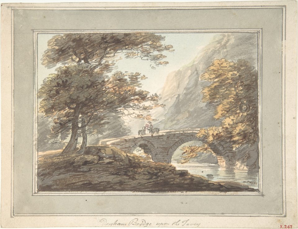
A small Devon landscape in watercolor at the Metropolitan Museum of Art, signed “W. Payne”. It shows the method he taught: dark trees and banks in front, hazy gray hills behind the bridge, and a pale sky. The museum does not record which grays he used, and two centuries have warmed the paper, so the grays now photograph as soft warm browns, about #706355 in the shadows, far from the web code.
Sampled from the painted scene, without the mount, in the Metropolitan Museum of Art’s photograph (X.247), released as CC0 (public domain). Colors in a photo shift with the lighting, so read the codes as close, not exact.
Palettes are sampled in-house.
A dark gray with a blue cast. The usual code is #536878 (RGB 83, 104, 120). As paint it looks almost black at full strength and a soft blue-gray when thinned with water.
William Payne (1760–1830), an English watercolor painter from Devon who became a popular drawing teacher in London in the 1790s. He used a ready-mixed gray for the hazy middle distance of his landscapes, and the mix took his name.
It has always been a mix, not a single pigment. Old recipes combine indigo or Prussian blue with an earth such as sienna or ochre and a red lake. Most modern versions are a blue, often ultramarine, mixed with black.
Both. Grey is the British spelling and gray the American one. They name the same color.
They share a hue, but charcoal, #36454F, is much darker. Both codes come from the same color dictionary, which placed Payne’s gray across both groups.
Warm paper whites and cream for a soft, painterly look, ochre or mustard for warmth, and blush or coral for contrast. White text reads well on it.