A button is a user control element for triggering an event such as saving, deletion, toggling or changing any other state of the underlying system. Conventionally from the physical world, it got adopted into the virtual space as one of the most fundamental control elements.
Characteristics
Buttons are usually rectangular shaped and horizontally aligned.
Text and Icon
Inside a button, an indicative description in the form of text or an icon is placed. An icon is visually faster to spot and can transfer meaning across multiple languages, however it is also more ambiguous due to cultural differences (not only across countries or regions but also across generations). Text can describe the buttons function more precise and more nuanced, for example when there are multiple similar actions like Save and Save as.... Text and icons might be present simultaneously for an emphasized meaning and making use of both their advantages. Text usually is centered with equally large spaces to its side for visual balance.

Color
The color of a button plays an important role as it is already visible before one can even take a glimpse of the content. This makes it attractive to visually hint the purpose connected to the button.
If a user interface is rich in controls, they often are kept to a neutral gray or have a matching color to its container to be less intrusive. Action buttons that are more important, because of their central role in the user interface, or because they are the favored option to pick (by the user, or the provider) can have a more signaling color.

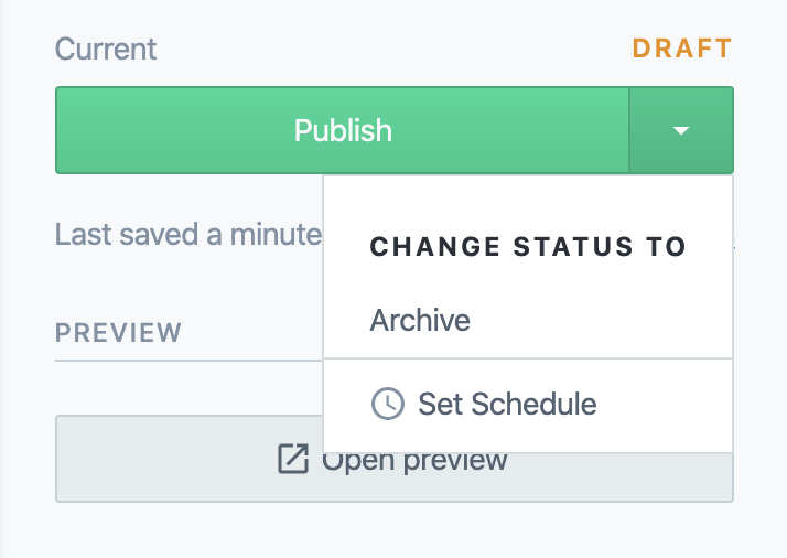
Examples for functionally relevant colors are green for positive enforcements like saving or publishing, or red for negative losses like deletion and cancellation.
Variations
Skeuomorphism
Due to their analog use of physical buttons, they oftentimes inherit skeuomorphic elements like gradient backgrounds and casting shadows simulating bulging and depth. And often a darker background color when pressing it simulating a physical push of the button into the console interface.

Flat Design
In absolute contrast to skeuomorphism flat design takes the role of a minimalistic approach by removing visual cues of depth. Flat design is a puristic form of digital art style as plain, flat rectangles are very simple to render on a diversity of platforms. Whereas skeuomorphic elements need textures, more complex effects, effortful customization for adaption and more computational resources to work out, flat design is simple to implement, easy to scale and resource-saving. Furthermore, it has a weaker intrinsic character, allowing it to be adopted on a wide range of platforms.

Common critics against flat design are that the lack of depth makes it visually hard to see as a clickable element, especially if the interface is loaded. If there is no separate background color set for the button it is also unclear how big the space is, that it occupies or even if it is clickable in the first place, as it may appear similar to labels.
Ghost Button
A ghost button is a special form of flat design which makes use of a transparent background and a defined border. Except for its content and its border one can see through it, providing it with this name. Its effect shines when placed on a wider image background, as the image rules out that the button is indeed transparent and not only plain colored.

While a ghost button can be a stylistic choice of putting not as much emphasis on it, it can, similar to normal flat design, making it less clear of it being a button or resemble too much of a text input.
Illustrative
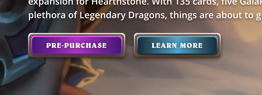
Similar to skeuomorphism an illustrative style makes use of a more pronounced style with decoratives. It shares the realistic aspect to some degree, but it doesn't try to emulate the real world. It is not realistic per se but adopts aspects like lighting and texture. This style category is mostly adopted by games, for example as a cartoon style or another stylized adoption of the real world.

Technicality
Reactive States
Ideally, a button provides reactive feedback of its internal state, most commonly these are when the pointer is hovering over the button or when it is in focus in another way, when it is actively pressed on, and when it is disabled.
Default—The natural state of the button, ready to be interacted with.
Hover—Is the pointer in reach of the buttons control then it enters the hover state, indicating its readiness of being activated. A button might change its background or text color, scale up slightly, glow or have another kind of transformation happening to signal this state. On mobile, this is often emulated by touching on the button, without releasing it on it.
Focus—Similarily to hover the focus state shows that it is the active component under the influence of the user. Unlike hovering however it can change to this state by other means like tab navigation. The user then gets a visual cue which control has input focus; a button then might be activated by pressing the enter or space key. Based on the asynchronous nature of tabular control and mouse events, a button can be in focus and active or hovered at the same time.
Active—The actual state of a button when it is being activated. Ideally, the visual change differs from the hover, focus and idle state, so the user can be sure it has been activated.
Disabled—A button might show itself non-available if the function should be displayed without it being able to be triggered. Often it is grayed out and blends more into the background. It then should stay in this state and not be able to switch to any other state showing readiness as this would confuse the user. A button might be disabled for example when it is a submission button for a form that is not filled out completely yet; its function then is limited to show what the user would be able to do if requirements are met.
Size
A button rarely is only as big as the content it contains. The reasons to make it even bigger are aesthetically, to make multiple buttons the same size or fit them into a layout and also functionally to make them easier to reach and faster to click.
This has been studied and solidified in Fitt's law, which formally describes...
The time to acquire a target is a function of the distance to and size of the target.
Border
A button might have a visible border depending on its art style. A border is defined either by an actual boundary surrounding the button or by the edge visually created between the different colors of the background and the button.
The size of a plain, transparent button without visible border can be hard to judge and may even lead it to not being recognized as a button. A transparent button with a visible border can be considered a ghost button. Both styles are notoriously used in  Flat Design.
Corners
While buttons usually are rectangular shaped, they can have a degree of rounded corners. While details like this may easily be dismissed as subtle, the effect of that decision can already influence the user. The book Universal Principles of Design talks about the Contour Bias:
Consider the contour bias in all aspects of design, but especially with regard to objects and environments that are emotionally neutral. Use angular and pointy features to attract attention and provoke thought. Use contoured features to make a positive first impresssion.
Usage
Buttons are ubiquitous in graphical user interfaces. Their use extends from a simple dismissive Ok for checking off notifications and popup, up to making up more complex controls like dropdown, ribbons and menus.
Events
A small selection of common events for button are:
Execution of action—The most straight forward function of a button is a stateless execution of an action: The button gets pressed once, another thing happens once in reaction. The button gets pressed twice, another thing happens twice.
Submission of data—The button acts as a gatekeeper between the input of a form and the actual submission to the server. It may be disabled while the form is empty or awaits more input and it may indicate an idle state while the submission is ongoing.
Confirmation—A confirmation that interaction has happened and the user is aware of it.
Navigation—A button on the web usually shouldn't be used for navigational purposes as for this case links are the appropriate element to use. Nevertheless they are often used for highlighting the desired path of navigation, eg. call-to-action buttons.
Higher-level controls
A buttons simplistic nature allows for versatile use for higher-level controls, these include:
Dropdowns—The button as the starting point of a palette of more actions, dropping down as a list of options. To distinguish it from an event button a small downwards arrow is commonly used as an accompanying icon.
Switch—Also called toggle button, it is similar to a checkbox, only that its state change is immediate. It should also have clear communication of an on-/ and an off-state.
Tabs—Comparable with radio boxes, allowing only one to be active and acting as a navigational tool to switch sections of content.

