
The world of web art and design has made major milestones and strides, especially in the last few years. In the early years of the internet, the vast majority of the designers packed their sites with showy animations and flashy illustrations to show off their design portfolios, skills, and prowess.
It wasn’t long before the trend shifted towards skeuomorphic design, in which designers tried to mimic real-life objects on their work. For instance, one would use 3D icons, drop shadows, real object characteristics, textures and depth to make design elements more realistic.
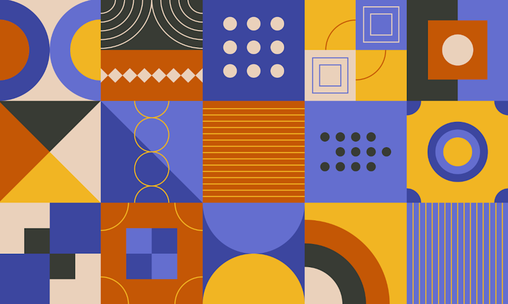
Skeuomorphism soon paved the way for flat design, a more user-centered and simpler web design style. Over the years, it has burgeoned to become the staple of digital art & design and remains as popular and green as ever. It’s almost ubiquitous, found everywhere from web ads and media publications to mobile apps and websites.
What exactly is Flat Design?
Flat design is a classic minimalist design style that places a particular focus on user-friendliness. In this type of design, designers leverage bright yet muted colors, 2-D illustrations, clean lines and white spaces for improved usability and faster loading. As such, it’s a more user-centric, simpler, and more intuitive web design style than its predecessor, skeuomorphic design which, for the most part, favored 3D elements and animations with lots of effects and embellishments.
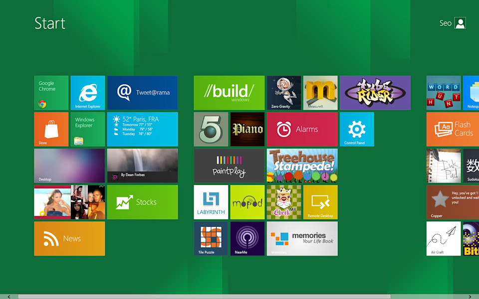
A quintessential example of flat design is Microsoft Windows 8, which was the first user interface to ditch the flashy and faux interface of the previous windows version for the use of flat, bright icons that lack depth. Windows 8 designers went for icon-like images instead of replicating real-world objects such as an envelope for email icon, a house for the home button, etc.
Characteristics
Flat design has been around since the early 1950s, popularized by the emergence of Swiss Style and International Typographic Style. However, the design style started gaining increased traction when Microsoft introduced flat elements into its Windows Media Center back in 2002 and more recently in Windows 8.
As it’s evident from Windows 8 UI, flat design elements are optimized using contrasting, bright colors for easier usability. In addition, the textureless, depth-less and simple shapes of the flat icons mean they can be scaled to offer maximum user experience (UX) on a variety of devices, from smartphones and tablets to desktops and every screen in between.
Use of Bright, Practical Colors
In flat design, the designer makes use of bright often muted colors, preferably simple, practical hues like solid colors. This way, icons, illustrations, and buttons are set apart from the backgrounds, making them easier on the user’s eyes and to easily capture one’s attention.
On the other hand, ornate textures, shadows, and gradients are dropped altogether from the interface. Bright, contrasting colors are chosen for practical purposes, for instance, to create contrast for enhanced visibility. Moreover, retro colors like purple, midnight blue, pink glamor, dark burgundy, salmon, and so forth are used for a calming, easy-on-eyes look.
Functional
In a practical sense, flat design is decorative owing to the extensive use of simple icons instead of text. Designers also tend to use images and photos. Even still, the flat design stays aways from extras that serve no purpose, like a decorative backdrop.
This can be done on purpose as simple images convey a message faster and with less ambiguity than even the most detailed illustrations. Imagery such as icons, on its end, carry universal meaning, which means they are easy to grasp and are likely to optimize on-screen pixel count.
Uncomplicated Elements and Shapes
Simple is the keyword when it comes to flat design. Instead of elaborate, 3D shapes, it uses simple UI elements like icons and buttons which are generally flat. These can take uncomplicated shapes like circles, squares, rectangles, etc
Heavy Reliance on Symmetry
Simple shapes aside, the flat design relies mostly on symmetry to strike a subtle style balance. Even though asymmetrical shapes and UI elements may occasionally be seen in a grid, flat designers shy away from using elaborate balance techniques that aren’t symmetrical.
No Depth and Texture
Flat design is centered around simplicity, which is why elements lack depth and texture. This helps create more crisp edges, cleaner lines and flat icons that are easily noticeable and clear.
Simple Typography
With a lack of texture, typography is certainly a crucial aspect of flat design. To create sharper elements, designers use simple retro typography, making sure the typeface tone marries well with the overall design scheme. After all, a flashy tone may look out of place when incorporated into a very simple flat design.
The font is typically bold and use simple words to create a consistent tone. The size and weight of the type are often scalable to fit any screen and offer a textual and visual consistency of the design.
Generally, San-Serif fonts like Open Sans are chosen for their modern, clean and simple look, as well as their ability to be readable across multiple screens.
Minimalist Mindset
Minimalist style is at the core of flat design, allowing for increased readability and usability. It usually involves the use of many white, empty or negative spaces around text or images.
Grid layouts that are easy to resize and scale is another big issue that’s addressed by the minimalist design style. More importantly, lack of gradients, shadows, and strokes means that the text will pop up, saving plenty of space as well. For instance, fewer navigational options and buttons appear in smaller screens, making a flat UI incredibly user-friendly.
No Fancy Effects
The name says it all - flat designs offer a distinctive 2-dimensional style that lacks embellishments, such as gradients, embossing, bevels, 3D effects drop shadows and other nuances that add depth and pizzazz. In fact, each element or images, from menu items to buttons and text, is clean, shadow-free and lacks edges.
In other words, everything in flat design doesn't include any artificial elements that help them look more realistic, for example, tricks meant to make buttons appear 3D. Despite the lack of realistic elements, it still offers a distinct feel and look without all the fancy extras. It rather uses a clear sense of hierarchy in the placement and design of elements, making the interface easy to interact with and understand.
Variations
There are several variations of flat design that are found in the wild, some, for example, utilize big soft shadow underneath the otherwise flat surfaces. More examples below.
Long Shadows
While many designers have embraced flat design completely, it looks like an increasing number want to add a few changes. One of the most popular variations being touted by a new breed of designers is the so-called “long shadow” design.
It refers to a trend whereby designers use long, dramatic flat shadows, especially for small user interface icons and elements. This effect brings in more depth into the UI, all while maintaining the aesthetics of a flat design. This emerging design style is characterized by a 45-degree shadow that stretches past the length of a conventional drop shadow.
Long flat shadows may apply gradient color which is more or less close to the background color. On the overall, long shadow is equally idealistic, ambitious and sharp as flat design, making it an ideal fit for branding and icon projects.
Slight Gradients
Designers have started to re-introduce gradients into their flat designs. In practice, a gradient lets designers leverage a blast of colors to create elements that appear new and fresh. Often titled as Gradient 2.0, this trend allows designers and web artists to take bold and risky decisions in their designs. A slight gradient is created by incorporating multiple colors to create a seamless transition or shift between them.

Semi-Flat
Also known as Flat 2.0, semi-flat design this is an offshoot of traditional flat design. It was developed in a bid to solve some of the perceived user experience problems with initial flat design.
It brings together the best of the two worlds - the slight three-dimensional elements of skeuomorphic design and stylish, minimalistic appeal of flat design. More specifically, 2.0 brings back some gradients and subtle shadows to enhance the user experience.
Technicality
Flat design has less to do with a strict set of rules and guidelines and more of a style and philosophy. As an inference from the name, it borrows a big leaf from a modern minimalist style that emphasizes simple shapes, bright colors and lack of 3-dimensional depth.
Simplicity
Unlike skeuomorphism that tries to replicate real-life objects, the flat design offers simplicity in UI that embraces simple native elements, functional decoratives. This in and of itself isn’t outlandish because web design was flat from the beginning simply because there were no capabilities for extended visual effect.
Scalability
Steering away from skeuomorphic design, flat design leverages clean lines, color contrast, variations in typography and simple images to spruce up overall UX. The result is affordable designs that are not only sleek across multiple screens but are also easy to scale and generate dynamically.
Content Hierarchy
On a more technical level, flat designs focus on function and content over flashy and superfluous embellishments. Of more importance, the content hierarchy within the design prevents the intersection of elements, therefore creating a seamless flow. Contrasting colors and text boxes not only enhances this hierarchy but also makes the elements appear as if they are built on top of typography.
Usage
UI
From a utilitarian point of view, flat design is exceptionally efficient, particularly when it comes to mobile sites and apps. The minimalist nature of the design allows designers to keep their pages clutter-free and simple yet aesthetically-appealing enough to keep the user engaged.
That’s why flat design is used extensively in UI concepts and a broad range of interface elements, icons, mascots, and even original interfaces.
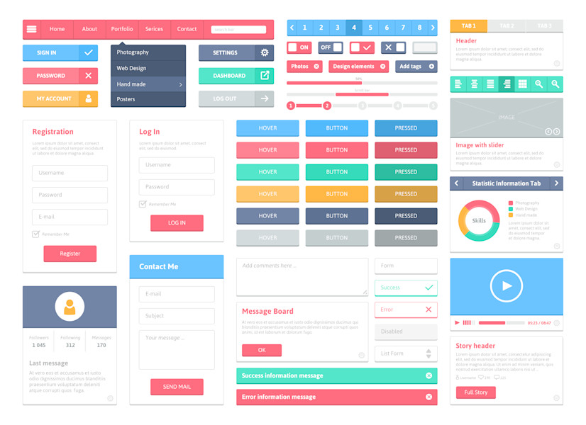
Another popular area is user interface navigation icons, tabs, buttons, and other elements. The simplicity, contrast and visual appeal of these elements help boost the responsiveness of the UI and readability, particularly across multiple devices, platforms, and screens.
Illustration
The introduction of flat design saw a seismic shift in UI custom illustration. These are flat, non-embellished illustrations designed for a specific site, app or products. And they are tailored to the needs and preferences of a given target audience and in the alignment of your business objectives.

Why use flat design?
Here are the top benefits of employing a flat design:
Leads to simple, clean and modern-looking web pages, apps and other digital projects
Less is more - it helps in saving space, allowing for scaling across devices, and enables web pages to load faster.
Results in a better user interface (UI) and user experience (UX)
Offers a function-first approach
Bright colors are not only attractive but also sets a positive tone and vibe for the user
It’s perfect for mobile interfaces and smaller screens and may help elevate SEO metrics for a website.
Great Examples of Flat Design
Windows 8—Although Microsoft had used some flat form of design in Windows Phone 7, Zune MP3 and Windows Media Center, it wasn't until Windows 8 that the minimalist design style took off.
Apple iOS 8—Apple may have kicked off the skeuomorphic design, but its iOS 8 (and by extension iOS 7) used flat design to optimize user experience.
Rio 2016 Website—The use of color contrast and retro type made Rio 2016 site appealing and minimalistic at the same time.