
Textboxes are the most common way of allowing the user to provide text-based inputs. Therefore whenever language is involved a textbox will be viable.
Characteristics
Placeholder
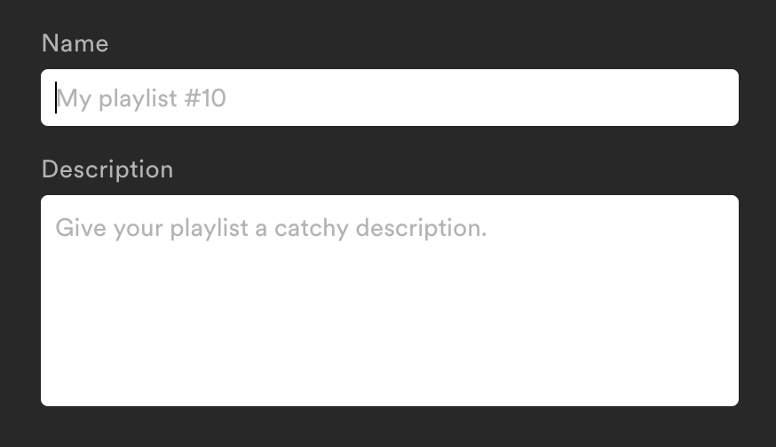
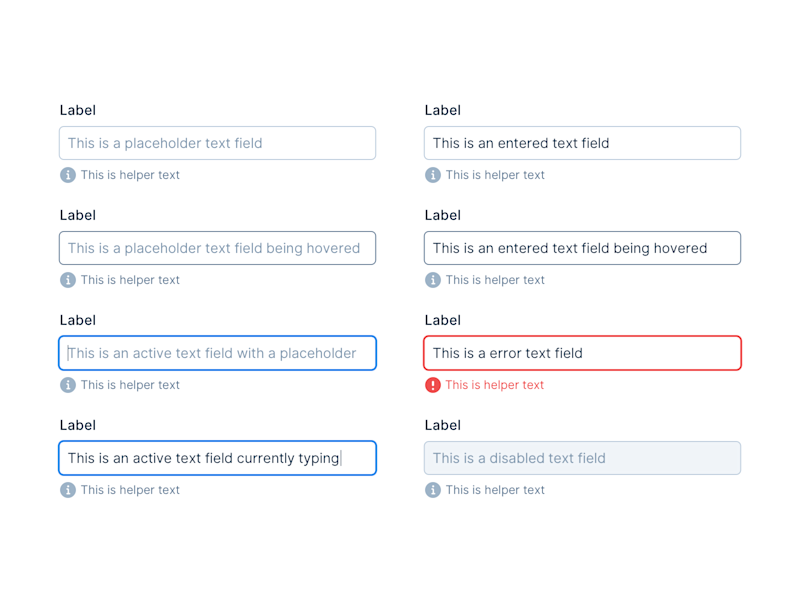
A placeholder is a text inside the textbox, which indicates or demands the required input from the user. A label for an e-mail textbox for example could take the forms of "E-Mail", "your@mail.com" or "Enter your e-mail address". It's usually grayed out or faded for the distinction of the actual input text and disappears once the textbox is in focus or has the first character typed in.
Label
A label is a small text close to the textbox with multiple functions. For one, it provides a semantic association with the textbox element and lays out a descriptive denotation of what is expected as input (eg. "Username or E-Mail" on login forms). For another, it often enough provides a larger hit area to set the focus on the input element, which especially on mobile can be an advantage. In HTML a label also carries a programmatic association, which can be used by screenreaders for enhanced understanding of the input.
Icon
If an icon has no interactive function it acts similar to a placeholder or label, only that its association is purely visual. It can however also take the place of a submission button, that is directly connected to the text input. Examples are a search glass icon on a searchbar, or a paperplane for sending a message.
Default Value
In distinction to the placeholder text, a default value is a valid input ready for submission. It's usually set by the provider (the app or website), often because the information is already known, but should be editable (eg. the username for a registered user). A textbox in this case acts as an intermediate element sharing properties of a text and an input.
Auto-Complete
Either for convenience or for limitation an auto-complete provides the user with a selectable choice. Different to a default value is an auto-complete function, in that it is only suggesting the user possible input values, depending on the type of textbox. These can either be set by the provider, in case a limited set of options are available (eg. Cities of the World), or if other options have been typed in before that might be interesting to the user (eg. tags or search queries).
Another type of auto-completion comes from the application layer, like external software, the web browser or its extensions. These can be used for filling out contact details and login credentials known by the browser, the following word in a message, or re-suggesting already searched terms and so forth.
Variations
Plaintext
The most versatile and simplest form of a textbox is a context-agnostic textbox accepting plaintext. It has no internal instruction for what is acceptable, therefore types of any texts are valid.
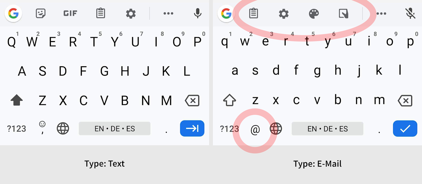
Textboxes that appear to be plaintext could programmatically be specialized textboxes for common text formats like emails and URLs. In this case the appearance doesn't differ (much) from a generic textbox, however the system is aware of it and can help the user with auto-completion or a specialized keyboard layout that displays the common symbols by default, like the @-symbol for e-mails and forward slash for URLs.
Password
Passwords are a common input for login and signup screens. The display of sensitive data however often poses the undesirable consequence that the password is exposed for everyone on the screen. For this use a special textbox variation is used that obscures each character with a symbol (like "*" or "•"). Without revealing its content it allows to see the number of characters typed. Additionally, on mobile, it often displays the last character in plaintext to allow for early correction as compensation for the lack of physical feedback from touch-controlled keyboards.
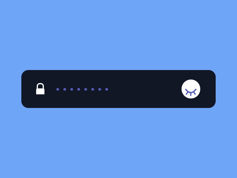
Passwords field may also allow toggling the visibility of the characters for checking the entire input, essentially rendering these on-demand in either plaintext or masked.
Single-Line / Multi-Line
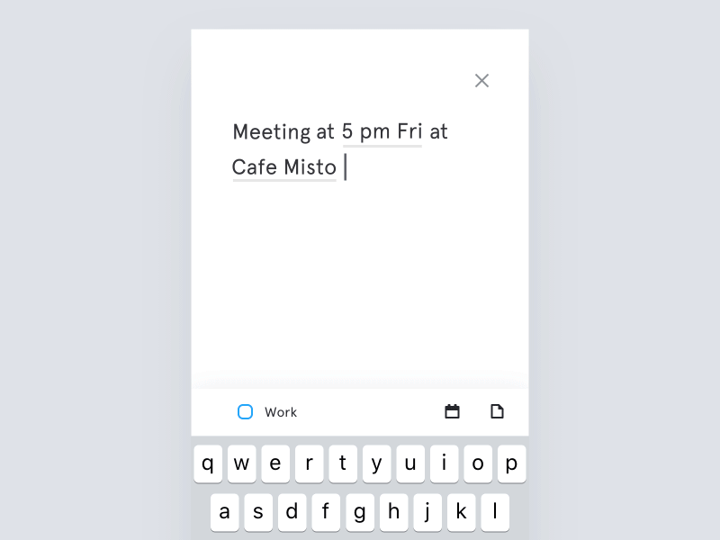
Textboxes only providing support for one line have the advantage that the entered information is segmented by default. This way for example a name can programmatically be distinguished from an address, and each again from its internal parts like first name and family name, or city and street name. If more structural freedom is needed or the number of possible fields isn't known, a multiline textbox can be used. Depending on the underlying system these are either regular textboxes with a multiline option or different types of inputs; in HTML it's the latter and therefore called textarea.
Moreover multiline textboxes have the option to display textlines that are longer than the containing box itself either by providing a scroll option or by breaking the lines into the next line. This option is commonly named word wrap. A break in the line caused by word wrapping is called a soft return and is only visually existent, while a new line from the user is called a hard return and inserted as an actual line-breaking character.
Content Awareness
Besides the different types, there are also different purposes for textboxes that enforce or enrich the input accordingly. The purposes can span from a broad range of options, like social media textboxes that are highlighting external links as such, textboxes for programming languages may provide a syntax highlight and corrected formatting, and WYSIWYG ("What You See Is What You Get") textboxes may translate your input into their final visible form.
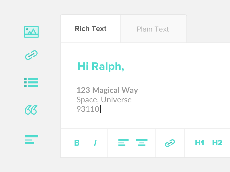
Enriched Text
Enriched text (or previously Richtext, and Microsoft's Rich Text Format) is text with inherit formatting properties. Textboxes may be able to display these similar to other WYSIWYG editors. They are especially common for e-mail clients, but may also be used for blog posts and forum comments.
Technicality
Caret
The text cursor in a textbox, which usually is a long vertical and blinking line is also called caret. It may also appear as an underscore, or as a filled rectangle in some applications. It acts as the insertion point for text and therefore has the function to navigate within the textbox. It should not be visible if the textbox is disabled or not editable.
In addition to placing it with the operating system cursor, it may also be controlled by the keyboards non-character keys, namely the cursor and modifier keys.
Reactive States
A textbox obeys the standard states of a generic screen input. In comparison to a button however it is not centered around getting clicked or activated, but much more about what happens after it is in focus. Common states of a textbox are:
Default—The natural state of the textbox.
Hover—Many textboxes only change slightly or not at all when hovering with over them. The biggest telling point will be the operating system cursor which will change to the cursor symbol. This is not the textbox caret, but an indicator for the user that there is a viable textbox input underneath, which would gain the focus after clicking on that area.
Focus—The principal state of a textbox is the focus state, only then the user is able to change its input. In this state, it also features its caret and claims keystrokes to its own context. A website or an application can also provide an autofocus option to a textbox, making it the immediate focal point.
Readonly—The content of a readonly textbox is not mutable. It then may be used as a text display or be editable to a different point in time.
Disabled—Depending on the system there might exist two different properties to disable editing on a textbox. In HTML there exist readonly and disabled, where a readonly textbox is still focusable and considered part of a form submission, while a disabled textbox is not focusable and programmatically exempt from the submission form.
Feedback
If a textbox expects a certain format for the input, it may provide feedback to the user. Common methods are a red border around the textbox or a checkbox icon next to it, depending on the validity of the input; or tooltips and info texts pointing out the rules for the input (eg. "Password must contain at least 8 characters").
Usage
When not to use it
Due to their basic and versatile functions, textboxes are one of the default ways of allowing user input. If the options are limited or the structure of data is highly constrained, more dedicated inputs will make more sense. They will help the user seeing all possible options or prevent mistyping to happen, these include:
Limited options—Binary fields (Yes/No) can be replaced by checkboxes, limited options can be presented with list boxes, radioboxes or dropdown fields.
Type constraints—Information like numbers, dates and colors can and often are stored as text, they also can exist in an unlimited amount of options. Nevertheless more dedicated input fields have these constraints integrated. A dedicated number field for example inherently allows only digits and possibly the character "e" for scientific notation.
Honeypot
A very special case of textboxes is used on the web, where automated spam bots are a problem for contact and message forms. Here the developer will add invisible textboxes to a submission form, that the user neither sees nor can interact with as an anti-spam measurement. A bot however will interact with it programmatically and may try to fill out the input in an attempt to fake a valid user input.
Hybrid Controls
A textbox can be used in junction with other user interface elements like listboxes. They utilize the advantage of textual freedom, while still providing help and guidance for predefined choices. Typical use cases are for selecting tags, users or locations, that might or might not exists already in the system.